|
|
|
Showing 1841 - 1850 of ~2213 |
| Image |
Comment |
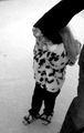
| 01/12/2006 01:41:17 AM | The law says stepmother, she always called her Mommy.by DarkprincessComment: ::: Critique Club :::
Hi Heather
My name is Kari and from the critique club I am currently undertaking a critique of your photo "The law says stepmother, she always called her Mommy". I hope you find this helpful.
Interesting to do a critique on your image but it is difficult if you don't give us much information in your photographers comments. When we do a critique, we go past just the photographic result, that's what voters comments do. The critique looks at what you were trying to achieve, how you wanted it to look and what issues you had in getting the image captured and ready for voting. I am nervous of saything things like sharpen more etc, when you might be going for a softer look, so these details help.
Anyho on we go!
First Impression - the most important one:
I thought this was lovely. I also note the comment that I initially made and what was said by many of the other commentors - we miss the little girls face.
Composition:
This is ok. Not fantastic, but then again, I am still learning how to do fantastic, these things take time and are learnt for most of us! I like that you cropped out the other feet and stuff but there are still a couple of distractions in the ice (dark marks on the left side and at the top a bit of a weird thing going on. I tried cropping them out myself and you can do this without loosing any of the impact of the picture.
Also would like to see the face, but this in itself was a hard shot to take, so I can understand if it wasn't possible, I do think that this counted against you in the long run.
Subject:
Lovely choice of subject matter, which defiantely meets the challenge, and tugged at the heartstrings.
Technical (Colour and light):
This is really lovely picture, I like the use of black and white, play as you can with contrasts and brightness to ensure that this is as chrisp as you need it and then don't forget to sharpen the image after you have reduced its size, this helps to remove some fuzziness.
To grow its vote?:
Take note of what the voters are saying. They have left some really good comments that taken into account will continue to set you up in good steed.
Summary:
Well done, keep it up, can't wait to see the next one.
If you've got any questions about this critique, please feel free to contact me via the PM system.
Cheers
Kari |  Photographer found comment helpful. Photographer found comment helpful. |
| 01/12/2006 01:22:05 AM | Before the Alterby gerakdepanComment: ::: Critique Club :::
Hi, I am Kari and from the critique club.
I am currently undertaking a critique of your photo "before the alter". I do hope you find this helpful.
Interesting to do a critique on your image but it is difficult if you don't give us any information in your photographers comments. When we do a critique, we go past just the photographic result, that's what voters comments do. The critique looks at what you were trying to achieve, how you wanted it to look and what issues you had in getting the image captured and ready for voting.
First Impression - the most important one:
What an awesome picture and situation - the caputre of both the mother and the bride is lovely and the crop is interesting and putting the focus on the mother rather than the bride.
Composition:
This is good. My thoughts are that the mother is the subject of the picture, therefore it would have been nice to have her eyes working on the thirds lines a little more. Also the fron object is straight but the doors behind and the ledge above the door is quite crooked - cropping our the ledge may have helped to reduce the feeling of crookedness.
The depth of field here is working really well.
Subject:
Nice choice of subject matter, which defiantely meets the challenge.
Technical (Colour and light):
This is lovely and balanced picture, I get the feeling that it may be in the black and white overkill ... but it may not depending on the colours that are there in the original.
To grow its vote?:
I don't know completely what you were going for without the comments, so am unsure how to comment too much on this. I would think about the cropping, and also consider if colour would have worked to push it into voters faces a little.
Summary:
Well done, keep it up.
If you've got any questions about this critique, please feel free to contact me via the PM system.
Cheers
Kari
| | Photographer found comment helpful. |
| 01/11/2006 07:36:38 PM | Natural Bounceby KiwiShotzComment: I think that is really cool ... the bounce off the wall at the back really does create that backlight effect being sought. | | Photographer found comment helpful. |
| 01/11/2006 06:53:29 PM | Wine Countryby sbgreenComment: This is an interesting image, my problems are limited but do really affect my scoring here. There are marks all over the glass, there are also fingerprint imprints showing through. The dribble line in the middle of the glass doesn't give a pleasent visual, and although sharp in focus the picture seems to have lost its crispness. 4. |
| 01/11/2006 03:26:06 AM | | | Photographer found comment helpful. |
| 01/11/2006 12:26:12 AM | |
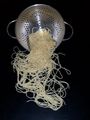
| 01/10/2006 11:35:45 PM | Spilt Spagettiby Kimberly75Comment: B] ::: Critique Club :::[/b]
Hi, I am Kari and from the critique club.
Welcome to DPC and your first challenge.
Great fun to do a critique on your image but it is difficult if you don't give us any information in your photographers comments. When we do a critique, we go past just the photographic result, that's what voters comments do. The critique looks at what you were trying to achieve, how you wanted it to look and what issues you had in getting the image captured and ready for voting.
First Impression - the most important one:
What an interesting picture, lots of swirls and twirls to take my eye.
Composition:
This looks quite natural, you just tipped the bowl over and took the shot didn't you? As it looks natural it looks and feels good to the viewer.
Subject:
Nice choice of subject matter, it defiantely meets the challenge.
Technical (Colour and light):
The picutre is cropped very centred in the frame. Looking at the rule of thirds is a good tip. Try looking here for a simple explaination here and click on rule of thirds for a brief explaination. This is a good way to look at work and create interest to the subject.
To grow its vote?:
Look at the various rules, good start is thirds, try cropping and re-cropping prior to entry to find what you think is the best way. Keep entering, and having fun with you pictures.
Also, when you resize your photos try to make sure that the longest side is 640 - this maximises your image. Take time with your photo programme to also learn how to maximise the amount of detail to the maximum allowed file size.
Summary:
Well done, keep it up.
If you've got any questions about this critique, please feel free to contact me via the PM system.
Cheers
Kari |
| 01/10/2006 11:00:04 PM | |
| 01/10/2006 10:58:36 PM | The Beehive Shapeby KiwiShotzComment: Having been there, I think this is a great capture of where parliment sits in NZ ... nice shape. | | Photographer found comment helpful. |
| 01/10/2006 07:21:11 PM | Wrong Wayby StormCatComment: ::: Critique Club :::
Hi, I am Kari and from the critique club.
I am to critique your photo "wrong way" as requested.
First Impression - the most important one:
Interesting picture, a little stark and a bit small.
Composition:
The composition is ok. I probably would have worked the broken down car into thirds a little more to make it a bit more of the focus of the picture.
Subject:
Great choice of subject matter. Always and so often happens and all you think is sh!!t .. how did they manage that.
Technical (Colour and light):
The picture appears a little blurry but this may be the depth of field. Also a number of the commentors have mentioned that they like the black and white aspect, but how does it look in colour. I would also work on the resizing options as 640 longest side is going to get a bit more attention (especially in thumbnail) than something smaller.
To grow its vote?:
Solid entry... top 50%. As you practice more with your camera and software you will find more ways to entice people into your picture, and ensuring they have to give it more thought.
Summary:
Well done, keep it up.
If you've got any questions about this critique, please feel free to contact me via the PM system.
Cheers
Kari |
|
Showing 1841 - 1850 of ~2213 |
Home -
Challenges -
Community -
League -
Photos -
Cameras -
Lenses -
Learn -
Help -
Terms of Use -
Privacy -
Top ^
DPChallenge, and website content and design, Copyright © 2001-2026 Challenging Technologies, LLC.
All digital photo copyrights belong to the photographers and may not be used without permission.
Current Server Time: 07/18/2026 11:11:00 PM EDT.
|