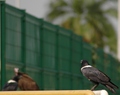
Galileo's Legacyby
blurredvisionComment: ::: Critique Club :::
Hi, my name is Kari and from the critique club.
The critique I am doing is for "Galileo's Legacy"
Great fun to do a critique on your image but it is difficult if you don't give us any information in your photographers comments. When we do a critique, we go past just the photographic result, that's what voters comments do. The critique looks at what you were trying to achieve, how you wanted it to look and what issues you had in getting the image captured and ready for voting.
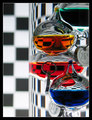
First Impression - the most important one:
For me the shot is too busy, but for others it wasn't ... I read the comments, and read about your preferred picture, I liked that one more as there was less going on. But for this one, it is a good photograph, and it did really well in the challenge.
Composition:
This is an interesting composition ... the impression is quite centred but I think it is well skued to the thirds.
Subject:
Meets the challenge on so many different levels.
Technical (Colour and light):
Crisp and well balanced. The lighting has worked well, and the picture is sharp. The DOF is well done.
To grow its vote?:
Top 20 ... I don't know how to improve this pictures vote it was an extremely tough challenge.
Summary:
This is a good picture .. might be too busy, but it worked well for this challenge. Congratulations on the Top 20 finish.
If you've got any questions about this critique, please feel free to contact me via the PM system.
Cheers
Kari