|
|
|
Showing 181 - 190 of ~296 |
| Image |
Comment |
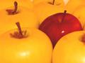
| 10/10/2005 07:11:28 AM | take your pickby mimsydotesComment: What a striking arrangement!
Complementary colours are pairs of colours that contrast strongly when compared to each other. Unfortunately, the red of the single apple is not the complementary colour to the yellow of the rest of the apples... you would need to have a more green tone on all the other apples to achieve the complementary pair of red/green, or a more blue-violet hue on the single apple to achieve the complementary pair of yellow/violet.
Regardless, this is an eyecatching arrangement, and it could have done well in another challenge. |
| 10/10/2005 07:08:32 AM | Roses are RED!!! dunno about violets!!by doctabrezComment: What a fine composition!
Complementary colours are pairs of colours that contrast strongly when compared to each other. Unfortunately, the yellow colour you show in the center of the photo is not the complementary colour to the red on the outside... you would need to have a more green tone in the center to achieve the complementary pair of red/green, or a more blue-violet hue on the outside to achieve the complementary pair of yellow/violet.
Regardless, this is a superb close up photograph, and I admire your skill in arranging the composition, despite the fact that it didn't meet the requirements of the challenge. |  Photographer found comment helpful. Photographer found comment helpful. |
| 10/10/2005 07:06:12 AM | she tried not to cross the lineby nnischkeComment: Complementary colours are pairs of opposite colours that contrast strongly when compared to each other. The challenge called for two complementary colors to compose your photograph, but in your photo you have used red and yellow as your only colours on a neutral background, and they don't give the effect of tones of a single predominating colour against tones of its opposite or complementary colour.
This is a great study of an unusual juxtaposition of objects. But I think your submission would have been a demonstration of complementary colours if, in the same scene, you had shot a blue pump instead of a red one. Then, you would have had a complementary pair of yellow/blue, and a striking image as well.
Nevertheless, I enjoy your vision and the way that you have portrayed texture in this image! In another challenge, this would have been a great submission.
| | Photographer found comment helpful. |
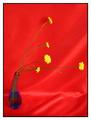
| 10/10/2005 07:01:01 AM | Follow the Sunby shemetnaComment: Complementary colours are pairs of opposite colours that contrast strongly when compared to each other. The challenge called for two complementary colors to compose your photograph but in your photo you have used two pairs red/ green, and blue/yellow, which don't give the effect of tones of a single predominating colour against tones of its opposite or complementary colour.
This is a great arrangement of the vase of wildflowers. But I think your submission would have been a stronger demonstration of complementary colours if you had worked with two main colours that are complementary to each other. For example if you had de-emphasized the green stems, worked with just the yellow flowers and the blue vase, and shot against a black, or white, or grey background, you would have had a complementary pair of yellow/blue. Likewise, if you had kept the red background and put more emphasis on the green stems, you would have had to change the colour of the vase---clear, perhaps? and the colour of the flowers, to a neutral white for contrast against the background.
Regardless, this is still a great composition and it works well outside the restrictions of the challenge.
| | Photographer found comment helpful. |
| 10/08/2005 06:42:33 PM | Bikini Bottomsby KitaComment: What a strong design!
Complementary colours are pairs of colours that contrast strongly when compared to each other. Unfortunately, the yellow colour you show in the triangles on the sides is not the complementary colour to the red in the center... you would need to have a more green tone on the sides to achieve the complementary pair of red/green, or a more blue-violet hue in the center to achieve the complementary pair of yellow/violet.
Regardless, this is a very striking design, despite the fact that it didn't meet the requirements of the challenge. | | Photographer found comment helpful. |
| 10/08/2005 06:37:34 PM | Autumn Beautyby woodseyComment: What a beautiful composition!
Complementary colours are pairs of colours that contrast strongly when compared to each other. Unfortunately, the yellow colour you show in the center of the flower is not the complementary colour to the red of the petals... you would need to have a more green tone in the center of the flower to achieve the complementary pair of red/green, or a more blue-violet hue in the petals to achieve the complementary pair of yellow/violet.
Regardless, this is a strong composition, despite the fact that it didn't meet the requirements of the challenge. | | Photographer found comment helpful. |
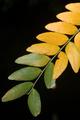
| 10/08/2005 06:33:48 PM | Symphony for two...by cwalmyeComment: What an elegant composition!
Complementary colours are pairs of colours that contrast strongly when compared to each other. Unfortunately, the yellow colour you show in the upper leaves is not the complementary colour to the green of the lower leaves... you would need to have a redder tone in the upper leaves, and a corresponding shift towards a blue-green in the lower leaves to achieve the complementary pair of red/green.
Regardless, this is a beautiful image, and despite the fact that it didn't meet the requirements of the challenge, I think it is lovely. | | Photographer found comment helpful. |
| 10/08/2005 06:27:25 PM | African Violetby holyfamComment: The complementary colours I see in your image are yellow/violet, but the addition of the strong green from the leaves of the plant change the effect of the complementary colours.
Complementary colours are pairs of colours that contrast strongly when compared to each other. The main colours in your image are yellow and violet.
I think your photo would have been stronger if you could somehow have de-emphasized the green or else shot the photo with just the blossoms and not the leaves. | | Photographer found comment helpful. |
| 10/08/2005 06:23:04 PM | Blackest Eyesby CorySmithComment: This was a difficult challenge to work on... people's opinions differ on what the complementary colours are, mainly depending on whether they are working with a system based on Red, Yellow and Blue as their primary colours (subtractive colour) or a system of Red, Green and Blue (additive colour) as their primary colours.
For this challenge, I believe either system is acceptable.
Complementary colours are pairs of colours that contrast strongly when compared to each other. The main colours in your image are the red of the dice and the blue in the background. The white spots are neutral, and the bubbles carry a greenish reflection, but the dominant colours are red and blue.
I think your photo would have been a stronger submission if you had used a rich dark green in the background to enhance the effect of the dice, or else kept the beautiful blue background and made the dice closer to a yellow-orange so as to enhance the complementary contrast with the background.
| | Photographer found comment helpful. |
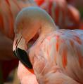
| 10/08/2005 06:17:46 PM | Pretty in Pinkby lagansComment: This was a difficult challenge to work on... people's opinions differ on what the complementary colours are, mainly depending on whether they are working with a colour wheel based on Red, Yellow and Blue as their primary colours (subtractive colour) or a colour wheel of Red, Green and Blue (additive colour) as their primary colours.
For this challenge, I believe either system is acceptable.
Your image appears to be composed not so much in complementary colours as in a monochromatic scheme, in that it is mostly pinks, or pale tones of red-orange. The complementary colour to this would be a greenish-blue...and in fact t his colour does exist in your photo. (Try inverting the colours in Photoshop to test this out.) However, my eye reads this cyan colour as being white highlights along the top of the head and the feathers.
Nevertheless, this is a great photo of a beautiful bird, and the colours are phenomenal! A small adjustment in the colours in the background would have made a huge difference in showing complementary colours.
|
|
Showing 181 - 190 of ~296 |
Home -
Challenges -
Community -
League -
Photos -
Cameras -
Lenses -
Learn -
Help -
Terms of Use -
Privacy -
Top ^
DPChallenge, and website content and design, Copyright © 2001-2026 Challenging Technologies, LLC.
All digital photo copyrights belong to the photographers and may not be used without permission.
Current Server Time: 07/16/2026 01:13:31 AM EDT.
|