| Image |
Comment |
| 01/28/2007 06:22:52 AM |
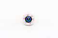
The Photographer's Eyeby TechnoShroomComment: Interesting concept, but it doesn't really work for me as an image, and the white reflection just above the center black circle was unfortunate and distracting to my eyes. |
| 01/28/2007 06:20:14 AM |
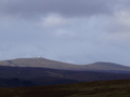
Early Warningby fredandaudComment: The different hill layers in this, with the washed out look of both the middle and upper ones, detracted from this shot, and to my eyes made it too busy to be a minimalist shot. |
| 01/28/2007 06:17:55 AM |
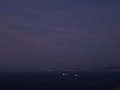
Ships at Duskby craigesterComment: The overall look of this shot didn't appeal to me; the minimalist elements are caught up in the imprecise focus on the ships and problems with contrast in their lights, and the distracting rocks in the lower right corner. |
 Photographer found comment helpful. Photographer found comment helpful. |
| 01/28/2007 06:16:40 AM |
Simply Beautifulby littlegettComment: A beautiful shot, but it's not minimal to me (either within the challenge description or within my understanding of the technique). |
| Photographer found comment helpful. |
| 01/28/2007 06:12:50 AM |
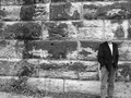
Untitledby kanajComment: There was a bit too much going on here for me to think of this as minimal. I also wish the model had been a bit more to the right, so that his hair didn't get lost on the left side (as you look at him) in the brick. |
| 01/28/2007 06:11:16 AM |
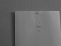
The Message is simpleby TlemetryComment: This didn't work for me; minimal, but with elements that detracted from that for me (the size of the paper, the nail, the texture on the wall). |
| Photographer found comment helpful. |
| 01/28/2007 06:10:22 AM |
hatby shamerComment: I was unsure what was going on with this shot; the image on the right (Hendrix?) detracts from the minimalism for me, and turns it into a different kind of shot; the diagonal on the right distracted me from the main subject(s) here. |
| Photographer found comment helpful. |
| 01/28/2007 06:07:01 AM |
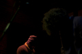
Lens Flareby gliphixComment: Interesting idea, but for me it didn't really work; the extra reflections near the flare, the line coming out, and the lone reflection to the right don't fit together to me. |
| 01/28/2007 05:48:40 AM |
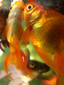
Feed Meby drz01Comment: Nothing minimalist about this for me, a very busy, confusing shot, though well lit with some nice highlights, the focus seems off to me for the subject matter. |
| Photographer found comment helpful. |
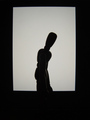
| 01/28/2007 05:47:51 AM |
squareby directionsforpestComment: Shadows alone aren't really minimalism to me, and there's a lot going on here for me to think of this as a minimalist shot. You're also (probably unfairly) falling victim to my prejudice against woodies (they do absolutely nothing for me as subject matter, sorry); that said, you did a wonderful job with the lighting on this, showing more than just the bare outline (though I may have actually put the figure behind the frame, as the bits of highlight showing at the bottom are distracting to me); I'm bumping it up a bunch from where I first voted it. |
Home -
Challenges -
Community -
League -
Photos -
Cameras -
Lenses -
Learn -
Help -
Terms of Use -
Privacy -
Top ^
DPChallenge, and website content and design, Copyright © 2001-2026 Challenging Technologies, LLC.
All digital photo copyrights belong to the photographers and may not be used without permission.
Current Server Time: 06/18/2026 06:50:39 PM EDT.