| Image |
Comment |
| 02/04/2006 02:55:03 AM |
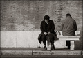
Incommunicadoby srugoloComment: same as the romance bench?? hmm. Like that one better. but would make an intersting study overall I think. |
 Photographer found comment helpful. Photographer found comment helpful. |
| 02/04/2006 02:52:35 AM |
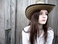
Composure, at week 34by ergoComment: not sure the cold green tint was the best of choices, but I like the comp and contrast. textured background is a little off-putting / distracting. |
| Photographer found comment helpful. |
| 02/03/2006 11:08:39 PM |
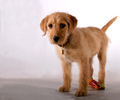
"Rural Illinois"by tmorninglory96Comment: Eyes and face could have been a wee bit sharper, especailly the eyes. everything looks just a bit fuzzy here. (maybe no USM after resize??). I like the composition and the wooden fence background. |
| Photographer found comment helpful. |
| 02/03/2006 11:05:26 PM |
Golden Hefeweizenby PhilComment: Lovely lighting, good sharpness and wonderful refraction in the handle. I think you could have smoothed out/blurred the jaggies at the left of the highlight on the handle though, that's a bit distracting. good stuff overall. |
| Photographer found comment helpful. |
| 02/03/2006 11:01:35 PM |
|
| Photographer found comment helpful. |
| 02/03/2006 03:06:39 PM |
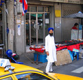
Street Photography: A Fading Art?by Mark of SRQComment: Street art/photography is not dead or fading. Take a look at pawdrix's portfolio, or www.chromasia.com (click back through the entire last year, it's worth it), Or Librodo's portfolio.
The problem with this photo is that you abandoned all thought of composition. I have no idea if you had problems with the man and getting his photo. But if he could have been (or was) a willing subject, I think you could have done much more with this. Maybe give him some money to pose or something.
Anyways, use thirds, symmetry,negative space, or whatever, but this haphazard arrangement takes away from the focal point (the man IMO). I can see many possibilities, but the most obvious to me is stand directly in front of him, him to the left side of the frame, and his table beside him. |
| Photographer found comment helpful. |
| 02/02/2006 06:32:23 PM |
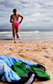
The Beachby roadrunnerComment: Hey, It's an Elsapo "shoes" entry!
Nice detail and colors. Your model looks a wee bit dark though... Overall a 6.5, but they don't have that so 7 |
| Photographer found comment helpful. |
| 02/02/2006 06:06:31 PM |
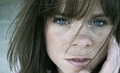
Wind & Wonderby mandyturnerComment: Hi Mandy!
I guess this was one of the ones you were experimenting with on your new 20d (yay!). I think maybe if you'd added more fuzzyness in an action or something, maybe something akin to goth glow (I can tell you how to approximate if you dont have CS/CS2), and tried to sharpen the eyes a bit manually, you may have pulled this one off. For me, it just looks out of focus right now. Learning new equipment sucks, hope you get in your groove soon and turn out what I know you're capable of doing. I love the pose and the windblown hair though. Good luck! |
| Photographer found comment helpful. |
| 02/01/2006 07:36:54 AM |
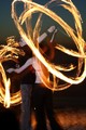
Two souls, one heart, the fire withinby danica22Comment: That's crazy cool, but I have no idea (besides the title) what this has to do with romance. Maybe if you had set one of those things to swinging around the two lovers in and embrace, and it wasn't so obvious that they were the ones twirling. I'm thinking someone above them swinging it around. Tenuous position for them I guess. I think the thing for me, is that their energies seem so concentrated on making their fires, that they're apart while being so close... 6, nah, make it 7 |
| Photographer found comment helpful. |
| 01/31/2006 03:07:12 PM |
Pink Milk Glassby alzartComment: This is a nice study in lighting, but I think the subjects lacks interest (for me) and it looks a little too staged. You don't want to make it look like you tried hard, it has to be look efortless. (something I have yet to really achieve myself I'll admit) If the light is to be obvious, then it should be an intrinsic part of the composition. The red spot distracts from the subject IMO, and looks like an afterthought. The right side of the jar (or whatever it is) needs a little more bounce or fill light also. Possibly having the white light on one side, and a diffuse soft red on the other maybe. Having the red on the other side negates the negative space leading you to the subject. Also I think makeing the silky BG into a specifc pattern that gently leads the viewer by the hand over to your subject would be nicer than the haphazard arrangement. Good elements here, but I think you need to practice the arrangment and setup some more. |
| Photographer found comment helpful. |
Home -
Challenges -
Community -
League -
Photos -
Cameras -
Lenses -
Learn -
Help -
Terms of Use -
Privacy -
Top ^
DPChallenge, and website content and design, Copyright © 2001-2026 Challenging Technologies, LLC.
All digital photo copyrights belong to the photographers and may not be used without permission.
Current Server Time: 06/12/2026 12:34:16 AM EDT.