|
|
|
Showing 451 - 460 of ~888 |
| Image |
Comment |
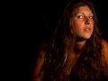
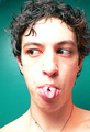
| 04/29/2006 01:07:17 PM | Spicyby bseifipourComment: Hola! From the Critique Club!
Wassup Brian.
I think, for this challenge especially, that a tigher crop/composition were needed. The negative space here might seem artsy, but what people really wanted to see were faces, faces, and more of their faces. The top 9 were all tight crops, (#10 had other things distracting from the face) and 8 of the next 10 were tighter crops. That makes 17 of 20 at the top tight, mostly face crops in my estimation.
The negative space here is just a bit too much I think. The eyes are great, but, again, a tighter crop could have served to highlight them. He r face is turned a little too much away from the camera, and thus the viewer. Automatically takes a bit of the connection out of it. Turning her face down a bit and more toward the viewer, makes for a better pose.
The lighting is great, I like that, a bit more highlight on all the great hair would have done you well also. |  Photographer found comment helpful. Photographer found comment helpful. |
| 04/29/2006 12:41:21 PM | Mother, Mentor... My Heartby ColeyComment: Hola! From the Critique Club!
I love, and I mean LOVE this picture, Cole. The composition is so well thought out. It really makes a connection with the view, and it tells something about the subject, even without the title. I love pictures with a point and a story lately, so this is right up my alley. If I had come across this in the voting, I would have given it at the very least an 8.
The only thing that may be hurting you here is the lighting/color may be a little bit cool (just a teeny bit), and the expressions of your daughters and somewhat your wife, are not quite inviting. I think maybe just getting a small smile out of them (not a beaming grin or anything) could have helped the viewers connect with them a bit more.
The subtle heart shape that you mentioned was a bit too subtle for me. Maybe I need a bit more hand holding for that to come across to this view. All in all, a great shot, and should have been rated higher IMO. | | Photographer found comment helpful. |
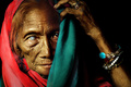
| 04/29/2006 12:18:30 PM | Adrianeby saracatComment: HI! from the Critique club.
In this picture I like the pose and composition in general, but there may be a little too much negative space on the right.
This could use a bit of sharpening I think. Especially on the eyes, left eye in particular.
Lighting is good, but not spectacular. One thing that i noticed in this challenge is that the top 10 all had their subjects looking directly at the camera, and thus the viewer. This really serves to create a connection between the viewer and the subject I think. The top 9 all had much closer crops than this, and great lighting and sharpness on the eyes.
I agree with the others that commented that there is a bit much noise, and the background, while being seemingly neutral, actually may distract with it's blandness. You may think about color coordinating with your subjects in the future. | | Photographer found comment helpful. |
| 04/29/2006 12:03:00 PM | into the blue....by AzCKellyComment: I keep meaning to try one of these, I love the way the water kind of looks like a globe because of the roundness (and slight distortion?). | | Photographer found comment helpful. |
| 04/29/2006 12:00:46 PM | Onion Bloomby AzCKellyComment: This is a great shot, I didn't vote on that challenge, but congrats on the top 20. I sort of wonder if a shallower DOF would server to highlight the open bloom a little better, but it's really great the way it is. | | Photographer found comment helpful. |
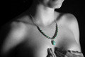
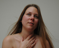
| 04/22/2006 02:12:59 AM | Remembranceby jwillertonComment: You know, I'm usually pretty loose with DNMC comments lately, but I really don't think this meets portrait in either of it's meanings very well. You're either showing me a person's face, and letting that tell me about them, or you're showing me something about the person in another fashion. The problem being here is, I don't know what you're trying to tell me with this, and I can't see their face. I'm sure the necklace has some significance, but you're not laying it out for me.
But, the lighting and pose are nice, the desat worked well to highlight the necklace. I think the extra exposed skin is more of a distraction than additive to whatever message you might have been going for. |
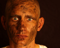
| 04/22/2006 02:04:29 AM | Graveyard Shiftby DustDevilComment: I like the portraits that seem to tell more of a story, let you feel like you know the subbject a bit better after seeing it. I think this does that very well. Great lighting, and just enough DOF, 8 for now. | | Photographer found comment helpful. |
| 04/20/2006 11:51:41 PM | |
| 04/20/2006 11:50:15 PM | Unveiledby librodoComment: man, when you pick a subject, you just don't let go until you're satiated do you? | | Photographer found comment helpful. |
| 04/20/2006 05:29:21 PM | Untitledby hopelessoptimistComment: Try this: in Photoshop, copy main layer to a new layer, gaussian blur at about 5-10 or so (I'd need to play with it full size to know for sure) set layer blending to Soft Light. Pick the eraser, delete the eyes of the second layer to let the eyes from the original layer show through.
Sharpen the first layer at 100%/.5pixels/0 threshold, or to taste. This will make the eyes pop out. Crop the picture to portrait with the face in a thirds position, upper right. If you don't know what thirds is, go to photoinf.com.
Go to Layer/new adjustment layer/levels. Pring the rightmost slider over until it's at the bottom of the curve just into the black to brighten the background away from gray.
[url]//www.brizfoto.com/321901edit.jpg [/url]
Just trying to help, hope that's how you take it. Also, you may need to check your monitor calibration, this looked really dark to me. | | Photographer found comment helpful. |
|
Showing 451 - 460 of ~888 |
Home -
Challenges -
Community -
League -
Photos -
Cameras -
Lenses -
Learn -
Help -
Terms of Use -
Privacy -
Top ^
DPChallenge, and website content and design, Copyright © 2001-2026 Challenging Technologies, LLC.
All digital photo copyrights belong to the photographers and may not be used without permission.
Current Server Time: 06/12/2026 12:34:31 AM EDT.
|