|
|
|
Showing 301 - 310 of ~888 |
| Image |
Comment |
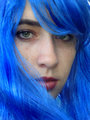
| 09/07/2006 11:51:03 PM | day3by FayeaComment: I think I figured out what I like about this. The electric blue hair meet a face with pretty standard makeup, just a bit of lipstick. The juxtaposition is nice, and not really noticeable at first because of the understated nature of the facial feature next to the insanely blue blue. I like it. |  Photographer found comment helpful. Photographer found comment helpful. |
| 09/05/2006 06:55:24 PM | | | Photographer found comment helpful. |
| 09/04/2006 12:10:10 AM | | | Photographer found comment helpful. |
| 09/01/2006 02:14:43 PM | White " X "by jellyooooComment: I am a picky person, I like the image overall, but little details like the tag? causing the distortion in the glove- right at the end- are distracting. | | Photographer found comment helpful. |
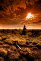
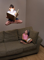
| 08/31/2006 07:53:09 PM | Light Reading by scalvertComment: you know, I just read through all the comments about drab lighting and harsh lighting from the book and all.
Do people ever see a picture for a picture anymore? I thought the same thing, I admit, then I thought: "But magic books are SUPPOSED to be blindingly bright" seriously, I thought you did it on purpose. A little smoke something to make the light stream really would have been the icing on this.
And the drab lighting on the rest? I LOVED it. The magical meeting the ordinary in a stark contrast, amazing happenings intruding on our everyday monotonous environs, even the walls are barren of life or painting or imagination. Oi. Ve.
Or maybe I'm reading too much into it and your living room is just a zen sanctuary? hrm.. | | Photographer found comment helpful. |
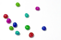
| 08/28/2006 02:34:19 AM | Peas smile for the camera!by freakin_hilariousComment: Greetings from the Critique Club :O)
Ah, the fickle voter. How elusive and slippery your affections are.
I'll skip the technicals here, they're all very good, and I think you know that.
The colors: Okay, so they didn't like the colors. Peas should be green you see, and when people come across red and blue peas, they have to think about their vote. They don't want to think, they want to be amazed by your photograph and how amazing it was on the first second they saw it. Which brings us to...
The arrangment: I (and I admit, I can be blind sometimes, I can't see the illusions in those magic-eye things, but I digress) ahem... I didn't see the smiley face at first. I looked at the title, then I looked back up and saw the face. I donder if I'm alone in this experience. I think a closer arrangement of the peas, and more in the smile, could have alleviated any first glance confusion. First impressions are everything. Especially if someone only takes 2-3 seconds to vote. | | Photographer found comment helpful. |
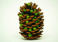
| 08/28/2006 02:24:21 AM | Guys, I don't think this is our pod!by BeckyTComment: Greetings from the Critique Club. :O)
The composition here is a bit lacking. It feels a bit indecisive as to where you wanted to place the subject. Just slightly off-center, and not really to the right, yet leaning to the left. It just makes the whole thing FEEL off kilter. You don't want people to get that feeling when the look, because then they're not sure how to vote ;)
This is a very nice and clean white BG, but I'm not sure it really servers the photo all that well. Actually, I'm thinking a more complicated setup would feed better into the joke at the bottom. Maybe laying in a piney bed of underbrush or somthing. A little more complex, but still do-able indoors. Lighting here is good, I like the shiny wetness of the peas contrasted with the earthy pinecone tones.
I, personally, am not fond thepicture depending entirely upon the title. If it can't stand as a picture without the title at all, then the concept comes across weakly, deadens the impact of the idea. I'm not saying that a title can't be the icing, but they should compliment each other, not ride upon the back of the other to carry the photo.
| | Photographer found comment helpful. |
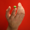
| 08/28/2006 02:12:41 AM | The Oneby talikfComment: Greetings from the CC ;)
Hey, what can I say? This is a great photo, very clean graphically. I love the color in the background, and the use of shallow DOF is nicely used to highlight your lone pea there.
Improvement possibilities: maybe the hand could have been coming up at a diagonal, holding the pea in an off-center thirds position, this would have given a better overall flow to the pic I think, and increase the feeling of simplicity that I think you were going for. | | Photographer found comment helpful. |
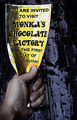
| 08/27/2006 10:25:53 PM | Charlie's Ticketby xianartComment: Ugh, I just noticed how relatively low this placed. Really should have done better than this. Sweet idea, and well taken. Silly voters. I gave it a nine during the challenge BTW. | | Photographer found comment helpful. |
| 08/24/2006 06:15:48 PM | impendingDOOM.JPGby wavelengthComment: nevermind. I'm dumb. I've meant to upload a file that doesn't have compression artifacts, I just never have.
Message edited by author 2006-08-24 18:17:01. |
|
Showing 301 - 310 of ~888 |
Home -
Challenges -
Community -
League -
Photos -
Cameras -
Lenses -
Learn -
Help -
Terms of Use -
Privacy -
Top ^
DPChallenge, and website content and design, Copyright © 2001-2026 Challenging Technologies, LLC.
All digital photo copyrights belong to the photographers and may not be used without permission.
Current Server Time: 06/11/2026 05:15:22 AM EDT.
|