| Image |
Comment |
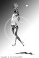
| 05/13/2006 09:47:15 AM |
volleyby SkipComment: Super cool, lots of artistic funk to this sports photo. |
 Photographer found comment helpful. Photographer found comment helpful. |
| 05/13/2006 09:44:11 AM |
Wildflowersby myraComment: Very beautiful 'Mexican Hat' closeup. Great composition and nice rich color tones. |
| Photographer found comment helpful. |
| 05/12/2006 03:02:14 PM |
With a Cherry on Topby Marc923Comment: Great exposure and composition. Nice color tones and sharp. Roof peak in front a minor, minor distraction. Fitting title. Colorado capitol building, where's my A? |
| Photographer found comment helpful. |
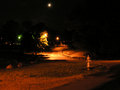
| 05/12/2006 02:20:29 PM |
Dark Roadby perotyComment: If you had included more of the road(the part immediately in front of you) in the foreground, you could've of created stronger leading lines that would really pull the viewer into the photo. |
| Photographer found comment helpful. |
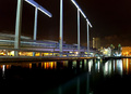
| 05/12/2006 02:14:12 PM |
bridgeby sciartapelloComment: Great exposure & color tones. If the perspective was adjusted such that the bridge came more from the corners and diverged to the center of the frame, you'd have some leading lines that would really pull the viewer into the photo. I say that also because the building have much more interest than the brige. |
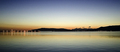
| 05/12/2006 01:19:16 PM |
Night Light for the Wearyby chaliceComment: Great framing at the top with trees, the bottom looks a little strange though. It looks like the ground just falls away. I like the light cast by the streetlamp. Good photo-6, probably go 7 or 8 if the bottom didn't bother me so much. |
| Photographer found comment helpful. |
| 05/12/2006 01:12:00 PM |
|
| Photographer found comment helpful. |
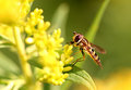
| 05/12/2006 12:28:31 PM |
bee.jpgby TransitComment: Incredibly sharp detail right where it needs to be, and all else out of focus. Awesome compostion and perfect DOF. Great photo! |
| Photographer found comment helpful. |
| 05/12/2006 09:34:58 AM |
|
| Photographer found comment helpful. |
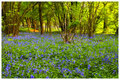
| 05/12/2006 09:30:57 AM |
BlueBell-Wood.jpgby ArtanComment: Very beautiful and rich colors. Peaceful and comforting 'scape. Great photo! |
| Photographer found comment helpful. |
Home -
Challenges -
Community -
League -
Photos -
Cameras -
Lenses -
Learn -
Help -
Terms of Use -
Privacy -
Top ^
DPChallenge, and website content and design, Copyright © 2001-2026 Challenging Technologies, LLC.
All digital photo copyrights belong to the photographers and may not be used without permission.
Current Server Time: 05/10/2026 10:41:47 AM EDT.