DPChallenge: A Digital Photography Contest You are not logged in. (log in or register
 
Browse Settings
Currently viewing:
Registered Usermpeters

Show comments:

Per page:

Order:

Comments:


Comments Made by mpeters
Pages:   ... [511] [512] [513] [514] [515] [516] [517] ... [539]
Showing 5131 - 5140 of ~5383
Image Comment
Winter Run
01/20/2006 05:02:55 PM
Winter Run
by loriprophoto

Comment:
great exposure. I like it. 7
Photographer found comment helpful.
Bicycle at the Market
01/20/2006 04:55:41 PM
Bicycle at the Market
by Jean

Comment:
I like the effect here
Photographer found comment helpful.
Our Lady of Guadalupe
01/19/2006 07:43:34 PM
Our Lady of Guadalupe
by TheresaA

Comment:
Hi from the Critique Club. Feel free to contact me if you have any questions regarding this critique.

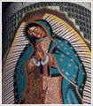
First impression: Colors a little muted, obvious religious symbol, interesting juxtaposition between the colored mosaic and the glass block above.

Composition: Placement of the subject is OK in the frame, She is leaning just a bit to the viewers left which I think is fine because it provides a connection to the viewer. With this subject, the center orientation works, and the head/eyes are positioned near the rule of thirds.

Lighting and Color: Colors are muted, and lighting is a little flat. Its tough to do much on a subject where there is little texture, a slight bump in contrast would help. I'm not sure what your main source of lighting was but I suspect on camera flash. Next time try a similar picture with available light only. this should give more texture to the scene.

Challenge: There is a lot of color in this pic, just not as bright as most of the other entries. I'm sure this hurt the overall score. Also, scoring can be rough when the subject is another piece of artwork, unless the pic has very creative framing or lighting. Keep shooting!

mark
Photographer found comment helpful.
The Tree Line
01/19/2006 07:09:19 PM
The Tree Line
by JohnTF

Comment:
excellent picture, if it was full 640 pixels wide I suspect it would do even better. 7
The Colors of Morning
01/19/2006 07:08:45 PM
The Colors of Morning
by aerogurl

Comment:
great color and exposure. Horizon seems a little slanted to my eye.
Photographer found comment helpful.
Reflections of  Fall
01/19/2006 07:07:17 PM
Reflections of Fall
by Resusit8u

Comment:
great composition, a little adjustment to darken the upper left and the side of the mill would have improved image IMHO. I like it, especially the reflection.
Photographer found comment helpful.
Christmas in Seattle
01/19/2006 07:05:58 PM
Christmas in Seattle
by caba

Comment:
creative framing, nice
Photographer found comment helpful.
sharing their grief
01/19/2006 07:04:46 PM
sharing their grief
by kerrilyn

Comment:
Political feelings aside... This could have been a stronger image with a little more cropping. My suggestion would be eliminate more of the foreground, and zero in on the clasped hands with the signs as BG. The bench on the right is also distracting.
Trio
01/19/2006 06:43:03 PM
Trio
by jjbeguin

Comment:
A little dark, might be my display. I looks like the levels could have been adjusted slightly to enhance the white of the birds and still keep the darkness.
Photographer found comment helpful.
Oil by Water
01/19/2006 06:41:04 PM
Oil by Water
by xyphoto

Comment:
nice color, upsize a little and it would improve another notch.
Pages:   ... [511] [512] [513] [514] [515] [516] [517] ... [539]
Showing 5131 - 5140 of ~5383


Home - Challenges - Community - League - Photos - Cameras - Lenses - Learn - Help - Terms of Use - Privacy - Top ^
DPChallenge, and website content and design, Copyright © 2001-2025 Challenging Technologies, LLC.
All digital photo copyrights belong to the photographers and may not be used without permission.
Current Server Time: 09/05/2025 09:51:04 PM EDT.