| Image |
Comment |
| 09/24/2005 11:26:22 PM |
|
 Photographer found comment helpful. Photographer found comment helpful. |
| 09/24/2005 11:25:46 PM |
|
| 09/24/2005 11:25:15 PM |
|
| Photographer found comment helpful. |
| 09/24/2005 11:24:31 PM |
|
| Photographer found comment helpful. |
| 09/24/2005 11:24:10 PM |
|
| Photographer found comment helpful. |
| 09/24/2005 11:23:23 PM |
|
| Photographer found comment helpful. |
| 09/24/2005 11:22:31 PM |
|
| Photographer found comment helpful. |
| 09/24/2005 11:09:30 PM |
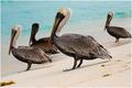
Odd Man Outby jseyerleComment: *Critique Club*
What an image! This is great, the birds are a awesome subject. I think the angle is prefect for the image and helps with the perspective category. The lighting, color and composition are all very well done. I think the top 100 is very well deserved, I would have defiantly put this shot higher up. The clarity of the main bird is amazing. I know in many art pieces they always state to use an odd number of subjects or placement but I really think the four work perfectly for the area that was shot. The only thing I could possibly see was maybe a little more focus on the sand were you panned out from, but I don't know how feasible that would in keeping your clarity on the main bird. Excellent work! |
| Photographer found comment helpful. |
| 09/24/2005 10:59:16 PM |
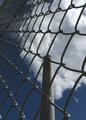
Secure That Smoke!by BowerbirdComment: *Critique Club*
This is a cool perspective. Good job taking a common place item and really making it into something to look at. The first thing that grabbed my attention is the sky. The sky looks so blue great job on editing. I really do appreciate the angle you took the photo from, it gives great depth to the shot. I would be curious to see the tower place to one side or another. You would probably have to move to the right, I think if you went to the left you might loose the smoke. I think based on the quality of your photo you defiantly should have placed higher, but excellent job on the photo itself. |
| 09/24/2005 10:13:55 PM |
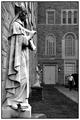
In the Presence of Saintsby sibelingComment: *Critique Club*
Wow the title was a great choice and so catching. I do like the image and I can defiantly see what frustrations you would have had with that statue being out of focus but I can understand the key was capturing the man. Overall this is a great shot. I think it would be more appealing to the masses if the statue was in focus, but you still captured an interesting perspective of the world. I am really glad you used the black and white, it makes the photo look nice and classic. After reading a couple of your comments, I would have to agree with you and say including the man in the photo was a great choice. Also I really like the contrast and how the gentleman's t-shirt and that small light pop out of the image. One last thing I liked is that you chose to capture all the way to the top of the statues hat, I think if you had cropped it out the shot would be missing something. Good job! |
| Photographer found comment helpful. |
Home -
Challenges -
Community -
League -
Photos -
Cameras -
Lenses -
Learn -
Help -
Terms of Use -
Privacy -
Top ^
DPChallenge, and website content and design, Copyright © 2001-2026 Challenging Technologies, LLC.
All digital photo copyrights belong to the photographers and may not be used without permission.
Current Server Time: 07/23/2026 08:20:10 AM EDT.