| Image |
Comment |
| 05/12/2006 12:49:31 AM |
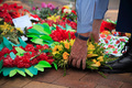
Remember Our Fallen Menby JudiComment: *Critique Club*
"Remember Our Fallen Men" is obviously a wonderful shot for the Photojournalism II challenge. I saw obviously based on your placement and score.
The image itself is a touching one, that I could easily see in the newspaper. The composition is just lovely. Great placement of the subject to offset all the flowers. The focus is nice and clear and brings the viewer right into his hands. Because of all the flowers it doesn't look like a shot you created but something you happened to be able to capture in real life.
The colors are so bright and vibrant in contrast to the subject it really bring attention into the piece. Great work as usual, I look forward to all your future entries. |
 Photographer found comment helpful. Photographer found comment helpful. |
| 05/12/2006 12:42:52 AM |
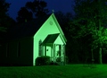
Twilightby rayg544Comment: *Critique Club*
"Twilight" is a different choice for the Free Study Challenge XI. This was an image that stands out because of the vibrant colors.
My first impression when looking at the shot is boy that is creepy, my perspective is probably altered because I was just reading about the Amityville horror and then I got this shot. Anyway I can defiantly tell you were using color to enhance the feeling of the shot and it worked very feel. The green cast makes the house look weird/creepy but the tree looks fake (to me). It would be interesting to see the shot even with the tree cropped out. Also there is a small red dot in the grass that took away from the shot a little bit.
Overall I think you did a great job with this one, it really stand out from the rest. Unfortunately I think the voters may not have been to keen on the green. |
| Photographer found comment helpful. |
| 05/12/2006 12:27:19 AM |
Blue Light Shadowby KrisbyComment: *Critique Club*
"Blue Light Shadow" is a very interesting addition into the Free Study XI challenge. The subject was something different which I think is a great feature to have in a Free Study.
The first thing that grabs my attention is the blue. What a great choice to enhance your eyes. The image has that nice artsy feel to it, which would help the vote I gave you but I am sure some voters think the opposite. I love the placement of your subject as well. Even though it is different type of shot the composition feels natural. I read your comments and noted that you said had done a lot of post processing which I think worked well for you. The only thing that takes away from the vote is the haze behind your head.
Overall I do like the shot, the noise works for me. Good work. I look forward to your shot with the new camera! |
| Photographer found comment helpful. |
| 05/11/2006 12:34:05 AM |
|
| Photographer found comment helpful. |
| 05/10/2006 11:50:08 PM |
A Stitch in Time Saves Nineby xianartComment: ::Critique Club::
Subject::
"A Stitch in Time Saves Nine" was a clever idea for the Cliches and Sayings challenge. This was a very creative idea.
Technically::
The image itself is a very nice shot. I really do like the lighting, you have drawn direct attention to the subject we are supposed to be focusing on. You might have just stretched the lighting a little bit more so that the center spot was a little bit bigger. The clarity and focus appear strong. I would be curious to see the shot if you were able to make the stich line tight, at first glance I just thought it was a string before I read the title (during voting). I can understand that it was probably pretty hard to set a tight string without having a hand in the photo which might cause more shadows. You might even try something like the clear fishing wire, just a thought. I also like your cropping and placement of the subject, we as voters know exactly what the subject was.
Summary::
Overall this was a nice entry and very creative. I look forward to your future entries. |
| Photographer found comment helpful. |
| 05/10/2006 06:23:13 PM |
|
| 05/10/2006 01:45:30 AM |
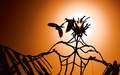
Birds of a feather flock togetherby jdannelsComment: *Critique Club*
"Birds of a feather flock together" is an amazing photography into the Cliches and Sayings challenge.
Overall I have to say up front this is an excellent piece of work. The composition is prefect. I love the glow of the sun from between the hair, excellent angle. Technically this is just an amazing piece. Great warm orange coloring to change the tone of the piece.
I read your comments and would agree with your choice. I think some voters would have appreciated the other title, where others would just say huh and give you a lower score for it.
Wonderful job, keep up the wonderful work. |
| Photographer found comment helpful. |
| 05/10/2006 01:35:36 AM |
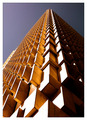
Up, up and awayby ericwooComment: *Critique Club*
Top ten, extremely well deserved. Congratulations on your new excellent work in "Up, up and away" this is an amazing piece in the Rhythm II challenge.
The overall image just grabs your attention. The pattern is obviously are very interesting, especially from this angle. At first glance I thought Jenja (that game where you stack the wooden blocks) but upon closer look realized it was a very intricate building. The composition is just wonderful, placing this subject just off of center works for me.
It must have been a sunny day to capture the much sun from the left side. The sunlight really brings out the pattern, great job! I look forward to your future entries. |
| Photographer found comment helpful. |
| 05/10/2006 01:24:01 AM |
The writing is on the wall ...by kari1Comment: *Critique Club*
"The writing is on the wall ..." is an interesting addition into the Cliches and Sayings challenge. Very good choice on subject and matching it up with your title.
The overall image does give off a harsh feel, but very appropriate for the title. I really do like the sharp angle to you took to put a different slant on the graffiti. Obviously from the shot and your comments you wanted a high contrast shot. I would have done the same thing to give it an edge. You wouldn't want to shot to be soft, but to really let the writing pop. This look like a tough shot, I might try cropping it so that the black triangle at the bottom isn't so distracting. I do like the include of the box on the upper part to give the image more dimension.
Overall good work, I think you really created an image that grabs attention and defiantly illustrates the title. I look forward to your future entries. |
| Photographer found comment helpful. |
| 05/10/2006 12:46:09 AM |
|
| Photographer found comment helpful. |
Home -
Challenges -
Community -
League -
Photos -
Cameras -
Lenses -
Learn -
Help -
Terms of Use -
Privacy -
Top ^
DPChallenge, and website content and design, Copyright © 2001-2026 Challenging Technologies, LLC.
All digital photo copyrights belong to the photographers and may not be used without permission.
Current Server Time: 04/12/2026 08:14:39 AM EDT.