| Image |
Comment |
| 01/03/2007 03:10:37 PM |
Ophthalmologistby eyeslanderComment: *Critique Club*
The Ophthalmologist is a wonderful entry into Your Occupation II. I remember seeing the shot when voting and thought it would score higher, because it was something just a little bit different from the norm.
I really like the placement of the subject, it is great that your faced is centered especially with this type of shot. The coloring and focus look really good. This is awesome that you were able to accomplish in between patients. The contrast in green and red on your face is wonderful, as opposed to just using the letters. The only thing I would change would be to leave a little more room on top. It feels a little crowded because your hair is cut off.
Overall this is an excellent piece, something I would be extremely proud of. Nice job and I look forward to your future entries.
|
 Photographer found comment helpful. Photographer found comment helpful. |
| 01/01/2007 09:27:13 AM |
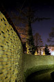
"Another Brick In The Wall" - The Wallby orvaratliComment: *Critique Club*
Wow this really is a great shot! I think you have meet the challenge and the title easily makes sense, even to those of us who aren't fans of Pink Floyd.
Overall this is an extremely strong piece in the challenge. I think the score is fairly decent, so close to a 6. The composition for this piece is extremely nice. I would have to agree with the others who have commented in saying that the bright light on the right hand side does take away from the over all image. I think maybe if you tried a tighter crop to maybe from the right just past the little tree, it would take out the distraction. I think your editing steps really allowed the brick to be drawn out. I also wanted to say that I really like the contrast between the sky and the wall, the colors are so rich.
Very nice work and I look forward to your future entries.
|
| 11/11/2006 09:09:00 PM |
|
| Photographer found comment helpful. |
| 10/06/2006 06:32:50 PM |
|
| Photographer found comment helpful. |
| 10/03/2006 08:18:51 PM |
|
| Photographer found comment helpful. |
| 09/22/2006 09:26:46 PM |
3758-HDReditby lifternessjtComment: Wow I was just reading about this in Pop Photo and here it is a prefect example. Great work. The colors look amazing. |
| Photographer found comment helpful. |
| 09/01/2006 11:18:45 PM |
My son in our front yardby JewellyComment: The position in this shot is really cool, it lets it stand out from the rest because it is so different, good job going outside the box it get this one. The colors are very nice and vibrant which I always love on children's portraits. I think based on the position and the coloring his eyes grabbed me the most. Great work! |
| Photographer found comment helpful. |
| 09/01/2006 11:14:22 PM |
My daughter at homeby JewellyComment: I think the colors you choose for her are perfect. The colors really allow the viewer to have a sense of the child like quality. Even if she doesn't like to look at the camera, you still have captured an essence. The expression is one I have seen a million times from my daughter when I try to get her to look at me but it works very well for this piece. |
| Photographer found comment helpful. |
| 09/01/2006 11:05:19 PM |
Josh age 16by JewellyComment: Nice use of what looks like natural light to capture Josh. I think it awesome you were able to get a nice shot a of 16 year old boy. I like the placement of the subject, I might suggest leaving a little more on his head in even if it added a little more to his shirt as well. |
| Photographer found comment helpful. |
| 09/01/2006 10:58:28 PM |
Unsoundby Canadian_ehComment: Wow amazing piece, I love how your eyes just grab the viewer. Wonderful work. |
| Photographer found comment helpful. |
Home -
Challenges -
Community -
League -
Photos -
Cameras -
Lenses -
Learn -
Help -
Terms of Use -
Privacy -
Top ^
DPChallenge, and website content and design, Copyright © 2001-2026 Challenging Technologies, LLC.
All digital photo copyrights belong to the photographers and may not be used without permission.
Current Server Time: 04/11/2026 06:51:45 PM EDT.