| Image |
Comment |
| 10/07/2005 02:50:10 PM |
earth waterby drz01Comment: While I like the shot, composition, lighting, etc. for me, there are too many colors to fully meet my understanding of this challenge. |
 Photographer found comment helpful. Photographer found comment helpful. |
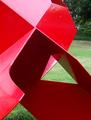
| 10/07/2005 02:49:23 PM |
Reflexionesby Ricky CleaveComment: Red and green are definitely complementary, but I wonder how this would look with the red hue/saturation taken down justa bit more. Some of the highlighted areas come across almost as a magenta. Too bad about the vehicle(?) in the upper right hand side. |
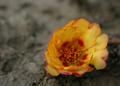
| 10/07/2005 02:48:14 PM |
Symphony for two...by cwalmyeComment: Too bad about the light spot (or refelction) near the one green leaf on the right. A nice simple shot and the colors aren't too bad, but for me, the complementary colors you chose don't have the same impact of other entries in this challenge. |
| Photographer found comment helpful. |
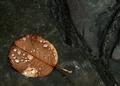
| 10/07/2005 02:45:55 PM |
Almost Brownby TwylaComment: For me, this falls a little short as far as complementary colors (as I understand them). I like the composition and angle. |
| Photographer found comment helpful. |
| 10/07/2005 02:44:59 PM |
lightsby erainmanComment: While I can see some complementary colors by looking at the front yellow and darker sky (although a daytime blue sky would be even more complementary), the other objects in the photo detract overall and lessen any complementary colors, in my opinion. |
| Photographer found comment helpful. |
| 10/07/2005 02:43:36 PM |
Black & Tanby ScreamingToadComment: For me, this is a very nice photo. Well composed and good lighting, but I'm not so sure it fully meets the complimentary colors as I understand them. |
| Photographer found comment helpful. |
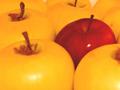
| 10/07/2005 02:40:57 PM |
take your pickby mimsydotesComment: I like the concept, but the orange/yellow cast is so very....bright (for lack of better technical terms), I feel the need to squint a bit when looking. Also, a bit more sharpening or focus on the red apple itself would help boost the overall appeal. |
| 10/07/2005 02:39:15 PM |
Coloured skyby ashutosh666vComment: For me, the red, white and blue are complementary, but the photo seems a bit washed out. Also, I think if the shirt in the lower right were cropped out it would put the focus back onto the planes themselves. |
| 10/07/2005 02:38:10 PM |
Ripple Effectby TTAMComment: I find this an interesting photo and effect. As for the colors though, to me they are too muted and dark, and I can't quite tell if that's a very dark forest green and maybe a darker violet? I wonder if a stronger light source or additional sharpening would increase the overall color effect? |
| 10/07/2005 02:36:51 PM |
Black and Whiteby banditComment: For me, while I think this is a really cute photo, it doesn't meet the complementary colors challenge as well as other entries. Very sweet eyes though. |
| Photographer found comment helpful. |
Home -
Challenges -
Community -
League -
Photos -
Cameras -
Lenses -
Learn -
Help -
Terms of Use -
Privacy -
Top ^
DPChallenge, and website content and design, Copyright © 2001-2026 Challenging Technologies, LLC.
All digital photo copyrights belong to the photographers and may not be used without permission.
Current Server Time: 07/26/2026 06:25:32 PM EDT.