| Image |
Comment |
| 10/19/2005 08:56:43 AM |
Sunny Side Upby Tommy 2 ToneComment: I like the composition and idea, but those egg whites look unaturally green and the eggs a bit on the bluish side. |
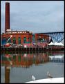
| 10/19/2005 08:55:41 AM |
Two Birds and a Breweryby bobdaveantComment: I like your title...for some strange reason after reading it the old TV show Laverne & Shirley popped into my head and now I can't get the theme song out. LOL. Nice shot, I like it. |
 Photographer found comment helpful. Photographer found comment helpful. |
| 10/19/2005 08:54:24 AM |
There are lights everywhere... !!!by rishinicolaiComment: I do like the colorful reflections. I think if you were able to rotate this about 0.3 degrees counter-clockwise (or more to straightern out the columns) it would be even more effective. |
| Photographer found comment helpful. |
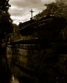
| 10/19/2005 08:52:00 AM |
A haunting good timeby jmleliiComment: My favorite part of your photo is the left half. For me, I wish there was a bit more contrast on the right hand side as it is so dark, but I like the tones you chose to use. |
| Photographer found comment helpful. |
| 10/18/2005 11:33:52 PM |
|
| Photographer found comment helpful. |
| 10/18/2005 11:33:04 PM |
|
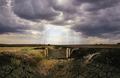
| 10/18/2005 11:30:27 PM |
Looking Through The Cloudsby KitaComment: Nice wide angle. Too bad about the man made telephone pole! I do like the way you caught the sunlight shining through the clouds. |
| Photographer found comment helpful. |
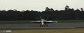
| 10/18/2005 11:29:04 PM |
Safe Landingby roscoComment: A nice wide angle, yet I wish the plane wasn't so centered in the photo. Sometimes I find more interest in photos where the main subject is off to one side or the other. I wonder how this would look at a different time of day where there was more lighting? |
| Photographer found comment helpful. |
| 10/18/2005 11:27:49 PM |
Tin Soldiers IIby LeighroyComment: Good wide angle and the elements creat an interesting pattern. For me, I wish there was a bit more color saturation or contrast, but a good entry. |
| Photographer found comment helpful. |
| 10/18/2005 11:26:59 PM |
Wide Open Space...by DrakeComment: While I see the use of wide angle and it's a unique structure, I find it doesn't hold the visual appeal for me compared to others in the challenge. It looks a bit flat...or something. Sorry, I'm not very good on the technical critiques. |
| Photographer found comment helpful. |
Home -
Challenges -
Community -
League -
Photos -
Cameras -
Lenses -
Learn -
Help -
Terms of Use -
Privacy -
Top ^
DPChallenge, and website content and design, Copyright © 2001-2026 Challenging Technologies, LLC.
All digital photo copyrights belong to the photographers and may not be used without permission.
Current Server Time: 07/27/2026 10:00:09 PM EDT.