| Image |
Comment |
| 10/23/2005 08:09:00 PM |
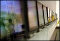
Screeningby boguloComment: I've tried to figure out what these containers(?) or machines(?) are, but that's besides the point. :-) For me, I kind of feel I'm looking at two separate photos. One with the reflections of the two men and then further down the line there are the yellow reflections. Personally, I like the far end of your photo better and more interesting. |
| 10/23/2005 08:07:08 PM |
|
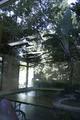
| 10/23/2005 08:06:35 PM |
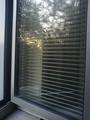
White Sun, Blue Fragmentsby dahvedComment: An interesting building. The white highlight is a bit too much in the upper middle for me. also, I would have used either more or less of the tree in the upper left. More to frame the photo, or simply crop it out altogether. My favorite part is the upper right quadrant - nice blues. |
 Photographer found comment helpful. Photographer found comment helpful. |
| 10/23/2005 08:05:06 PM |
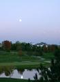
Shadow Ridge on Autumn Nightby jgawrychComment: Not bad. I think this works well as a vertical photo. I like the sky. Keep in mind that DPC allows us to have a maximum of 640 pixels - use this to your advantage to show the voters/viewers your photo. I like the colors of the sky, but the pine tree in the foreground is a bit distracting. I also wish there was more of the reflection than what is shown. Good effort. |
| Photographer found comment helpful. |
| 10/23/2005 08:03:03 PM |
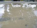
clear as muddby way2fast4uComment: Well, there is a refelction, but compared with other entries your subject matter doesn't hold my interest, and the colors seems flat and dull to me. |
| 10/23/2005 08:02:00 PM |
With my Kettle by the Windowby juliajoneswilsonComment: I like your concept - it shows creativity. I think with a few tweaks it could work better. For me, a bit more focus on the window reflection would make it better and I wonder how this would look in color. The black and white seems a little...flat to me. Perhaps a bit more contrast would take some of that away. |
| Photographer found comment helpful. |
| 10/23/2005 07:57:55 PM |
Splash'N Reflectby PalaiteComment: I like the coloring. For me, it could have been a bit sharper, but I'm bumping it up a point after a second look. |
| 10/23/2005 07:57:20 PM |
Sun and trees reflcted on my windowby kateto178Comment: My favorite part is the actual refelection - I wish there was more of it. I also wonder how this would be if you rotated counter-clockwise so that it wasn't tipping downward to the right? |
| 10/23/2005 07:56:19 PM |
Trees In The Meeting Roomby AmberLoveComment: Not a bad concept, but for me the photo is too small. DPC allows us to use a maximum of 640 pixels. I find that having a larger photo gives the viewer/voter a better feel for your shot. |
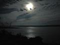
| 10/23/2005 07:55:22 PM |
Reflections on the Moon and the Riverby HVGB_photosComment: A good concept, but the colors seem a bit griany (although that may have been intentional on your part). For me, had the moon and reflection been off centered it would add more interest. Also, I wonder how this would look if you lowered your horizon to show more of the sky and thereby keeping your horizon out of the dead center photo zone also. |
| Photographer found comment helpful. |
Home -
Challenges -
Community -
League -
Photos -
Cameras -
Lenses -
Learn -
Help -
Terms of Use -
Privacy -
Top ^
DPChallenge, and website content and design, Copyright © 2001-2026 Challenging Technologies, LLC.
All digital photo copyrights belong to the photographers and may not be used without permission.
Current Server Time: 07/28/2026 07:53:04 AM EDT.