| Image |
Comment |
| 11/02/2005 07:37:34 PM |
Petals and Raindropsby BowerbirdComment: For me, if there was more daylight, I think the transparency of the water droplets would be better. Nice composition though. |
 Photographer found comment helpful. Photographer found comment helpful. |
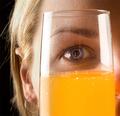
| 11/02/2005 07:35:56 PM |
I seeby totiComment: Nice transparency. I like how you can see the glass in the iris of her eye. 8 |
| 11/02/2005 09:05:58 AM |
Vasesby 3eyedcrowComment: For me, the background makes this shot work well. That and the contrasting color flower. If the vases were a bit more in focus (yeah, I'm one of those voters who likes sharp images) I would have scored it even higher. Very well done though, and good luck in the challenge. 7 |
| Photographer found comment helpful. |
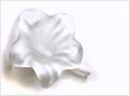
| 11/02/2005 09:04:40 AM |
Glass Flowerby admart01Comment: For me, the white is overblown a bit and although the rose is made of glass, I don't get the same transparency sense from your photo as I do from other entries. I do like the composition though. |
| Photographer found comment helpful. |
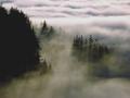
| 11/02/2005 09:03:45 AM |
Through the fogby beafliesComment: My favorite part of your photo is the bottom half. The clouds at the top look a bit too bright (to me), but a very cool shot. What a beautiful vantage point. |
| Photographer found comment helpful. |
| 11/02/2005 09:02:52 AM |
light/rockby tateComment: I like the building itself and you've nicely captured the morning light. |
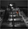
| 11/02/2005 08:56:04 AM |
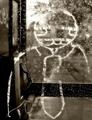
Upwardsby jseyerleComment: Your photo gives me a good journalistic feel - kind of a gritty, inner city quality. I like the lighting and the way you made it all black and white except the one person - clever and good use of a photo editing program. |
| 11/02/2005 08:54:30 AM |
Voice maleby bpickardComment: Interesting. I like it. In fact, the more I look at it, the more I like it. I like the color tones you chose. The upper left corner is a bit bright, but still a very cool photo. Well done. 8 |
| Photographer found comment helpful. |
| 11/02/2005 08:52:23 AM |
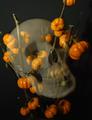
Trick or Treatby cabaComment: Interesting setup. I'd be curious to know how you did this after the challenge is over. I find that bit of green around the skull's teeth distracting, and for me, I think cropping out the partial pumpkin at the top would work better. |
| Photographer found comment helpful. |
| 11/02/2005 08:50:45 AM |
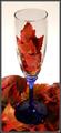
A Toast to Fallby Buckeye_FanComment: I like the leaves in the glass, but for me, I find the very stark white background too much of a contrast. |
| Photographer found comment helpful. |
Home -
Challenges -
Community -
League -
Photos -
Cameras -
Lenses -
Learn -
Help -
Terms of Use -
Privacy -
Top ^
DPChallenge, and website content and design, Copyright © 2001-2026 Challenging Technologies, LLC.
All digital photo copyrights belong to the photographers and may not be used without permission.
Current Server Time: 05/11/2026 05:20:53 AM EDT.