| Image |
Comment |
| 02/23/2006 10:04:44 PM |
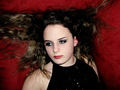
Haute Coutureby dkallmanComment: I like the concept. The lighting seems a bit harsh or maybe it's because her eyelashes are pitch black, but overall, not bad. |
 Photographer found comment helpful. Photographer found comment helpful. |
| 02/23/2006 10:03:51 PM |
Ne me touchez pasby EnnilComment: Bumping up after second look, although she looks like she is frozen - almost devoid of emotion - kind of...odd to me, but that's just how it looks to me. I do like the soft tones and color values though. |
| Photographer found comment helpful. |
| 02/23/2006 10:02:48 PM |
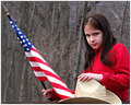
Simple American Girlby NeuferlandComment: I like the composition. The reds really stand out against the bleak winter background. I wish the flag wasn't blurry, but overall, a nice photo. |
| Photographer found comment helpful. |
| 02/23/2006 10:01:53 PM |
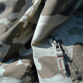
Stand Out in Camoby GeneralEComment: I like the natural lighting. Compared with others in the challenge, it doesn't hold my interest as well, but I did feel pride for those serving when I first viewed your photo. |
| Photographer found comment helpful. |
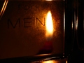
| 02/23/2006 10:00:55 PM |
Shades Coutureby kdkaboomComment: After looking at your image for a few minutes now, I sometimes feel like I am looking at two separate images (even though I know I'm not). I think it's the light of the face "fighting" with the darkness of the hair. not sure if that makes sense to you, but that's how I view your photo. |
| Photographer found comment helpful. |
| 02/23/2006 09:59:24 PM |
The Fashion of the Suspiciousby saphireComment: Cute title. For me it aids your image. Although I think the man in the front is your focal point, it's the mane in the dark jacket and shades that my eyes keep getting drawn to. |
| Photographer found comment helpful. |
| 02/23/2006 09:57:29 PM |
eau de cologneby charlievComment: I like your notion of lighting the bottle the way you did. For me, technically, I think if you pulled the camera back a bit and it had better clarity, I would like it better. Just my untrained observations. |
| Photographer found comment helpful. |
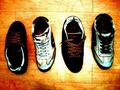
| 02/23/2006 09:56:19 PM |
Shoes for 2by leavingmyselfComment: For me, the lighting is a bit too harsh and on the yellow side. I'm curious how this would look if you had lined the shoes up perpendicular with the lines of the flooring. |
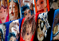
| 02/23/2006 09:55:25 PM |
Oh ... to be young again ...by lidalenschComment: Interesting image. I wish there were less wrinkles in the material the faces were printed on. Also, if your overall shot was larger, closer to the allowable 640 pixels, it might have better impact, or at least allow is with aging eyes to see everything better. :-) |
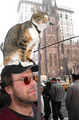
| 02/23/2006 09:53:58 PM |
New Fashion Trendby Nikolai1024Comment: Interesting shot. The thing that keeps drawing my attention is how the lamplight seems to be protruding from the cat's cheek - looks kind of odd. Perhaps if the background were blurred out to keep the ofcus on the man and cat only, it would help. Just my unprofessional observations. |
| Photographer found comment helpful. |
Home -
Challenges -
Community -
League -
Photos -
Cameras -
Lenses -
Learn -
Help -
Terms of Use -
Privacy -
Top ^
DPChallenge, and website content and design, Copyright © 2001-2026 Challenging Technologies, LLC.
All digital photo copyrights belong to the photographers and may not be used without permission.
Current Server Time: 05/10/2026 06:55:50 AM EDT.