|
|
|
Showing 831 - 840 of ~1483 |
| Image |
Comment |
| 03/28/2003 07:40:33 PM | Pepperby DennisFComment: I think that you did a great job here, it was instantly recognisable as Westons Style. I think that you did a great job with the lighting in the front, perhaps a tiny bit more in the back would have been good. really great shot though!! |  Photographer found comment helpful. Photographer found comment helpful. |
| 03/28/2003 06:58:01 AM | | | Photographer found comment helpful. |
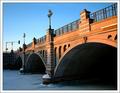
| 03/23/2003 09:45:45 PM | blueprintby tomzinhoComment: Critique Club
Composition-Content
Composition is great, with the two bridges mirroring each other. I think that it is a very strong architectural shot, with the details of the bridges showing very well.
Technical
Personally, I really like the effect, it is strong, original and has impact. Unfortunately, I think that a lot of voters on this site prefer the more "traditional" approach, which is where your score suffered. I agree that this is a love it or hate it effect. I love it and the process you used is interesting and something which would be fun to play around with in the future. Focus is spot on and Dof is great, even though your aperture is only 3.5. Just wondering why you chose to use such a fast shutter speed and large aperture. The end result is great with good sharpness throughout the image, which I am kind of surprised about!
My Opinion
Great shot, original and has impact! Shame that the score didn't quite get over 5! However, I am sure that you are happy with the result of the shot, it's just not everyones taste! Personally, I love it! | | Photographer found comment helpful. |
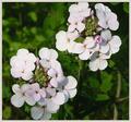
| 03/23/2003 09:31:47 PM | Petals of "8"by jerrftComment: Critique Club
Composition-Content
This is a lovely picture, a really pretty scene. Perhaps the Natural Numbers are not as obvious as others, but as the picture stands, it is great!
Technical
DOF is perfect, great sharpness on the petals and a very attractive blurred background. The flowers really jump out! Lighting also enhances this effect, with the light falling on the petals and creating beautiful colours and contrast. The border complements the picture and colours very well.
My Opinion
This is a lovely shot, I think that the Natural Number element probably wasn't strong enough for most voters, but this was a very hard challenge and I think that you did a great job! | | Photographer found comment helpful. |
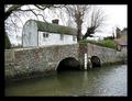
| 03/23/2003 09:19:22 PM | Eynsford Bridge & Fordby Geo_GriffinComment: Critique Club
Composition-Content
You found a lovely bridge with a lot of character, which makes a very interesting picture. I feel that the white building is slightly hich in the shot, perhaps cropping off abit of the water, then bringing the white building would bring more of a relaxed and peaceful feel to the shot. The house on the right adds dimension to the shot, but I wonder if the picture would have been nicer without it, I think that it isn't necessary in the shot, as the bridge and white building add enough interest. You have framed the picture very nicely with the trees.
Background
People mentioned the white sky, I am from England, I understand!! There really isn't much you can do about it within a time frame, but you have done well in cropping out much of the sky and filling it with the landscape.
My Opinion
Lovely shot, very interesting bridge. Perhaps a slightly smaller border would have been good and complemented the scene more. Good Luck in the next challenge. | | Photographer found comment helpful. |
| 03/23/2003 09:08:05 PM | Eye of Time - [0]by rj324Comment: Critique Club
Composition-Content
You found an excellent subject for this challenge, well spotted! I agree with inspzil that perhaps positioning the circles in the bottom right corner would have added more interest composition wise.
Technical
Nice overall lighting here, which shows the texture well. My biggest point is that focus seems pretty soft here, I notice that you used a slow shutter speed, did you have a tripod? Texture of the wood is the main attraction of this shot and would benefit from being super sharp, either through afaster shutter speed or use of a tripod.
My Opinion
Great shot and wonderful textures. Excellent capture for the challenge. |
| 03/23/2003 08:58:14 PM | Archesby mariomelComment: Critique Club
Composition-Content
The angle that you have shot this bridge is great, with the lines from the top right corner, leading the viewer across the bridge and into the picture. The balance between the blue sky and slightly bluish snow is also great.
Technique
Lighting is very beautiful here, with the light on the arches, which brings the viewers attention to the arches and lovely brickwork. I agree with some of the comments, that if there was a little more light under the bridge, it would have brought out an interesting perspective and added more depth to the shot. Perhaps a tiny bit later would have added this lower lighting.
My Opinion
You found a lovely bridge and made the most of it with the composition and lighting. Great job and congrats on a very good score! | | Photographer found comment helpful. |
| 03/18/2003 08:13:41 AM | At Peaceby mbardeenComment: Beautiful shot! I dint't think that this was England when I saw the thumb! Congrats on your recent 3rd place win! | | Photographer found comment helpful. |
| 03/13/2003 09:18:08 PM | Nataliaby dimitriiComment: I love the shadow, which mirrors the shape of her body. But I agree, it looks like she needs something to hold on to, would be a very interesting location for a slightly bondage theme (and I mean soft!) | | Photographer found comment helpful. |
| 03/09/2003 09:23:30 PM | Alone In Hidingby BigSmilesComment: Critique Club
Composition=content
Composition is lovely here, perhaps a little too much like Shiizzams recent win, but works well. You have made a good statement here, but it could be taken as too general to really fit the topic of despair.
Technical
Focus appears to be on the material, adding a bit of softness to the eye area, perhaps this could be sharper. I think that the flash is a bit too bright for this kind of shot, perhaps some soft side lighting would have been good, lighting up the eye area, but de-emphasising the material.
My Opinion
I like the shot, it has a meassge and does make people think. The composition is great. |
|
Showing 831 - 840 of ~1483 |
Home -
Challenges -
Community -
League -
Photos -
Cameras -
Lenses -
Learn -
Help -
Terms of Use -
Privacy -
Top ^
DPChallenge, and website content and design, Copyright © 2001-2026 Challenging Technologies, LLC.
All digital photo copyrights belong to the photographers and may not be used without permission.
Current Server Time: 07/20/2026 02:56:17 AM EDT.
|


![Eye of Time - [0]](https://images.dpchallenge.com/images_challenge/0-999/73/120/Copyrighted_Image_Reuse_Prohibited_13773.jpg)