| Image |
Comment |
| 10/15/2005 05:48:17 PM |
|
 Photographer found comment helpful. Photographer found comment helpful. |
| 10/15/2005 05:39:48 PM |
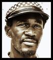
Parking Attendant by whiteroomComment: Great photo. Love the look. The one thing that doesn't work too much is the play on pride. Just looking at the photo I wouldn't be able to tell what he does/takes pride in. |
| Photographer found comment helpful. |
| 10/15/2005 05:38:15 PM |
Morning Colorsby sabphotoComment: The pole is lined up well but the extra space to the right of it is distracting. Maybe have it flushed against the side or cropped out completely. Without the pole it might look like the flag is being raised up to the sky? |
| Photographer found comment helpful. |
| 10/15/2005 05:35:27 PM |
Silent prideby TOYComment: Nice composition however I don't like the color. Doesn't fit the mood of the shot. |
| Photographer found comment helpful. |
| 10/15/2005 05:30:25 PM |
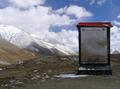
Mountains Majestyby 4forfunComment: Judging the image by itself I like the way you cropped this. It's not the typical way of shooting mountain ranges. However given the theme of this challenge and especially your title this should have shown more of the mountains. As is their stature/majesty is reduced. |
| Photographer found comment helpful. |
| 10/15/2005 05:24:26 PM |
The Family Prideby TwylaComment: Not to be harsh but this doesn't do anything for me. The highlights are distracting and the crop doesn't make this any more appealing. Maybe if there was an arrangement of photos showing different generations it might have a stronger impact. |
| 10/15/2005 05:20:16 PM |
|
| Photographer found comment helpful. |
| 10/15/2005 05:17:56 PM |
Proud Tributeby zara-opalComment: The image looks too bland. Could use some more contrast and perhaps a saturation boost. Might also work better as a b/w image. |
| 10/15/2005 05:13:38 PM |
|
| 10/15/2005 05:02:30 PM |
|
Home -
Challenges -
Community -
League -
Photos -
Cameras -
Lenses -
Learn -
Help -
Terms of Use -
Privacy -
Top ^
DPChallenge, and website content and design, Copyright © 2001-2026 Challenging Technologies, LLC.
All digital photo copyrights belong to the photographers and may not be used without permission.
Current Server Time: 06/11/2026 08:58:11 PM EDT.