| Image |
Comment |
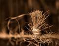
| 02/23/2006 10:05:49 PM |
Knotby glad2badadComment: A striking photo. Love the duotone colors and the DOF. Looks artsy. Don't really find anything wrong with this. It looks like you just avoided clipping the highlights not that it matters since it's in just a small area. Great photo. |
 Photographer found comment helpful. Photographer found comment helpful. |
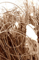
| 02/23/2006 10:02:38 PM |
Frozenby IzadoraComment: I like the duotone colors used here and there is good contrast from the middle down. What hurts this the most is the blown highlights. Not just in the sky but most importantly on the ice itself (I'm assuming that's ice). What I would have tried is to underexpose the shot and get some detail from the ice, which would have also made the sky less distracting. Maybe also use an ND filter? If anything I would rather have the shot underexposed than overexposed since you can always get some detail back from an underexposed image which you can't do from an overexposed one. This holds true even more nowadays with products like neatimage which can do a great job in removing the noise associated with underexposed images. |
| Photographer found comment helpful. |
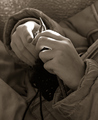
| 02/23/2006 09:48:02 PM |
Sacrificeby GrandmomComment: The duotone looks good and there's nice detail here. I kinda wish the tombstone had more impact since as it stands now the trees carry most of the focus and real estate. |
| Photographer found comment helpful. |
| 02/23/2006 09:44:18 PM |
|
| Photographer found comment helpful. |
| 02/23/2006 09:17:09 PM |
Harley Davidson 95th Anniversaryby yankoComment: Originally posted by Melethia:
Great use of desat here. Lovely shadows - is that via exposure or post processing? Good crop as well. |
I could say the shadows were already there and I boosted them in photoshop. Does that answer your question? ;) |
| 02/23/2006 09:05:28 PM |
|
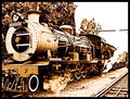
| 02/23/2006 08:39:36 PM |
Maureenby zetosComment: Too much detail has been lost due to the clipped hilights. I barely notice the smoke plume at the top because of it. The left side of the photo is fine even though there are hot spots but those don't bother.
Beyond that the photo is good. It's fairly sharp and it looks like you captured it while it was in motion. Composition-wise, I'm wondering if you had the front of the train more towards the lower right corner that way you'd minimize the highlight problems on the right and more focus would be placed on the front of the train. As it is now my eyes start at the front and make it's way down to the back of the train where the highlight problem areas are.
Anyway, just my opinion. Others might actually see the right side as adding to the style of the look. |
| Photographer found comment helpful. |
| 02/23/2006 08:33:16 PM |
The Maskby permapierComment: To be honest, I'm not in love with this photo. There isn't anything technically wrong with it. Perhaps the highlights are a bit too bright but there doesn't seem to be any lost detail as a result. And that's part of the problem. The mask is just ordinary with little interesting details to look at. Maybe if it was painted or someone was wearing it and you saw their eyes this photo would do better. As is there isn't anything that grabs your attention. Hope this helps. |
| Photographer found comment helpful. |
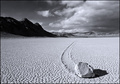
| 02/23/2006 08:24:10 PM |
Moving Rock by rd_325Comment: Two photos like this in the challenge? I would never have figured. Hopefully you and the other person with the same subject don't split the vote on this (so to speak).
As for the photo, I really like the contrast, perspective and detail. The transition from foreground to background is very smooth. You get a good sense of scale. The lines the rock created does a great job in carrying your eyes throughout the photo.
The only negative I have is I'm not in love with the color selection for the duotone. I think this would look better in b/w but I can certainly see why you didn't go that route for this challenge. |
| Photographer found comment helpful. |
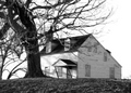
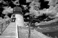
| 02/23/2006 07:58:58 PM |
Owls Head Lighthouseby LN13Comment: I like the POV. The gradient in the sky, the hill, the stairs, everything leads you to the lighthouse. |
| Photographer found comment helpful. |
Home -
Challenges -
Community -
League -
Photos -
Cameras -
Lenses -
Learn -
Help -
Terms of Use -
Privacy -
Top ^
DPChallenge, and website content and design, Copyright © 2001-2026 Challenging Technologies, LLC.
All digital photo copyrights belong to the photographers and may not be used without permission.
Current Server Time: 06/16/2026 04:05:55 AM EDT.