| Image |
Comment |
| 02/26/2006 09:17:35 PM |
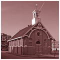
Church of Loveby JoostComment: Great photo. Nice duotone color, which makes it stand out. I have a question, what is that pole at the top? Is that a flag pole? Looks odd being there. |
| 02/26/2006 09:15:48 PM |
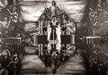
Pastorby BrinComment: That's pretty cool. I take it that's a shiny conference table or something? Whatever it is great effect. Oh and that background is stunning (as is this photo). This gets one of my very few 10s. |
 Photographer found comment helpful. Photographer found comment helpful. |
| 02/26/2006 09:13:49 PM |
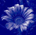
Daisy Maeby EvaanComment: Very different. Definitely one of the best non-typical duotone image. Very pop art-ish. |
| Photographer found comment helpful. |
| 02/26/2006 09:11:07 PM |
Generationsby rwouthuisComment: Nice choice in background. Don't really have anything else to add except this is really good. This works perfectly as a duotone. Gets a 9 from me. |
| Photographer found comment helpful. |
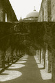
| 02/26/2006 09:06:59 PM |
Bishop's Walkby PhantomEWOComment: This is a very odd photo for me. I'm more of a high contrast type of guy but the level of contrast here doesn't really bother me. Nor does the color, which works. Also the detail is good. What I find odd is the photo, for a lack of a better word, is in conflict. There is such a prominent dividing line in this photograph that it makes it a little hard on the eyes at least for me. Maybe if there was some meaning behind that it would work but for me I don't see one. Maybe if you shot at a lower angle you could have shown some separation in the arches? |
| Photographer found comment helpful. |
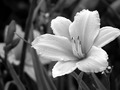
| 02/26/2006 08:58:19 PM |
Stamenby 3DsArcherComment: Mmm nice. I like how you got the delicate details throughout the flower despite the shallow DOF. This really pops and is one of the best photos in this challenge. |
| Photographer found comment helpful. |
| 02/26/2006 08:54:42 PM |
Peace in solitudeby abroken1Comment: Very nice image. Good exposure. It's sharp. Overall, it's very stylish. This one has good contrast but maybe you could have pushed it a bit more in that direction. I really like high contrast images so take that with a grain of salt.:) |
| Photographer found comment helpful. |
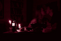
| 02/26/2006 08:47:28 PM |
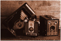
Valentine's Momentby drisComment: Great duotone color and the lighting really works. I especially like the reflections in the glass and the detail you captured in general. Overall, you really captured the essence of the moment. I can definitely see this as a ribbon winner. Gets a 9 from me. |
| 02/26/2006 08:41:02 PM |
|
| Photographer found comment helpful. |
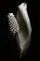
| 02/26/2006 08:40:05 PM |
...almost a Roseby AzCKellyComment: This has very nice tones and the detail is good. I like the color and the play on the title name. The crop I'm not crazy about. It's not that you didn't include the whole flower but rather the dark areas seen at top right and lower right corners. Can't really explain it but they bother me. Regardless of that I give it an 8. |
| Photographer found comment helpful. |
Home -
Challenges -
Community -
League -
Photos -
Cameras -
Lenses -
Learn -
Help -
Terms of Use -
Privacy -
Top ^
DPChallenge, and website content and design, Copyright © 2001-2026 Challenging Technologies, LLC.
All digital photo copyrights belong to the photographers and may not be used without permission.
Current Server Time: 06/18/2026 01:59:29 AM EDT.