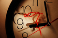
DPChallenge: A Digital Photography Contest You are not logged in. (log in or register
 
Browse Settings
Currently viewing:
Registered Useryanko

Show comments:

Per page:

Order:

Comments:


Comments Made by yanko
Pages:   ... [520] [521] [522] [523] [524] [525] [526] ... [639]
Showing 5221 - 5230 of ~6390
Image Comment
238175-edit
05/12/2006 01:09:07 AM
238175-edit
by Rikki

Comment:
Aparrently someone slipped. Yikes.
Photographer found comment helpful.
Nature's  Rhapsody
05/12/2006 12:08:51 AM
Nature's Rhapsody2nd Place
by Cam

Comment:
Congrats. You sure you didn't paint this? :P
Photographer found comment helpful.
Street Side Shrine
05/12/2006 12:04:19 AM
Street Side Shrine
by neophyte

Comment:
I like the technicals. However I'm having trouble connecting with this to be honest. I find myself more interested in the things that are further away in this photo including the inside, which we can't see at all. I think this would have worked better if there was someone in the shot who I can identify with.
Photographer found comment helpful.
Golden Light
05/11/2006 11:48:30 PM
Golden Light
by amber

Comment:
Amazing detail. The crop works. Maybe it would have been better if you cropped out the bright spot but it doesn't bother me too much.
Photographer found comment helpful.
Capilla Particular (Private Chapel)
05/11/2006 11:43:37 PM
Capilla Particular (Private Chapel)
by Germaine

Comment:
I really like this. I like it's simplicity and how it doesn't speak to just one religion/spiritual belief.
Photographer found comment helpful.
Freedom
05/11/2006 01:28:06 AM
Freedom1st Place
by Kpalsson

Comment:
Great use of scale.
Photographer found comment helpful.
Sinulog Festival
05/10/2006 11:48:28 PM
Sinulog Festival
by blackenedwhite

Comment:
Greetings from CTP2

First Impression:
Postive. I really like this.

Composition:
I wouldn't change anything. I love the depth the image has, which is carried out well with the composition.

Subject:
Interesting. It's one of those images where you look at it and want to look more.

Technical (Colour and light):
Nothing wrong here. The exposure works for me. The color is alive, which was how the event itself must have been like.

Improvement:
None really.

Summary:
Great photo. I like how you kept the grain in this shot.

Like always, it's just my opinion/suggestions. Good luck and I look forward to seeing more of your work!
Photographer found comment helpful.
Sleep Like a Baby
05/10/2006 09:52:16 PM
Sleep Like a Baby
by margiemu

Comment:
Greetings from CTP2

First Impression:
Very cute.

Composition:
I might have zoomed out a bit just so not to cut off the top part of her head but otherwise is good.

Subject:
Works well for the challenge.

Technical (Colour and light):
Not really much to add that DrAchoo hasn't already covered.

Improvement:
What DrAchoo said. Also, I would add maybe choosing a different cliche next time. Not because this didn't fit the challenge but because you couldn't show off her eyes. Eyes can be so powerful in a shot even when the rest of the image has a bunch of flaws so I'd keep that in mind in the future.

Summary:
Good photo overall. I don't get those really low votes (1-3). That tells me there was a bias or they thought it didn't meet the challenge, which I don't get. Anyway, good luck in the future and I look forward to seeing more of your work.
Photographer found comment helpful.
ascension
05/10/2006 04:52:37 PM
ascension
by IreneM

Comment:
I really like how you light your subjects. There's a certain style that you carry with each of your entries. You are off to a pretty great start if I don't say.
Photographer found comment helpful.
A Stitch in Time Saves Nine
05/10/2006 04:43:53 PM
A Stitch in Time Saves Nine
by xianart

Comment:
Greetings from your own critique club.

First Impression:
Clever although I must admit I couldn't figure it out until I read the title.

Composition:
It works. Nothing comes to mind as to how you could have cropped this better.

Subject:
Good. Also, meets the challenge pretty well although judging by some of the votes not everyone agreed.

Technical (Colour and light):
Good. The image is fairly clean and sharp. Tonal range is ok although could be better. For example, the hook blends too much with the clock frame. However, I tend to keep my monitor set a bit on the dark side so this is just a reminder that this is how it's seen with those on darker monitors. I know I have mine a tad dark however others don't and will vote unknowingly so you may want to factor that in with your editing.

Improvement:
The main thing holding this back IMO was not enough wow factor. Something needs to carry that either with the subject or technicals. Here the technicals are good and the theme/subject is good but neither is great. Make one of those better and you'll have more wow factor going for you.

Also, you hit the challenge theme but it might have been too complicated/difficult for some to see. Maybe choose a simpler, easier to see challenge theme in your entry. I made a similar mistake with my Something Old entry and paid for it dearly in the voting.

Summary:
Good image. Just be more mindful of what the typical habits are with the voters.

That's it. I hope this doesn't come off as harsh. It's just my opinion and suggestions. Good luck and I look forward to seeing more of your work!

Edit for clarity.

Message edited by author 2006-05-10 16:49:11.
Photographer found comment helpful.
Pages:   ... [520] [521] [522] [523] [524] [525] [526] ... [639]
Showing 5221 - 5230 of ~6390


Home - Challenges - Community - League - Photos - Cameras - Lenses - Learn - Help - Terms of Use - Privacy - Top ^
DPChallenge, and website content and design, Copyright © 2001-2025 Challenging Technologies, LLC.
All digital photo copyrights belong to the photographers and may not be used without permission.
Current Server Time: 11/16/2025 09:27:12 AM EST.