| Image |
Comment |
| 05/23/2006 11:30:56 PM |
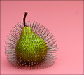
Prickly Pear by aimeethetooComment: Returning for comments. I scored this an 8 however I'm curious how this does given the theme of the challenge. I don't know much about still life but from a pure standpoint this seems arranged and manipulated to how you wanted to present it so it fits the challenge, IMO.
I can't imagine how long it took you getting those pins in there and so evenly distributed. In addition to the uniqueness of this I like the color scheme and the lighting is perfect. I like the composition but I'm wondering why you just didn't crop this tighter to eliminate that sensor dust. Hopefully that doesn't hurt you. |
 Photographer found comment helpful. Photographer found comment helpful. |
| 05/22/2006 10:22:30 PM |
il musicistaby GunnsiComment: Greetings from CTP2
Technicals:
The lighting is good but it feels a bit intense because of her squinting. The color and detail are good but her face could be sharper. With the amount of light you had available you should have shot this with a much smaller aperture, which would have helped produce a sharper image of her face.
Subject/composition:
I like the choice in subject with her instrument and medal included. The composition is also good. There's some space around her yet she isn't in the center, which I like. The background isn't distracting or anything like that but there is some detail there but that detail doesn't tell me anything more about her. In other words I think maybe something with less features should have been used or a background that in some way told us more about her or her music. Unless of course she's a street performer! In which case scratch the background comment. :P
Verdict/Summary:
I think if the issues I mentioned were corrected this would have been a 6+ scoring image, IMO. Message edited by author 2006-05-22 22:24:57. |
| Photographer found comment helpful. |
| 05/22/2006 10:02:50 PM |
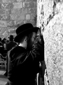
Tefiliahby TeedoejComment: Greetings from the Critique Club!
So many images in this challenge showed holy places in their ideal architectural beauty but few captured the emotion and impact of what these structures/symbols mean. Your's is one that does. So great job on that.
Technicals:
The lighting in this is good and efficient. The b/w treatment is perfect although looking at the image I am of the opinion that's how it pretty much looked in-camera.
Subject/composition:
The subject is good. This feels like a holy place even if there are no markers indicating such. The man's actions only tell me he has arrived at a holy place. Compositionally this is ok. The thing I don't like about the composition is the centered subject. I'm wondering how a landscape shot of this would have looked with the main subject on the right and more of those people in the background filling the frame on the left. It could have made for an interesting contrast as well as allow the eye to roam around the image better.
Verdict/Summary:
A fine image that met the challenge well. Your score was pretty good despite the centered framing and the b/w look, which typically doesn't go over too well in the challenges. So congrats on pulling out a more than worthy score. Good luck and I hope to see more of your work in the future! |
| 05/22/2006 09:46:15 PM |
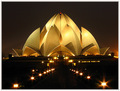
Beautiful Lotus Temple in night light. by arvinderComment: Greetings from the Critique Club!
Ok this may be hard to give a critique since I'd rather you be critiquing my images. :) But here goes...
Technicals:
Flawless. The lighting is impeccable. MAYBE if you shot this a bit more underexposed in RAW you could have fine tuned the hot spots better, but that's a major nitpick. The color is fantastic. I don't think you could have treated the color any better to convey night.
Subject/composition:
Excellent choice in subject. It stands out so well in the challenge. Composition wise I can't envision a better angle. Maybe there was but you pulled this off so well I almost don't want to see if there's a better way to show off this structure.
Verdict/Summary:
A winner. Not just a winner in the challenge but a winner as a standalone photograph. Congrats on your multiple ribbons and for pulling off this striking image.
Edited for spelling. Message edited by author 2006-05-22 21:48:59. |
| Photographer found comment helpful. |
| 05/22/2006 09:38:21 PM |
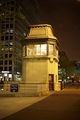
Adams St Bridgeby meyersComment: Greetings from the Critique Club!
Technicals:
In terms of lighting and color it's very good. This is a very sharp looking image. In general this image captured night quite well.
Subject/composition:
When I first saw this I didn't think this was a bridge since the main focus is the building structure. This would have been a better image had you shot this landscape style with the structure to the left. That way you would have the main focal point off-center and also include more of the bridge in the shot for people to identify with.
Another thing is the size of the image. It's quite small. Images like that are always going to be at a disadvantage since detail is harder to see and appreciate.
Verdict/Summary:
Overall this image has a lot of quality to it. Probably the best I've seen for an image of this size in the challenges and definitely one that scored so low that met the challenge. So good job there. If the image was larger and composed a bit differently I think this would have scored much much higher. That's all I have. Good luck on your next challenge and I look forward to seeing more of your work! |
| Photographer found comment helpful. |
| 05/22/2006 09:20:32 PM |
a glass of nycby RoosterComment: Greetings from CTP2
I like the idea. The choice in background is ideal and the composition is perfect. The thing that holds this back is the lighting. When I look at this in photoshop the histogram barely registers any information in the midtones, which is why there is a harsh transition from light to dark in this image. What I would try and do is use more lighting that is difused and light the glass from behind to avoid those hot spots in the front. You'll get better looking glass that can support a reflection like the skyline with better detail. Avoiding those hot spots will also allow you more room to work in post processing to bring out the detail in the skyline without worry about blowing the highlights in general. Message edited by author 2006-05-22 21:23:15. |
| Photographer found comment helpful. |
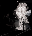
| 05/22/2006 02:37:41 AM |
White heatby KHoltComment: Stunning capture. This may ribbon regardless but I wonder why you choice this color treatment. |
| Photographer found comment helpful. |
| 05/22/2006 01:07:25 AM |
1400°C by gaurawaComment: Not sure I've seen flame composed better thant his. |
| Photographer found comment helpful. |
| 05/22/2006 12:45:30 AM |
|
| Photographer found comment helpful. |
| 05/22/2006 12:37:03 AM |
|
| Photographer found comment helpful. |
Home -
Challenges -
Community -
League -
Photos -
Cameras -
Lenses -
Learn -
Help -
Terms of Use -
Privacy -
Top ^
DPChallenge, and website content and design, Copyright © 2001-2026 Challenging Technologies, LLC.
All digital photo copyrights belong to the photographers and may not be used without permission.
Current Server Time: 06/21/2026 07:46:44 PM EDT.