| Image |
Comment |
| 05/24/2006 09:01:44 PM |
4.jpgby TNCameronComment: This type of shot would make a strong entry in the Single Light Source III challenge. |
 Photographer found comment helpful. Photographer found comment helpful. |
| 05/24/2006 05:41:52 AM |
|
| Photographer found comment helpful. |
| 05/24/2006 05:10:03 AM |
|
| Photographer found comment helpful. |
| 05/24/2006 05:06:00 AM |
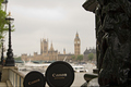
Daddy and son visiting Londonby alexgarciaComment: Greetings from CTP2
Ha! Very funny.
Technicals:
The lighting is ok but I think I might have liked a bit more on the lens cap to make the lettering stand out more or something else to add some wow factor to this.
Subject/composition:
Nice idea for the subject. Composition-wise, I wish that sculpture thing wasn't there but otherwise it works fine.
Suggestions for Improvement:
I think you carried off the idea well but it lacked that something extra. Maybe have the "daddy" lens cap tilted more so that lighting from the right could rake over it creating an interesting gradient. |
| Photographer found comment helpful. |
| 05/24/2006 04:59:30 AM |
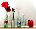
Are You a Pepper, Too?by RebeccaComment: Greetings from CTP2
Technicals:
The lighting on the bottles is really good. I like the soft/diffused specular highlights. I kinda wish the pepper had some of that on the front side of it like the bottles. I always picture peppers being shiny so this one feels a bit dull in comparison. The shadow cast in the background feels a bit out of place but it's not too distracting.
Subject/composition:
I like the choice in subjects and how you arranged them. I don't think I've ever seen those old looking Dr. Pepper bottles before. That really adds a classic look and feel to the image as well as the addition of flowers.
Suggestions for Improvement:
I like it the way it is but to do better in the challenges I think the back wall needs to be more evenly lit without that shadow and a shinier pepper would have really sealed the deal with voters, IMO.
Edited for spelling. Message edited by author 2006-05-24 05:00:45. |
| Photographer found comment helpful. |
| 05/24/2006 04:52:13 AM |
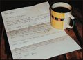
Memoriesby OddfrogComment: Greetings from CTP2
Just as a side note, I like the coffee stains. That's just classic to me but I think I would have just went with one instead of the two rings.
Technicals:
The lighting and color is good. Maybe a tad underexposed but overall it has a nice moody feel to it. The image is also nice and sharp.
Subject/composition:
This might not have been what voters wanted to see as a still life and as such you got a much lower score than what this images normally would have gotten, IMO. As for the photograph itself the subject works well in the composition. I really like how the cup and paper contrast well with the background and the focal point is off-center.
Suggestions for Improvement:
Nothing really technically other than go with something more traditionally still life. What you shot would fit the description of still life but for the challenges it apparently didn't. |
| Photographer found comment helpful. |
| 05/24/2006 04:42:59 AM |
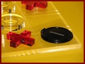
A Winner?by GunnsiComment: Greetings from CTP2
Technicals:
The lighting didn't come out well but you did do a good job of minimizing the hot spots. As for the color it looks a bit dull to me. Maybe some photoshoping with the levels could have helped that a bit.
Subject/composition:
Good idea for the subject. However, it wasn't immediatley obvious to me due to the crop and the translucent board. I think this might have been one of those occassions where a view from the top would have been better.
Suggestions for Improvement:
Hard to provide much here really. Honestly I think I would have just shot something else with more features rather than those translucent elements which seem like a nightmare to light. However, if you are going to shoot that try that above angle that I mentioned earlier. If anything it would make the idea easier to see in the image. |
| Photographer found comment helpful. |
| 05/24/2006 04:30:07 AM |
Queen of the Laundry Pileby margiemuComment: Greetings from CTP2
Technicals:
Good. The whites look incredibly white and the colors are colorful. Nice detergent, I mean lighting you used on this.
Subject/composition:
Good subject. Fits the challenge well. I don't think I could have composed this shot any better so great job all the way around.
Suggestions for Improvement:
I don't really have any. Alexgarcia had an interesting idea with the clothes but if you can manage 8 kids and a hobby like photography along with everything else I think having the clothes somewhat in order like you do here that's more accurate! All in all great photo. |
| Photographer found comment helpful. |
| 05/24/2006 04:22:46 AM |
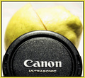
Ninja Lenscaps from Canonby blackenedwhiteComment: Greetings from CTP2
Dude that so looks like a lemon!
Technicals:
Well the foreground was exposed well but that background has a lot to be desired but you know that already.
Subject/composition:
To sell the idea that this lens cap is indeed a ninja it would have been better if you had some of the lemon/pear remains on the lenscap. Might have made this more gory but hey it's a ninja and it just sliced through that whole thing. :P Btw, I like how you composed this. Lots of balance and in your face action.
Suggestions for Improvement:
Try and not make it a last minute thing? |
| Photographer found comment helpful. |
| 05/24/2006 04:15:48 AM |
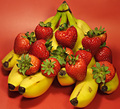
Strawberry Bananaby DigiFotoBuddyComment: Greetings from CTP2
Technicals:
Overall, I like the lighting especially the specular highlights on the strawberries. That makes the strawberries look so yummy. I'm not so keen on the shadows the bananas create but really that's not too distracting. The color is also good.
Subject/composition:
Good choice in subject. It meets the challenge. However, something feels awkward about the arrangment. It just looks unnaturally balanced to me.
Suggestions for Improvement:
To make the arrangement more natural looking I suggest having at least one of the strawberries on the ground. Also, I'm not sure about the DOF you used here. At least I'd like to have seen the first row of strawberries as sharp as the top row. That's about it. Good luck on your next challenge and congrats on that top placing in the photographer improvements stat! |
| Photographer found comment helpful. |
Home -
Challenges -
Community -
League -
Photos -
Cameras -
Lenses -
Learn -
Help -
Terms of Use -
Privacy -
Top ^
DPChallenge, and website content and design, Copyright © 2001-2026 Challenging Technologies, LLC.
All digital photo copyrights belong to the photographers and may not be used without permission.
Current Server Time: 06/21/2026 10:46:44 PM EDT.