DPChallenge: A Digital Photography Contest You are not logged in. (log in or register
 
Browse Settings
Currently viewing:
Registered Useryanko

Show comments:

Per page:

Order:

Comments:


Comments Made by yanko
Pages:   ... [493] [494] [495] [496] [497] [498] [499] ... [640]
Showing 4951 - 4960 of ~6391
Image Comment
There's a place
06/07/2006 06:02:44 PM
There's a place
by audinut

Comment:
Greetings from the Critique Club!

Technicals/Setup:
Good light and color. What you kept in focus looks sharp so good job there.

Subject/Composition:
The subject is an interesting one for the challenge. I think it fits well with the song even with the trespassing sign there. In fact I think it helps not hurts the image. Besides, the spot you are standing could be your place not the actual private land.

The composition is good. I like the main tree were it is positioned and the other group of trees to the right. The two help frame the path you are headed. The skinny branch/tree is really the only thing I don't like. It divides the image so I'd think about cloning that out.

Post Processing:
I like the saturation treatment. Also, the blur gives it a nice dreamy look but for me I rather you left it out.

Suggestions for Improvement:
I think you pretty much know what needs to be improved. You mentioned removing some of the clutter and that's really the only thing I see that would benefit this image.
Photographer found comment helpful.
Mother Nature's Son
06/07/2006 01:45:05 AM
Mother Nature's Son
by BigK

Comment:
Hey a personal best. Great concept. I think Team Outcasts is ready for season two!
Photographer found comment helpful.
Totally In Distress
06/06/2006 04:55:28 AM
Totally In Distress
by Kita

Comment:
Greetings from the Critique Club!

Hi Kita. Let me just say you are on a roll here! Eight favorites in your last two entries is fantastic. Ok on to the critique.

Technicals:
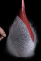
Overall good lighting. The subject is well lit and has no harsh highlights. I like the DOF. Everything that should be sharp is. Great job all the way around.

Subject/composition:
Good choice in subject. The image is very somber and one can easily see failure in it. The railroad locale is a very good choice especially since they are classic symbols of running away, moving on or making some kind of life altering change. Couple that with your model sitting there in distress and immediately I think of a 100 things that might have failed here. I think this entry did a better job of depicting failure than the one that won the blue ribbon. So great job in meeting/exceeding the challenge theme.

As far as the composition is concern, the main subject is off-center and to the left which works out well. There's also good space around the subject and nothing that distracts the image in the least.

Post Processing:
Everything looks good here. However, for this particular challenge I think I might have tried to tone down the colors just a bit. The blues in particular seem a bit too vibrant for such a somber image. Maybe just dull the blues a bit or a selective desaturation of just your model could heighten the somber feel of this.

One other thing about your processing. Your neatimage looks good however I would think about scaling back the effect on just the sweater. Since the sweater has a lot of small details to it the noise won't be noticable if you left it in there and that way you would avoid the smoothing effects neatimage tends to leave in certain spots. Probably the best way to do that is to use the history brush set to a point in the history before you ran neatimage and then just paint over the sweater to remove the neatimage effect in that area.

Well that's it. Really a great image all the way around. You have a super model to work with and a great teacher and mom also! I really look forward to seeing more of your photos. Keep up the good work!

Message edited by author 2006-06-06 05:03:31.
Photographer found comment helpful.
Catastrophic Containment Failure-revisited
06/06/2006 01:03:11 AM
Catastrophic Containment Failure-revisited
by ralph

Comment:
Wow. Not sure you improved on the original but this is very good and different in it's own way.
princess
06/06/2006 12:58:46 AM
princess
by ursula

Comment:
Wow this is cool. The bokeh makes it look like it's wearing a diamond necklace.
Photographer found comment helpful.
Me Myself and I
06/06/2006 12:57:15 AM
Me Myself and I2nd Place
by terje

Comment:
Awesome. The subject is perfectly placed. I get a good sense of height.
Photographer found comment helpful.
Red lips again
06/06/2006 12:54:55 AM
Red lips again
by unneva

Comment:
I love this crop.
Photographer found comment helpful.
Darkness and Light II
06/06/2006 12:44:41 AM
Darkness and Light II
by Nobody

Comment:
I would tone down the blue reflection in the water just a bit. Otherwise a great shot!
Photographer found comment helpful.
Take 2 Peso (Birds Challenge)
06/06/2006 12:42:56 AM
Take 2 Peso (Birds Challenge)
by Balko

Comment:
Vivid colors and the detail is great.
Photographer found comment helpful.
The 1720 Corridor
06/06/2006 12:41:05 AM
The 1720 Corridor
by SandyP

Comment:
Not sure who's shot this is but I'm thinking it's SandyP's. Whoever you are this is fantastic! I like this angle better than some others I've seen of this church and the editing just makes it all come to life.
Photographer found comment helpful.
Pages:   ... [493] [494] [495] [496] [497] [498] [499] ... [640]
Showing 4951 - 4960 of ~6391


Home - Challenges - Community - League - Photos - Cameras - Lenses - Learn - Help - Terms of Use - Privacy - Top ^
DPChallenge, and website content and design, Copyright © 2001-2025 Challenging Technologies, LLC.
All digital photo copyrights belong to the photographers and may not be used without permission.
Current Server Time: 09/13/2025 03:04:11 PM EDT.