| Image |
Comment |
| 07/02/2006 09:55:31 PM |
Having to Tidy Up...by Mr_PantsComment: Wow. Was this shot for Dyson or the challenge? This is really good. The image is super sharp but the lighting and the angle is what makes this sing. Question, is this a Dyson model for hardwood or you just did it this way because it looked better? |
 Photographer found comment helpful. Photographer found comment helpful. |
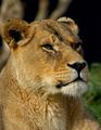
| 07/02/2006 09:48:22 PM |
Mother of the Prideby Mr_PantsComment: I think I like this one the best out of your animal photos. The pose is just perfect, IMO and the crop feels right. Since the background is mostly dark I would probably go ahead and make it all dark at the top. I think this photo would work better that way than your other photo like this with the black background.
Edited to add, I meant to say I like this one the best out of your lion photos. The one with the monkey is may favorite. Message edited by author 2006-07-02 21:49:57. |
| Photographer found comment helpful. |
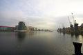
| 07/02/2006 09:45:17 PM |
MZ6Y1326.jpgby Mr_PantsComment: I like the clarity and the detail in the water is great. I like how there is a foreground element in the shot however it feels like it needs something like a bird on it. Can you add one? :P |
| Photographer found comment helpful. |
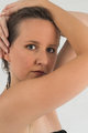
| 07/02/2006 04:05:49 PM |
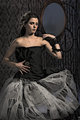
ME-4390.jpgby -Bec-Comment: I like the entry one also however this one also has lots of appeal. Now this is probably breaking rules but I would think about cropping this tighter on the left side so that *gasp* your hands are cut off. The thing I really like about the image is the smoothness of your arm as it frames your face and the hands, in particular the finger nails, breaks that flow and pulls my eyes over there, IMO. By the same token, I would crop a bit from the bottom to remove the edge of your dress that shows. Basically, what I want to see is just your facial features and your smooth skin framing all around it. Anyway, just a suggestion. I think you have a very nice shot. I wish my outtakes looked this good! |
| Photographer found comment helpful. |
| 07/02/2006 03:58:12 PM |
Emily2.jpgby -Bec-Comment: The color looks really good here and the lighting as well but maybe a bit too bright? Perhaps that's just because I saw your other version first, which I liked. Although the lighting here does fall on your model's face better producing less sharp edges. I also like how the model is looking towards the camera. However, the pose in general doesn't work as well for me as it did in the other version. I don't really know why that is. Maybe it has to do with this being a color version and it feels more upbeat and the stoic pose doesn't quite go with that? Ok, I think I'm rambling now. :P |
| Photographer found comment helpful. |
| 07/02/2006 03:46:31 PM |
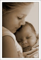
Sisters.jpgby -Bec-Comment: I agree with everything that has been said here.
To add, the composition is flawless. I love how the older sister fills the frame on the top, left and bottom leaving no gaps or anything to distract. The focal points are also perfect. The two faces are sorta in the rule of thirds areas but are closer in towards each other which works perfectly for the theme. The color and softness are also real winners here. And last but not least the connection the two have and also with the viewer is fantastic. Just goes to show you don't have to be looking directly into the camera to make it all work. Btw, those expressions are classic. The baby just looks so content and safe and the older one nurturing and caring. A heck of a photo Bec! |
| Photographer found comment helpful. |
| 07/02/2006 03:34:11 PM |
AddyB&W.jpgby -Bec-Comment: This is a good one. I love the look on his face and the catchlights in his eyes. Really a nice professional looking photo. If this was mine I probably would dodge the eyes just a tad to see what it looked like. Actually that would probably just be feeding my editing addiction more so than trying to improve an already perfect image. :P |
| Photographer found comment helpful. |
| 07/02/2006 03:18:57 PM |
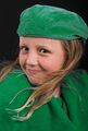
Girl in Greenby -Bec-Comment: Wonderful lighting and color. What a fitting shot for the challenge! I didn't vote in this challenge but if I did, I couldn't see myself giving anything lower than a 7.
That flowing hair and her expression makes me wonder how this would look in another crop. I know this was entered for the green challenge and the crop you used works well for that purpose but I'm wondering if a much tighter crop would help convey your daughter's expression and personality better. For example, when I pull this in photoshop I cut off a bit from the top so part of her hat is missing and from the bottom I cut off up to where her hair ends. It's a little more square like, but for me anyway, it adds something that compliments the way she is posing. If I had more to work with on the left side I might also think about going with a more landscape look with the crop example I gave.
Anyway just some random thoughts. This is very good and I could only wish to produce professional looking images like this. Good luck in future challenges! |
| Photographer found comment helpful. |
| 07/02/2006 03:01:18 PM |
Emily-PP.jpgby -Bec-Comment: I really like this one. The lighting is great and sets a very nice mood. The composition is also good. I particularly like how the dress flows at the bottom filling the frame nicely. I noticed you've used the same backdrop as Makka in the photos I commented on. However here I like the way you used it better which is more subtle yet more involved in the shot if that makes sense. Speaking of which, my knowledge in these model shoots is extremely limited so I may make some silly uneducated observations along the way. Just FYI. :)
As for the post processing I love it. The whole thing just fits well together. I especially like how the bottom part of the dress looks and fades off a bit at the bottom. The only thing I might think about changing is removing the sharp edge halo where the dress cuts off at the top on her chest. I'd just blur that a little so it didn't glow as much. Other than that it's perfect! :) |
| Photographer found comment helpful. |
| 07/02/2006 03:59:57 AM |
Wishesby IndigoButterflyComment: Ahh this is cool. I love the framing and the lighting is fantastic. Even though this color version looks great you might try looking at this in black/white also. I just pulled this in PS and applied a gradient map and it looked pretty damn good to me although you do lose that cool looking red glow on the boy. However, you could go the selective desaturation route. |
| Photographer found comment helpful. |
Home -
Challenges -
Community -
League -
Photos -
Cameras -
Lenses -
Learn -
Help -
Terms of Use -
Privacy -
Top ^
DPChallenge, and website content and design, Copyright © 2001-2026 Challenging Technologies, LLC.
All digital photo copyrights belong to the photographers and may not be used without permission.
Current Server Time: 06/22/2026 09:11:07 PM EDT.