| Image |
Comment |
| 05/05/2010 03:36:09 AM |
|
 Photographer found comment helpful. Photographer found comment helpful. |
| 05/05/2010 02:40:20 AM |
|
| Photographer found comment helpful. |
| 05/05/2010 02:34:36 AM |
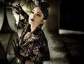
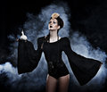
She's Got the Lookby InsomniacComment: I like the light and the color you achieved here. The lens flare is a nice touch. I kinda wish it actually dulled the image more. It's a common technique used in fashion and it looks great when done well.
What I didn't like about this is her pose and your POV. It's too static, IMO. Her arms (one showing and one not) brings attention to this and since the one showing is pressed a bit to her body it sort of makes that arm wider rather than thinner. Also, her clothes don't really wow. They look nice but photographically they are not a stand out and they could have shaped her body better but that has more to do with the pose than anything else.
That said, her hair is wonderfully captured! The only thing that I'd touch up is the hair hanging over her arm especially since it seems to fade in and out due to the light hitting it or maybe you did some fixing in that area? Anyway, just some thoughts. If you didn't want a critique then just ignore. I do think it was a good shot and one of the more fashion faithful entries. |
| Photographer found comment helpful. |
| 05/05/2010 02:18:16 AM |
Elleby BJokerudComment: Technical perfection usually wins out at DPC but had actual fashion editors voted I'd expect this to have fared far better. What some of the flawless images lacked was personality and presence, which this has in spades. |
| Photographer found comment helpful. |
| 05/05/2010 01:17:55 AM |
En Vouge by LalliSigComment: I didn't vote but I would have guessed this was yours immediately based on the smoke alone. The way you process it is very distinct. |
| Photographer found comment helpful. |
| 05/05/2010 01:07:00 AM |
Double Trouble!by Silent-ShooterComment: I thought this was a ribbon contender. Sucks that you got hit with so many low votes. Reminds me of the Bulworth movie poster. Well done. |
| Photographer found comment helpful. |
| 05/05/2010 12:27:59 AM |
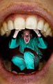
the eye like a strange balloonby yankoComment: Originally posted by pix-al:
I don't get it?
What are the crease marks? an (illegal) added effect, or is the hand holding the balloon a picture? |
Thanks for your comment but it would be the third option, i.e. legal effect done in-camera, no artwork/photo used. Message edited by author 2010-05-05 00:53:56. |
| 05/05/2010 12:22:49 AM |
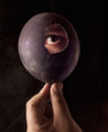
The Little Wookieby scalvertComment: Maybe the five 1s were from people who couldn't believe you would chop off your daughter's head and make your dog wear it. :P |
| Photographer found comment helpful. |
| 05/04/2010 05:31:34 PM |
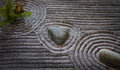
Around the Neighborhoodby DennisheckmanComment: Greetings from the Critique Club
Hi Dennis,
Congrats on the favs and strong finish. This is a pretty solid entry that was well executed. It immediately makes me think of zen and provokes a calm feeling. The lighting/editing might be a tad on the dark side but works.
My only real nitpick is the left side is much darker than the rest of the picture and as a result adds a little confusion as to where my eye should go since as a westerner I want to read it from left to right. Flipping the image fixes that but if you didn't want to use a leading line per se and just wanted the viewer to focus immediately one of the rocks and then just drift off from there like the wave pattern then I think the uneven vignetting doesn't help. |
| Photographer found comment helpful. |
| 05/04/2010 04:54:47 PM |
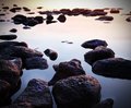
Floating rock gardenby cyphixComment: Greetings from the Critique Club
Hi cyphix,
Not bad for a first entry especially since zen isn't the easiest topics to shoot for. I think you did pretty good in terms of capturing zen quality. The smooth water and the floating rocks are very zen-like. The lighting and color are good but what holds this back is the composition/crop, IMO. The rocks needed a larger space to sit in to better maximize it's zen potential. In this square crop the rocks look trapped and the potential for a leading line to the floating rocks is diminished. Of course not knowing what your restrictions were at the time I can only speculate, but had you been able to use a taller or wider composition the extra space could have given this image more flow, more freedom and a more zen experience.
If you have any questions feel free to PM me. |
Home -
Challenges -
Community -
League -
Photos -
Cameras -
Lenses -
Learn -
Help -
Terms of Use -
Privacy -
Top ^
DPChallenge, and website content and design, Copyright © 2001-2026 Challenging Technologies, LLC.
All digital photo copyrights belong to the photographers and may not be used without permission.
Current Server Time: 05/01/2026 02:28:00 PM EDT.