| Image |
Comment |
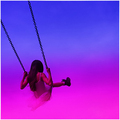
| 08/11/2006 04:28:56 PM |
Sandy Girlby coolharComment: Returning for comments.
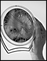
There appears to be a bit of a color cast going on (red). Assuming you have photoshop, a simple curves adjustment using just the options: Find Dark & Light Colors would have corrected it. Also, adding a bit more contrast using the unsharp mask technique would have helped give this image more oomph, IMO. In other words, apply unsharp mask with settings along these lines: Amount = 18, Radius = 40, Threshold = 1 and experiment from there.
In terms of improvements in camera, I think an angle that got more of her face in the shot rather than this side view would have given this more impact as well as shooting even lower to the ground. You would get more of the crashing waves in the shot which add/heighten the drama in the scene.
Anyway, just some thoughts. Good luck! |
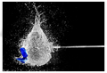
| 08/11/2006 04:17:38 PM |
UH OH!by QartComment: Very unusual image. I like the idea and the execution is good but the image suffers a bit from quality. The detail is there but so is some funky stuff. Judging by the file size (only 25k) it's probably jpg compression which is a shame since you could have probably saved this at a 100% without reaching the 150k limit. Other than that it's excellent. The composition the background and the stop motion. |
| 08/11/2006 04:12:09 PM |
Lickby PixelstateComment: Love the square crop. That's got to be one of the thickest cat tongues I've every seen although I'm sure it's just the angle of it. |
 Photographer found comment helpful. Photographer found comment helpful. |
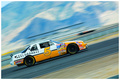
| 08/11/2006 04:10:26 PM |
R E A L G O N Eby NaldComment: The composition/angle you used really adds something extra to this photo. I love how the lines slice through the image diagonally and even frames it sorta like a scrapbook would. The color is also very good but not over the top. If I were to find any faults with this, which I don't it would be the dark line above the car. I'd probably have cloned that out to make it cleaner looking for finicky voter. |
| Photographer found comment helpful. |
| 08/10/2006 04:32:28 AM |
Target Practiceby NstiG8trComment: I typically find these shots rather boring because usually the only "wow" factor present is the mere timing of the shot and nothing else. However here this image can stand on it's own for purely artistic reasons. The composition is great as is the lighting and of course you nailed the stop motion but best of all it's simply a nice looking image to look at. I'm bumping this up from a 7 to a 10. Good luck. |
| Photographer found comment helpful. |
| 08/10/2006 04:17:38 AM |
|
| Photographer found comment helpful. |
| 08/10/2006 04:12:22 AM |
|
| Photographer found comment helpful. |
| 08/10/2006 03:26:14 AM |
In Shamblesby JutildaComment: I agree, very underrated. Maybe that ketchup would have helped. :P |
| Photographer found comment helpful. |
| 08/10/2006 02:07:05 AM |
Well Worn Transportationby walrus451Comment: Great looking product shot! Maybe brush the felt a bit so it's all going in one direction but that may ruin the "worn" aspect. |
| Photographer found comment helpful. |
| 08/10/2006 02:05:02 AM |
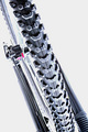
Pedal Powerby ElaineComment: I really like the high key look. However the composition doesn't work well for me. I think maybe if you included more of the bike it would fit better in the frame. |
| Photographer found comment helpful. |
Home -
Challenges -
Community -
League -
Photos -
Cameras -
Lenses -
Learn -
Help -
Terms of Use -
Privacy -
Top ^
DPChallenge, and website content and design, Copyright © 2001-2026 Challenging Technologies, LLC.
All digital photo copyrights belong to the photographers and may not be used without permission.
Current Server Time: 06/24/2026 11:24:15 AM EDT.