| Image |
Comment |
| 09/17/2011 02:12:24 AM |
|
 Photographer found comment helpful. Photographer found comment helpful. |
| 09/09/2011 05:28:54 PM |
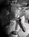
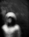
becomingby BrennanOBComment: First, congratulations on your ribbon. Seeing your outtake got me thinking about your edits and choices. I agree the b/w is better than the color. I also like what you did with the contrast. However, the smoothness and hyper sharpening in your b/w shot take's it in a completely different direction than Uelsmann's work. In one regard that's a good thing, but I'm not sure I'm liking the direction. Uelsmann's work has soft edges with texture left in the surfaces, which is very effective when combined with the model's expression as a whole. In your photo the edges are hyper sharp. Some of that is probably do to the resizing but the end result is the papers looks like razor blades that could easily tear into her skin if she moves. When you include that effect with the heavy smoothing and the girl's expression it's hard to make the connection your title offers unless you meant it's the becoming of the next SAW movie poster. No offense intended. Just my honest reaction. |
| Photographer found comment helpful. |
| 09/09/2011 04:25:20 PM |
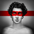
RED by elsapoComment: Congrats. Less beats out more. Doesn't it always? |
| Photographer found comment helpful. |
| 09/04/2011 03:23:14 PM |
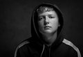
14th Yearby smardazComment: This is a very good portrait. I like the composition, but I do find myself wondering how it would look as a 6x7 portrait instead of landscape...
That said, the head positioning, POV slightly below eye level, the spill of light in the background to give separation, b/w conversion and exposure are great. It's all done with subtlety, which allows a little of that authenticity to shine through from your subject. |
| Photographer found comment helpful. |
| 09/04/2011 02:59:13 PM |
transitalienby tnunComment: Not sure what this is but it's pretty expressive when you let your eyes adjust to the rendering. |
| Photographer found comment helpful. |
| 09/04/2011 02:56:45 PM |
Fear Casts a Long Shadowby bcrantsComment: I really like the light and her expression you capture. Although there's nothing wrong with the composition, I do think I would have preferred the scene to include more of the room (i.e. zoomed out) The reason being, more shadows = more fear. However, that's just me. |
| Photographer found comment helpful. |
| 09/04/2011 02:51:05 PM |
|
| Photographer found comment helpful. |
| 09/04/2011 02:49:08 PM |
|
| Photographer found comment helpful. |
| 09/04/2011 02:46:49 PM |
|
| Photographer found comment helpful. |
| 08/10/2011 01:28:47 AM |
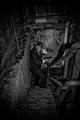
Corneredby markwileyComment: Looks good, but for me it's lacking some tension. It could use some shadow play. For example, a bright flashlight shining down on the guy or a large silhouette of the guy he's being chased by might have given the image more of an edge, IMO. |
| Photographer found comment helpful. |
Home -
Challenges -
Community -
League -
Photos -
Cameras -
Lenses -
Learn -
Help -
Terms of Use -
Privacy -
Top ^
DPChallenge, and website content and design, Copyright © 2001-2026 Challenging Technologies, LLC.
All digital photo copyrights belong to the photographers and may not be used without permission.
Current Server Time: 06/11/2026 02:20:49 PM EDT.