| Image |
Comment |
| 09/03/2007 09:39:07 PM |
|
 Photographer found comment helpful. Photographer found comment helpful. |
| 09/03/2007 09:37:44 PM |
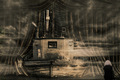
Don't Put It Off ...by GeneralEComment: This subject just isn't going to do well in the challenge but to help improve it make the lighing more dramatic by making it darker and more moody. I would shoot this in a dark room with a spotlight from above giving the toy and hammock shape. |
| Photographer found comment helpful. |
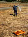
| 09/03/2007 09:29:34 PM |
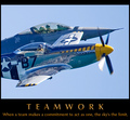
Teamworkby StrikeslipComment: Is that real? Geez. Way too close for comfort! Nice stop action. |
| Photographer found comment helpful. |
| 09/03/2007 08:46:57 PM |
|
| Photographer found comment helpful. |
| 09/03/2007 07:11:15 AM |
|
| 09/03/2007 07:09:59 AM |
|
| Photographer found comment helpful. |
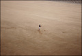
| 09/03/2007 06:53:43 AM |
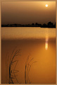
Time to Oneselfby redmoonComment: Strange how some want this off-centered while others thought it was off-centered. How can this be? Looks centered enough for my tastes. Speaking of which, the centered composition couldn't have been any more appropriate. It enhances the feeling of isolation. I also love how I can't read what looks like words on the ground which is good because they are not meant for me. |
| Photographer found comment helpful. |
| 09/03/2007 06:49:10 AM |
|
| 09/03/2007 06:46:28 AM |
|
| Photographer found comment helpful. |
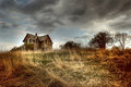
| 09/03/2007 06:23:35 AM |
house.jpgby mkComment: Originally posted by pcody:
to bad it didn't get accepted. But I saw the picture you posted as the winner last year...and, well...enough said. Their loss.
Can I ask why you decided on a softer version?
This is the MN fair? Next year I swear I'm going to send something in. Especially seeing that picture that won.
If you want I'll erase this comment. Don't want to mess up your presentation. |
Why do you prefer this version? No offense to the great Mysterious Yellow 70 but this edit kind of looks like she just punch in some random settings to produce this tonemapping. The tonal relationships are completely destroyed making the photo look like a mess.
The other version (i.e. take III.jpg) is a much finer edit hands down. The highlights and shadows while still looking tonemapped is still believable. The light still looks like it's coming from the sun where as in this photo it looks like the weeds are radioactive emitting their own light. It just floors me that people love these crazy edits but hey to each is own.
Also, don't kill me! *runs* Message edited by author 2007-09-03 06:26:22. |
| Photographer found comment helpful. |
Home -
Challenges -
Community -
League -
Photos -
Cameras -
Lenses -
Learn -
Help -
Terms of Use -
Privacy -
Top ^
DPChallenge, and website content and design, Copyright © 2001-2026 Challenging Technologies, LLC.
All digital photo copyrights belong to the photographers and may not be used without permission.
Current Server Time: 05/09/2026 05:18:55 PM EDT.