| Image |
Comment |
| 11/16/2005 06:47:47 PM |
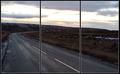
Cant see, hear or speakby totiComment: nice idea. Surpised I haven't seen more. They might be out there, haven't been through yet. B&W quality is nice. 7 |
| 11/16/2005 06:47:10 PM |
|
 Photographer found comment helpful. Photographer found comment helpful. |
| 11/16/2005 06:46:32 PM |
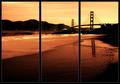
Golden Gateby bryanbrazilComment: A nice picture. The triptych quality isn't adding too much, but it isn't completely wasted either. The verticals echo the bridge nicely and there is a "subject" in the two frames and lack in the third. This seems to be a popular style. 7 |
| Photographer found comment helpful. |
| 11/16/2005 06:38:55 PM |
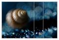
The Deepby Dax-Comment: I like the picture, but the triptych isn't adding much. I like the picture a lot though. 6 |
| Photographer found comment helpful. |
| 11/16/2005 06:37:23 PM |
|
| Photographer found comment helpful. |
| 11/16/2005 06:36:50 PM |
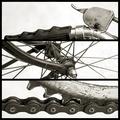
Triptych Dropsby davidus428Comment: I like the colors. It adds more compared to the other drop pictures. You did well putting your center image in the center. It is clearly the strongest. 7 |
| 11/16/2005 06:36:19 PM |
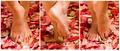
Piedi Nudiby rscorpComment: Elegant. There seems to be a little too much red as a cast. 7 |
| Photographer found comment helpful. |
| 11/16/2005 06:35:51 PM |
|
| Photographer found comment helpful. |
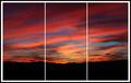
| 11/16/2005 05:15:53 PM |
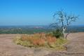
View From the Topby DannyMComment: I don't know if this is personal taste or not, but I'm always turned off by this shade of blue. It looks like an old, faded picture to me. Time of day (and thus location of the sun) and polarizer use is big here.
The colors suffer from lack of punch. I upped the saturation by +20 and that helps quite a bit. You can also try to go B&W in a picture with faded color. The red channel wasn't a bad pick. It made for a nice dark sky.
Composition isn't bad. On one hand it's centered, but on the other hand the tree is asymmetric. I can't quite decide which is dominant. |
| Photographer found comment helpful. |
| 11/16/2005 05:10:58 PM |
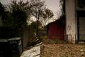
Garbage Lotby samnotisComment: Dark things with detail, I find, are very hard to photograph properly. The whole left third of your picture qualifies. The bushes look like a murky mess.
The composition isn't bad. I like the trash cans, which are the main subject in this challenge, are far to one side which is interesting.
A number of other pictures I commented on had the same issue with color. The colors here are unimportant and unimpressive, so try B&W. The picture then becomes more about texture and pattern and the detail of the detrius on the ground becomes more interesting. |
| Photographer found comment helpful. |
Home -
Challenges -
Community -
League -
Photos -
Cameras -
Lenses -
Learn -
Help -
Terms of Use -
Privacy -
Top ^
DPChallenge, and website content and design, Copyright © 2001-2026 Challenging Technologies, LLC.
All digital photo copyrights belong to the photographers and may not be used without permission.
Current Server Time: 06/12/2026 01:27:04 AM EDT.