| Image |
Comment |
| 03/01/2006 07:04:06 PM |
waiting for the springby gocComment: The biggest problem is the business of the debris laying on the snow and boat. It's a nice idea and composition, but the clutter subtracts from the picture overall. at 5.25, you have taken care of the big things, focus, lighting, composition, it's now the smaller things that need to be fixed. That being said, if you could magically make all the debris go away, you'd probably rise to the 5.5-5.7 area. There may not be enough to captivate the audience here, although that's a tough call. |
 Photographer found comment helpful. Photographer found comment helpful. |
| 03/01/2006 04:22:11 PM |
Mercurialby JonoComment: A few things. It's probably better to rotate the canvas so the shower tiles are parallel with the border (unless you go for an obvious tilt for effect). The technicals are not bad. The lighting is nice without too much glare and the focus is sharp. I'm not quite sure that this was the best shot for duotone as the tone doesn't seem to add too much to the picture. In the end, we may not have enough to keep our interest. The 103 5 scores show that people didn't have a big beef with the shot, but also didn't get wowed by it. |
| Photographer found comment helpful. |
| 03/01/2006 04:18:51 PM |
beautiful in Basic Blackby kiwinickComment: I gave this shot a 7. I think it looks pretty good for fashion. The stark background works because we are supposed to be concentrating on the model and her clothes. She is appropriately pretty, which is important (unfortunately). The composition and pose are excellent too. A 7 from me is a significant score. What kept it from a higher score was the perceived softness of her hair (see the upper right where the background seems to "invade" the detail of her hair). I also didn't like the large black area of no detail where her hair blends with her blouse. Finally, I would have ditched the earring. That's small though. |
| Photographer found comment helpful. |
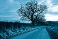
| 03/01/2006 11:28:52 AM |
coldby AtirezComment: A few things. 1) Blue was a tough tone to use in this challenge. I don't think you did a bad job here, but the biggest problem is blue is close to the actual sky color and therefore we keep thinking this is the real color of the sky and it doesn't work with our eyes. 2) Winter foilage is tough for a picture. The grass on the left is miserable and barren branches are tough because they quickly degrade into a jumbled mass of lines. (see the lower right where the tree behind it interferes.)
The composition is nice with the road slanting across the canvas. I think in the end there may not have been enough to hold the interest of the viewer. Note that you got 100 5s. That tells me most didn't find anything wrong with your pic, but weren't excited by it either. |
| Photographer found comment helpful. |
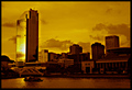
| 03/01/2006 11:23:52 AM |
Reflectionsby PaulEComment: You have a great score, so I'll keep this brief. I liked it and gave it a 7. I didn't notice any rotation problem, but I'd enjoy a bit more exposure in the dark areas of the picture. It may be hard to do it without blowing the sun however. I think primarily I speak of the boat, which looks like a undefined mass instead of a boat. In advanced, you could dodge it, but here you were stuck. I like the orange tone, gives the right impression and is nice and strong. Works in this picture. |
| Photographer found comment helpful. |
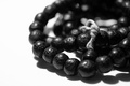
| 03/01/2006 01:17:06 AM |
Ohm mani padme hungby beggsComment: Personally, I'm not a big fan of the DOF causing both foreground and background to be OOF. I'd prefer one or the other. This is distracting to me especially on the left where we see 3 beads in focus but the ones before and after OOF. I do like the tonality and processing. The string is very sharp and that's good. the composition is good as well. it may be just a tad overexposed (seen in the string and the way the background sorta "invades" the beads on the left. |
| Photographer found comment helpful. |
| 03/01/2006 01:14:08 AM |
A new pastimeby beggsComment: I think the whole challenge was oversaturated with still life shots of 80's paraphenalia. You did a nice job not centering the shot and I do like the selective desat, but there isn't enough interest to really capture us. I gave it a 6. Also think about the background. Here, I'm not sure the pattern helps, especially since it seems to fade in and out of focus.
|
| Photographer found comment helpful. |
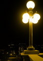
| 03/01/2006 01:03:33 AM |
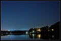
The Approachby rebs138Comment: Good old Troy, NY. I spent 4 years in Albany. It's a nice picture and I do think it was underrated. The tone is excellent and makes you feel like these are old sulfur lights. I like the dropoff, but perhaps the tiny lights below aren't enough to fill out the rest of the shot. It's not like you can change it, but it may be limiting here. I'd like to see a shot taken at dusk so the lights are on but you could see more detail below. You could make it dark in PP. Technicals are good. I don't mind the slight overexposure of the lamps, it gives them a nice glow. The crop is nice as well. I would have scored this a 6 on the limitations of the rest of the canvas. |
| Photographer found comment helpful. |
| 03/01/2006 12:59:27 AM |
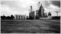
Big City Meets the Middle of Nowhere.by tryals15Comment: It's not a bad shot. I didn't make it to this one in the voting. The biggest problem is the sky not having enough definition because of the exposure. I see you were already on 1/1000th. Perhaps a different time of day? or with a polarizer or ND filter? The horizon exactly splits the picture, which isn't always bad, but probably is a bit static here. I see you were trying to contrast the expanse of blank with the building, but perhaps less dirt would have been better in the end. I would have given it a 5, which is right where you finished. |
| Photographer found comment helpful. |
| 03/01/2006 12:51:46 AM |
|
| Photographer found comment helpful. |
Home -
Challenges -
Community -
League -
Photos -
Cameras -
Lenses -
Learn -
Help -
Terms of Use -
Privacy -
Top ^
DPChallenge, and website content and design, Copyright © 2001-2026 Challenging Technologies, LLC.
All digital photo copyrights belong to the photographers and may not be used without permission.
Current Server Time: 06/19/2026 01:32:26 PM EDT.