| Image |
Comment |
| 05/10/2006 12:43:27 PM |
Beauty Is In The Eye Of The Beholderby NeuferlandComment: A few thoughts:
1) The subject is tough. In reality it's excellent and of course you think this dog is the most beautiful thing in the world where others might see an old decrepid dog. Perfect application of the saying, BUT in our weird world, people still want to see pictures of appealing things. You probably lost a bit for having the guts to take a picture which may not have mass appeal. (That's not a bad thing! It just doesn't help your score.)
2) The focus does seem just a bit soft. I'm not sure if it is DOF, OOF, or motion blur (even though you were at 1/250th). You can see this most apparent in the fur at the top of his head.
3) Perhaps to compensate for the focus, it seems a bit oversharp. If not, it may be just a bit too contrasty (which I rarely say in 4.7-5.3 pictures).
4) The square crop isn't the best. I would have actually made it more vertical so you had some negative space to move the dog slightly off center.
5) The conversion to B&W is pretty good. I think you did a good job there. |
 Photographer found comment helpful. Photographer found comment helpful. |
| 05/10/2006 01:38:50 AM |
|
| 05/10/2006 12:28:39 AM |
Rainbow Rythm by timfythetooComment: Big congrats on joining the ribbon club! That first one always feels great! You deserve it with this awesome shot. |
| Photographer found comment helpful. |
| 05/09/2006 01:08:09 PM |
|
| Photographer found comment helpful. |
| 05/09/2006 01:05:21 PM |
|
| 05/08/2006 10:38:15 PM |
|
| Photographer found comment helpful. |
| 05/08/2006 09:50:45 PM |
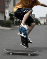
Freestyleby mecfcostaComment: I liked the subject, but I didn't like the setting. It looks too snapshot. By this I mean that it doesn't look like much effort went into the background. Could you have done this at a park or in some nicely urban alley?
Another issue is the color cast. It looks very blue, especially in the tones of the skater's skin. The picture could likely use more contrast as well. |
| Photographer found comment helpful. |
| 05/08/2006 09:48:08 PM |
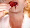
Burgundyby KenComment: I was one of those 70 fives. I think the biggest thing I saw that could be fixed is a color cast. The shot appears to my eyes to be blue.
The composition is nicely off center. The distant background isn't that great and doesn't help the picture. It also appears to be quite slanted which may have been done on purpose to compose the flower, but it's another reason that background isn't helping. |
| Photographer found comment helpful. |
| 05/08/2006 09:34:03 PM |
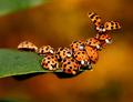
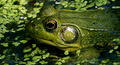
- Being Green -by mattmacComment: I like frogs too Matt, but I gave this a 4. Three issues, were they fixed, would have easily bumped this into the 6-7 range.
1) Too centered. Perhaps this is a result of being so zoomed. I used to love to zoom into things. I'm learning that a bit more environment makes for a good picture.
2) Motion blur. I'm guessing the froggie didn't let you use a tripod. IS or not, 1/6 is pretty darn slow. I noticed the blur right away and personally I tend to vote blurred or OOF shots fairly low. Big sin on DPC.
3) The highlight is quite harsh. I'm not quite sure what to recommend. A polarizer would have helped, but requires time to adjust as well as making the shutter even slower. Was it your flash? |
| Photographer found comment helpful. |
| 05/08/2006 09:29:19 PM |
No place to lie his weary head, but $5 richer this day.by ericwooComment: Leroy was going to do the PJ shots, but my quick impression is it is too posed. Even if it isn't, it looks too posed. Perhaps a horizontal crop would have made the subject more a part of his surroundings and let us see more of his world. The B&W conversion is quite nice though. |
| Photographer found comment helpful. |
Home -
Challenges -
Community -
League -
Photos -
Cameras -
Lenses -
Learn -
Help -
Terms of Use -
Privacy -
Top ^
DPChallenge, and website content and design, Copyright © 2001-2026 Challenging Technologies, LLC.
All digital photo copyrights belong to the photographers and may not be used without permission.
Current Server Time: 06/19/2026 07:39:48 PM EDT.