| Image |
Comment |
| 06/13/2006 06:22:18 PM |
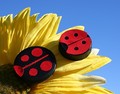
Child in Nature ~ Mirrors Redux by jenesisComment: Well, crap, it looks like you would have beaten me in this one too. ;) Look at you all ribboned up. You are riding the wave! Now keep it going as long as you can. |
 Photographer found comment helpful. Photographer found comment helpful. |
| 06/13/2006 12:38:54 PM |
157452 - Broadway Towerby ArtanComment: So Artan, interesting in that you received such a different score. The bottom line is there may only be small difference between a 6.4 and a 7.1 (but they mean a lot).
In this one I think you have better elements and worse.
The biggest problems with this (compared to the original), IMO, are the grass (you should have brought the mower, eh?), and the time of day. Yes, there are more shadows, but the lighting is much more harsh.
The castle composition is better, I do like the clouds too. So overall, I can see the lowered score. Still, both are excellent shots. a 6.4 is still nothing to sneeze at. |
| Photographer found comment helpful. |
| 06/13/2006 12:06:23 AM |
Water Drop Revisitedby RikkiComment: a 7.37 4th! Man! Well, I guess you can wear it with pride and use it as a story to tell the newbies years from now... |
| Photographer found comment helpful. |
| 06/08/2006 05:59:21 PM |
Super Glue Was Usedby Tap10Comment: haha, what the hell is this? I'm so confused about it I'm not going to vote on it. Is this a copy of my shot? or is there another done like it? Quite cute though. |
| Photographer found comment helpful. |
| 06/07/2006 04:03:09 PM |
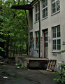
Staff Parkingby raishComment: It's a tough shot because it doesn't immediately ring as "failure". It's much more subtle and that doesn't always convey to the average voter who spends less than 5 seconds on each shot.
Overall the picture is sharp and the composition is reasonable. The lighting is flat and the colors are muted however. The colors may help with the failure feeling, but flat lighting like this probably hinders the picture. Either convert to B&W or boost the contrast, I think. I'd have to see it done to see if it helps. |
| Photographer found comment helpful. |
| 06/07/2006 04:00:50 PM |
Success is: Keeping your head while all around are losing theirsby tembaComment: temba, sorry it took me so long to respond. I like your shot but can instantly see that you got stung with the DNMC crowd. Only your title pulls the picture into a "success" shot. Some people buy that, others don't.
The technicals are pretty well done. I like the composition a lot. The repeated motif of the OOF flowers in the background is nice. The colors are pleasant. The DOF is a bit tough. I like it, but it looks like you have some artifacting around the stems in the back. It could be a result of the bokeh of your lens or it could be a PP artifact. I'm guessing the first since you say you didn't do too much to the shot. You can see it most in the lower right corner. |
| Photographer found comment helpful. |
| 06/06/2006 08:02:49 PM |
Coal Still Powers Our Cityby KenComment: The original is better. Both confuse me with the title, because I see cooling towers and I think nuclear, but perhaps these are used for coal too. This one suffers big time from the PP in the smoke. Can you see the artifact rings? |
| Photographer found comment helpful. |
| 06/06/2006 07:19:02 PM |
princessby ursulaComment: It is superior to the original, but still has issues. Too mee, I can't quite tell if I want to concentrate on the dewdrops as the subject, try to concentrate on the flower as the subject, or just take it in as an abstract. The picture doesn't really commit to any of those and that causes the ambivalence the voters are feeling (at least IMO). I gave it a 5. |
| Photographer found comment helpful. |
| 06/06/2006 06:47:05 PM |
The Santa Maria Revisitedby timfythetooComment: Ha, I was just wondering which was your's SJ. Nice shot. I love the gradient. I'm gonna comeback and compare the top shots to their originals. 7 for now.
Wait, this is Tim, not SJ...I'm back, yes, superior. The zoom out with the reflection adds a whole new dimension. The gradient sky is the best addition. bumping to 8 |
| Photographer found comment helpful. |
| 06/06/2006 06:38:52 PM |
I Do (take two)by sacredspiritComment: Brighter than the original, but not to a good effect. The highlights are too harsh and lead to an ill-defined feel. I'm afraid I liked the original better. |
| Photographer found comment helpful. |
Home -
Challenges -
Community -
League -
Photos -
Cameras -
Lenses -
Learn -
Help -
Terms of Use -
Privacy -
Top ^
DPChallenge, and website content and design, Copyright © 2001-2026 Challenging Technologies, LLC.
All digital photo copyrights belong to the photographers and may not be used without permission.
Current Server Time: 06/20/2026 10:18:47 PM EDT.