| Image |
Comment |
| 10/06/2006 04:49:43 PM |
Roxoby SquishyBComment: The technicals: I think a big part of your issue is actually the halogen lamp. They give off such a shifted color that sometimes it's hard to work with, especially when you are going for purple (cool) rather than yellow (warm). What happens in PP is you get pixelation and saturation problems in the highlights like you see here. There are also noise issues, which seem to be a no-no on DPC.
The feel: nicely abstract. I may have included more of the paper towel and less negative space along the bottom.
The game: abstracts always have a tough time outside abstract challenges here on DPC. |
 Photographer found comment helpful. Photographer found comment helpful. |
| 10/06/2006 04:41:32 PM |
Softby MelethiaComment: Technicals: lighting is excellent, focus and sharpness are not as important as you were going for soft. Composition is not bad, but I think is part of what is hurting this shot. See below.
The feel: since there are few patterns or geometries in the majority of the canvas, this picture is going to be about color. As a color shot, it isn't super exciting. 4/5th of the frame is one color and 1/5th is another, but there is little interaction or dynamics between the two. If you look at other rose macros, you will see they usually concentrate on the pattern of the petal whorl. This adds something to the picture and it's missing here. I give you props for trying something that isn't stock, but unfortunately you didn't come up with a superior result.
The game: Ya, you know what flowers are like on DPC. They can win, but they need to be done creatively and perfectly to do so. I bet the people who gave you 4s sensed the compositional weakness and then stuck it to you extra for doing it with a flower...
BTW, I didn't notice before you have such a sweet lens! My absolute favorite. (well, it's my only lens...) |
| Photographer found comment helpful. |
| 10/06/2006 04:33:08 PM |
Offby freakin_hilariousComment: Technicals: focus and sharpness are good. The lighting is nicely done. No blowouts and there is enough detail in the darks.
The feel: as an abstract, it probably has about the right score, middle of the road. I like the pattern of the blinker portion. Repeated geometries are a good idea in abstracts (although I am hardly an expert). You try to provide some context with the right half and I'm not sure if this helps or not. As a true abstract, it doesn't. As a "DPC" abstract, it may. DPC is not really an abstract kind of place.
The game: as mentioned, it's really a crapshoot to know what flies here for abstract. The winners are rarely truly abstract (in that you don't know what it is), but they also have strong themes of colors and patterns. The two halves of your shot may have ultimately hurt you in the end. There isn't a good synergy between them. |
| Photographer found comment helpful. |
| 10/06/2006 02:57:06 PM |
Feathersby ShamanComment: I gave this a 6 which is my vote for a solid shot. The shot is abstract in nature, which allows it to not have a focal point. The curved geometry is nice.
I think the biggest downside for me was that the purple seemed to be the result of a shift. This is not to say that a shift is bad (clearly I shifted the WB on my own shot), BUT I think the purple looks a bit muddled when you don't have true blacks and whites in the shot. The blacks look real (although I didn't pull it into PS), but you can see the whites have a cast to them. I didn't quite like that, and that's probably what kept it from getting a 7 or 8. |
| Photographer found comment helpful. |
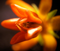
| 10/06/2006 01:10:50 PM |
Dragon's Mouthby ladyhawk22Comment: The technicals: Nice DOF and composition. You didn't oversaturate the reds and oranges too much which is good because they quickly become so in the digital format. I will bet more than one comment mentioned the blown highlights. Pretty much a no-no since they are large and are close to the main focus of the picture. I might have tried a polarizer.
The feel: Reasonably abstract. The square crop neither helps nor hurts. It probably suffers from being a bit "standard" (too many other shots like it).
The game: Flowers...love em or hate em. If you want to score well with a flower you have to a) shoot in an interesting way (you did that) and b) be PERFECT on technicals. People will devour any shortcoming all the more because it is a flower. |
| Photographer found comment helpful. |
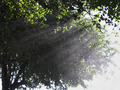
| 10/06/2006 12:53:37 PM |
Here Comes The Sunby GeneralEComment: A very difficult shot to pull off, so don't feel too bad. The blown sky is one of the issues that would have been quite hard to overcome. I'm not even quite sure how you'd do it. Does the tree seem to you like it's ready to fall to the right? I get that feeling and don't know if it's just me or the crop or what.
The mist probably limited you a bit too. I'm guessing it wasn't falling "down", but rather floating around. Had the drops been more like rain and falling, I would have tried a longer shutter speed to add some motion blur. The horizontal sun rays and vertical rain blurs may have been cool.
Don't sweat it too much. You really did take on a hard, hard shot.
EDIT: after reading the other comments, they did a better job of relating that the mist doesn't quite look like rain and confused people. I was getting at that in my paragraph above... Message edited by author 2006-10-06 12:54:56. |
| Photographer found comment helpful. |
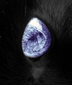
| 10/06/2006 12:45:01 PM |
The Blue Carbuncleby hihosilverComment: Heh, Holms or not, I'm not sure I'd put "carbuncle" in my title...
OK, the picture. The idea is good. I even thought of doing an eye for this challenge. The biggest issue here is the reflections off the cornea which detract from the blueness of the eye. Although the blacks of the fur are true blacks (and you did well to preserve detail), you can see the black of the pupil is actually quite light. Compare this to the 6th place entry and you can see a distinct difference. Sharpness is a bit of an issue, but not too much of a biggie. I do think the rotation added to the abstract nature. |
| Photographer found comment helpful. |
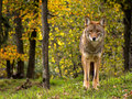
| 10/06/2006 12:34:05 PM |
Coyote Prettyby ronnytComment: Excellent capture of the coyote. Very nicely lit and sharp. However, I'd have to say that the background qualifies as "bad" bokeh. I don't know if it's the lens or PP, I'm guessing a filter was used on the background. You still get a good score though, but would have been higher with a better BG treatment. 7 |
| Photographer found comment helpful. |
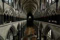
| 10/06/2006 12:11:33 PM |
Salisbury Cathedralby milo655321Comment: Dang, I don't remember being able to go up higher when I visited a number of years ago. You were likely limited by the wide angle of your lens, but a vertical composition would have been much better to emphasize the narrow configuration of the church. The lighting was a pain, I'm sure, but something else needs to be done here as well. B&W? I think bump the midtones. 5 |
| Photographer found comment helpful. |
| 10/06/2006 12:08:37 PM |
|
| Photographer found comment helpful. |
Home -
Challenges -
Community -
League -
Photos -
Cameras -
Lenses -
Learn -
Help -
Terms of Use -
Privacy -
Top ^
DPChallenge, and website content and design, Copyright © 2001-2026 Challenging Technologies, LLC.
All digital photo copyrights belong to the photographers and may not be used without permission.
Current Server Time: 06/18/2026 05:07:42 PM EDT.