| Image |
Comment |
| 02/08/2007 01:28:55 PM |
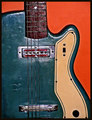
Two Strings Shortby HipychikComment: The technicals: lighting is good. colors are nicely contrasted. Yes, it's sharp. You get away with it on the guitar on my monitor, but I run 1900x1200 and I bet on a lower res it is too sharp. The sharpness, however, does not work with the texture of your wall. It comes across as noise. I would have applied a gaussian blur to the background (or just masked off the sharpening). Is the guitar slanting just slightly to the left?
The feel: A nice feel and a simple shot. I mostly like the contrast of the blues and orange and the curve of the body.
The game: A subtle shot. If you enter subtle, don't worry about the score not being in the stratosphere. It rarely happens on DPC. |
 Photographer found comment helpful. Photographer found comment helpful. |
| 02/08/2007 01:23:58 PM |
Whale Tailby Mr_PantsComment: The technicals: Well done. You did a good job managing the sun directly in the shot. We have nice gradient in the sky instead of vast amounts of blow out.
The feel: I think the composition hurts here. I do like the clouds as an addition and would keep them, but I would have moved so the tail fills up more completely the frame (that is, less negative space in the direction of the sun). Personally, I don't like the speedwing detail. I like to have objects either have a good dynamic range of detail or be compeltely sillouetted. This is sort of a quasi-world in between and that usually fails.
The game: Yes, a subtle shot for DPC. Don't worry about the score on a shot like this. However, I do think you could have made some improvements (as mentioned above). |
| Photographer found comment helpful. |
| 02/08/2007 01:19:28 PM |
The Lone Limeby UbersteinyComment: Short comment because you are over 5.5
The picture works with the DOF and color contrasts, but the long stem without leaves, while going with your title, isn't that appealing to me. |
| Photographer found comment helpful. |
| 02/08/2007 01:13:01 PM |
Waitingby MelethiaComment: You only get a short comment because you didn't score less than 5.5 silly.
Is your monitor calibrated? I see you mention more "detail in the ceilings". On my monitor (calibrated just last week), I see almost nothing in the ceiling. You may have an overbright monitor. |
| Photographer found comment helpful. |
| 02/08/2007 01:09:43 PM |
Sunset at the Suffolk Coastby kevip6Comment: Technicals: While you kept the exposure on the sky (that's important), it was only at the cost of very much reduced detail in the land. You want to do one of two things here. 1) burn the land into complete sillouette or 2) use either a graduated ND filter or processing techniques (such as tone mapping or HDRI) to bring up the detail. You may have been able to do the poor man version of 2 by bringing up midtones in the picture.
The feel: I have learned that the best sunsets have very interesting cloud formations. That's lacking in this shot. Not your fault, but it still limits the picture.
The game: You can see by the overwhelming number of 5 votes that people didn't think the shot was bad, but were hardly excited by it. (no 9s no 10s) The best thing you could have done would have been to pick a day with more interesting clouds (if that were possible). |
| Photographer found comment helpful. |
| 02/08/2007 01:03:13 PM |
Sensory Overloadby nards656Comment: The technicals: I like bounce flash so I think your lighting is excellent. Your composition is nice with the slightly off centered foreground subject. The color scheme works well.
The feel: What are you trying to accomplish here? This is where the picture fails. The title gives us the impression we should be "overloaded" either literally or virtually in one of our senses. Visually, the picture is more bare than crowdede. We could imagine an overload of coffee smell (mmmmm), but not in this picture. I can hardly see the coffee and it is trapped in the sterile cage of a white filter. The DOF, while nicely done, also does not add much here other than to meet the challenge.
The game: you were rewarded with a near five because your techincals were well done. You were not rewarded with a higher score because the picture fails for the reasons above and does not transcend beyond an exercise in shallow DOF. |
| Photographer found comment helpful. |
| 02/08/2007 12:57:00 PM |
The Nerf Ball Blasterby hopperComment: The technicals: excellent. Lighting is nicely smooth. Background is black. Conversion to B&W is wonderful. Composition is good except I would have moved the nerf gun down may two inches. You get both her eyes (which is good), but the half-cut glasses, to me, is a poorer choice than making them all visible.
The feel: subtle. captures a bit of who she is. Like I said above, a bit gutsy to hide some of the face for a portrait, but you almost got away with it. Showing just a bit more would have been better.
The game: too subtle for DPC. Don't worry about that. You can tell it's a quality shot from only having 8 votes of 1-3 and far more 6s than 4s. It just doesn't have the "wow" to carry the day at DPC. |
| Photographer found comment helpful. |
| 02/06/2007 07:29:23 PM |
|
| Photographer found comment helpful. |
| 02/06/2007 07:28:56 PM |
|
| Photographer found comment helpful. |
| 02/06/2007 07:28:41 PM |
Shyby pacpintoComment: I like it. This is my style for personification. Unfortunately there weren't many of y'all. 8 |
| Photographer found comment helpful. |
Home -
Challenges -
Community -
League -
Photos -
Cameras -
Lenses -
Learn -
Help -
Terms of Use -
Privacy -
Top ^
DPChallenge, and website content and design, Copyright © 2001-2026 Challenging Technologies, LLC.
All digital photo copyrights belong to the photographers and may not be used without permission.
Current Server Time: 06/11/2026 08:11:05 AM EDT.