| Image |
Comment |
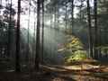
| 12/10/2005 11:27:15 AM |
The Chosen Oneby AndersComment: Love to see shots like this without any post processing. Just goes to show that composition and timing (as well as a great eye!) can still make awesome photos. Great job! |
 Photographer found comment helpful. Photographer found comment helpful. |
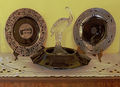
| 12/05/2005 10:51:33 PM |
Some of our favorites from Cambridgeby olddjComment: lovely plates, I can understand why they would be favourites. The background and lighting for this shot does not do them justice. The crystal stork (?) would be better viewed with a darker colour behind it that would bring out the features better. The detail on the plates would probably also be more eye-catching with a dark background. |
| Photographer found comment helpful. |
| 12/04/2005 02:48:11 PM |
Turtlesby KivetComment: Really like the composition and the colours on the white background. A shraper focus may have improved this shot. |
| Photographer found comment helpful. |
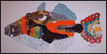
| 12/04/2005 02:44:39 PM |
CD fishby sarnComment: love the concept. The colours may have popped better if you had used a black background. As it is, the white labels and the blue labels tend to blend more into the background and not give it as much definition as it could otherwise have. |
| Photographer found comment helpful. |
| 12/01/2005 10:44:26 AM |
December Collectionsby lissylouComment: good composition of ornaments. You may want to consider ironing your backdrop cloth next time so that the creases don't distract from the subject (expecially when they run between the articles) IMHO |
| Photographer found comment helpful. |
| 11/30/2005 06:11:09 PM |
My Trophy Collectionby ChilibeanComment: I think black may have been a better background colour choice for this to really make the gold of the trophies pop. |
| Photographer found comment helpful. |
| 11/30/2005 06:09:16 PM |
Fae Dancingby AkashaComment: too much usm? (can see pixelation around edges of fairy) |
| 11/30/2005 06:04:03 PM |
Stamp Collectionby LedZeppelin588Comment: may have been more effective to have the larger frame in the foreground in focus as it dominates the shot and takes away from the smaller in focus frame at the back. |
| Photographer found comment helpful. |
| 11/30/2005 06:01:03 PM |
Vintage Holidayby tpocComment: good lighting and interesting subject. Whole picture seems to be slanted. Don't know if this was intentional but would have preferred to see it rotated a couple of degrees to the right to align the top of his has straight with the top border. |
| Photographer found comment helpful. |
| 11/30/2005 05:57:22 PM |
My pet collection.by WessyComment: nice, warm fuzzies. The lighting seems a little flat and doesn't bring out any depth to the shot. Perhaps a side or overhead light may have improved this shot. |
| Photographer found comment helpful. |
Home -
Challenges -
Community -
League -
Photos -
Cameras -
Lenses -
Learn -
Help -
Terms of Use -
Privacy -
Top ^
DPChallenge, and website content and design, Copyright © 2001-2026 Challenging Technologies, LLC.
All digital photo copyrights belong to the photographers and may not be used without permission.
Current Server Time: 07/16/2026 02:09:37 AM EDT.