| Image |
Comment |
| 02/26/2006 12:20:06 AM |
The Life of Cambodiaby claramarieComment: love the composition of this shot and the colours work well. I think adding more contrast and a levels layer to avoid blowing the highlights would help it to really pop. |
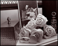
| 02/25/2006 07:02:42 PM |
_by davidbedardComment: studied this for a while before I realized that it is the angle of the box that gives it the feel that the whole shot is leaning. I like the grouping of the items and the sharp focus and choice of colour tones really enhance the subject. |
 Photographer found comment helpful. Photographer found comment helpful. |
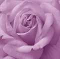
| 02/25/2006 01:51:27 AM |
Natures Beautyby trainComment: I really like the way the lighter purple tones in this emphasize the soft look of the petals and the darker tones emphasize the veins and depth of the flower. |
| Photographer found comment helpful. |
| 02/25/2006 01:41:41 AM |
Night Sky Reflectionsby MacDonaldComment: interesting choice to flip to the shot. Not sure I appreciate your perspective. I like the use of blues and the dark contrast with the blacks. |
| Photographer found comment helpful. |
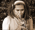
| 02/25/2006 01:37:52 AM |
Sax soloby burtctComment: You've probably heard this already but that is a trumpet, not a sax. Good composition and focus on subject. Great colour tones. Something strange looking about the edges of his hands and left arm. |
| Photographer found comment helpful. |
| 02/23/2006 09:57:05 AM |
Heart of the Roseby KivetComment: Cool shot! Would be interesting to see it if you do choose to re-edit to change the yellow eye. I tend to agree with your other commenters that it is a bit distracting. Really love the idea and compostion of the shot. |
| Photographer found comment helpful. |
| 02/11/2006 06:12:25 PM |
Pastel...by agwrightComment: Like the colours and the concept. I would have scored this higher with the neck of the pink vase? cropped lower so the line of colour ran more to the upper right hand third of the shot. |
| Photographer found comment helpful. |
| 02/11/2006 06:01:09 PM |
|
| Photographer found comment helpful. |
| 02/11/2006 05:55:20 PM |
|
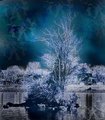
| 02/05/2006 12:19:06 AM |
tree.jpgby o2bskatingComment: Cool effects with this shot! I really like the blue colours. What did you do to get the sky like that? |
| Photographer found comment helpful. |
Home -
Challenges -
Community -
League -
Photos -
Cameras -
Lenses -
Learn -
Help -
Terms of Use -
Privacy -
Top ^
DPChallenge, and website content and design, Copyright © 2001-2026 Challenging Technologies, LLC.
All digital photo copyrights belong to the photographers and may not be used without permission.
Current Server Time: 07/16/2026 03:43:43 PM EDT.