| Image |
Comment |
| 08/02/2006 08:13:35 PM |
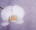
White Orchidby w4jzzComment: I like the muted colours and composition. Overall, slightly too much blur for my taste. |
 Photographer found comment helpful. Photographer found comment helpful. |
| 08/02/2006 08:01:48 PM |
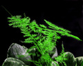
Zen-Likeby ChinabunComment: I like the bright greens against the dark background balanced by the rocks at the bottom. I do not like the piece of stem on the left with no leaves and feel it would have been a stronger image without that. |
| Photographer found comment helpful. |
| 07/26/2006 10:29:13 AM |
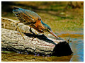
Green Heronby manishkComment: I think this shot meets the challenge very well. For the challenge, I know you couldn't spot edit the bark, but now you might want to try darkening some of the brighter highlights on the log to put more emphasis on the bird. For sharpening, you might want to try having the threshold at 0 when doing your unsharp mask. I like your overall composition and the colours are great. |
| Photographer found comment helpful. |
| 07/21/2006 02:21:19 AM |
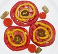
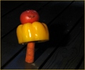
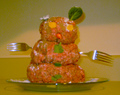
matosby eye has not seenComment: nice colour combinations with the tomatoes, carrots, mustard and peppers. I like the arrangement. I don't like the washed out celery bits. |
| 07/21/2006 02:18:50 AM |
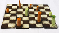
Check Mate - Carrots Winby indridistefansComment: I like the idea and the composition. The lighting does not bring out the potential this has, perhaps something softer or at more of an angle would enhance the "chess pieces" more. |
| Photographer found comment helpful. |
| 07/21/2006 02:15:10 AM |
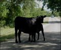
It's What's for Dinnerby CamComment: too rare for me, I like mine more of a medium-well done. :) A fill flash may have helped catch more detail in the animals face and added more interest to the shot. |
| Photographer found comment helpful. |
| 07/21/2006 02:12:46 AM |
|
| Photographer found comment helpful. |
| 07/21/2006 02:11:03 AM |
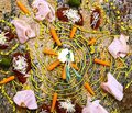
I'm getting sleeepy.....by jadComment: interesting mix of food and condiments. The overall effect is too busy for my taste and the lighting is very flat. |
| Photographer found comment helpful. |
| 07/21/2006 02:08:45 AM |
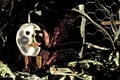
Frosty's rarely seen little brotherby cryingdragonComment: humourous subject choice. The lighting used does little to enhance the photo, perhaps more of a side light might have added more interesting shadows. The background colour may have been better had it been more opposite rather than so similar in tones to your subject. |
| Photographer found comment helpful. |
| 07/21/2006 02:05:04 AM |
Rave a Peelby littlegettComment: interesting, but not to my taste. I am not sure what the items in the chicken wire are to represent but if the "character" is the focus, they do detract from it. |
| Photographer found comment helpful. |
Home -
Challenges -
Community -
League -
Photos -
Cameras -
Lenses -
Learn -
Help -
Terms of Use -
Privacy -
Top ^
DPChallenge, and website content and design, Copyright © 2001-2026 Challenging Technologies, LLC.
All digital photo copyrights belong to the photographers and may not be used without permission.
Current Server Time: 07/16/2026 11:10:24 PM EDT.