| Image |
Comment |
| 04/14/2004 06:49:07 AM |
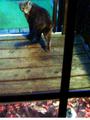
Looking back........by tolovemoonComment: Assuming the noise and poor sharpness is a limitation of your camera I won't judge the picture on that. You could have cropped the bottom part away, up to the horizontal bar, the leave area doesn't add anything. The cat could have done with some more space around it, it is very close to the edge. And for me it is an uninteresting picture, although meeting the challenge. |
 Photographer found comment helpful. Photographer found comment helpful. |
| 04/14/2004 02:46:33 AM |
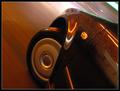
Night racerby aKiwiComment: Worked out really well, I like the raindrops adding extra sparkles. Just wondering how you attached the tripod to your door, it is such a smooth surface, did you do it with open window ? Front or back door ?
You might want to check my How'd they do that ? for some different angles using a tripod on the front. |
| 04/12/2004 03:28:25 PM |
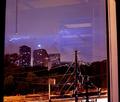
4th floorby jab119Comment: Should have gone to the 5th floor (if there was one) to get rid of these electricity poles. And switch off the light inside to avoid reflections. Nice try but a bit too messy for me. |
| Photographer found comment helpful. |
| 04/12/2004 03:25:52 PM |
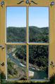
The American Riverby ChrisW123Comment: The window is so bright, sharp and colorful that it competes for attention with the landscape. Feels almost like two images (I assume it is not). |
| Photographer found comment helpful. |
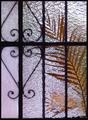
| 04/12/2004 03:06:07 PM |
ventana miaby rananculusComment: A great idea and a wonderful image. I like the recognisable leaf and steel with the patches of soft colors behind it. A pity the glass on the left has a different structure, I would suggest to maybe try to crop it out and see whether it makes the image stronger. |
| Photographer found comment helpful. |
| 04/12/2004 06:30:05 AM |
The Windmillby photomComment: I would have cropped of the left part up to the yellow frame to create more of an abstract view of it. That part now draws attention away from the rest. |
| Photographer found comment helpful. |
| 04/10/2004 01:55:16 PM |
|
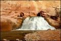
| 04/06/2004 02:29:03 AM |
Fremont Fallsby pitsamanComment: Yes, a classic waterfal/rocks texture picture, but also rather boring IMHO. It looks so static despite the flowing water. I think it is taken too much head on, straight from the front, and the leading lines could be stronger. The flow of water is to the left out of the picture, you really want it to flow out of the front. I would have tried to get a bit closer, just before where those three stones are piled up. And then get closer to the ground. Or even get a bit into the water, still leaving the ground visible on the right of the picture. This might create a more dynamic feeling to it. |
| Photographer found comment helpful. |
| 04/05/2004 08:08:40 AM |
Watch out !!!! (no edit)by willemComment: I have prepared a small "How'd They Do That ?", to be published shortly, including a picture of the setup. I'll post a link as soon as available. |
| 04/05/2004 02:22:10 AM |
Overwhelmedby jpochardComment: Amazed this one did not finish higher, it was in my top 5. One of the more original idea's and certainly well executed, with good expression and good colors, a clear message. Could be used in an advertisement for headache pills. |
| Photographer found comment helpful. |
Home -
Challenges -
Community -
League -
Photos -
Cameras -
Lenses -
Learn -
Help -
Terms of Use -
Privacy -
Top ^
DPChallenge, and website content and design, Copyright © 2001-2026 Challenging Technologies, LLC.
All digital photo copyrights belong to the photographers and may not be used without permission.
Current Server Time: 06/18/2026 05:08:15 PM EDT.