| Image |
Comment |
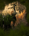
| 06/05/2008 06:18:14 AM |
Twilight Reflectionsby APComment: 8 - Beautiful image/scene... undecided if it is a touch too top heavy, but still.. very nice and would make a very nice print/wall sized - has a 'painterly' feel. |
 Photographer found comment helpful. Photographer found comment helpful. |
| 06/05/2008 06:13:15 AM |
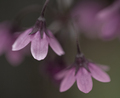
Belle Vieby Millere81979Comment: 7 - Nice isolation - wonder about a variation in composition, mainly for balance... difficult at this size - likely an intentional composition underappreciated on my current monitor. |
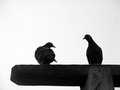
| 06/05/2008 06:09:49 AM |
Birds in loveby gauravComment: 3 - I like your composition / crop, but the quality doesn't seem there, which could still work, but this isn't interesting enough for me to keep my attention - plus your title makes me look for 'the look of love' - and I can't see it, maybe cleaning candid, curious pigeon candid.. but no 'love'. |
| Photographer found comment helpful. |
| 06/05/2008 06:05:58 AM |
Tower Viewby cstein96Comment: 3 - Clouds are the most interesting part of this image, therefore your title just works against you, in my opinion - especially also because your tower is so far on the edge of the frame. |
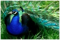
| 06/05/2008 06:05:35 AM |
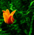
Bird of Rainbowsby goinskiingComment: 6 - Nice image, grows on you - can't help but think (especially on a cursory look) that, if the grass didn't dominate quite so much - this would be a much stronger image. |
| Photographer found comment helpful. |
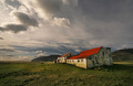
| 06/05/2008 06:02:41 AM |
New Morning, Old Worldby StructorComment: 7 - Nice country scene with a somewhat 'gritty' feel.. can't help but wonder about more off the right to make this even stronger, especially with the way the 'mound' (not really a hill) slopes toward the center of the frame/image. |
| Photographer found comment helpful. |
| 06/05/2008 06:01:16 AM |
The Red Chairby shankswareComment: 5 - Colors are nice, as is the lighting - to me, the tilt is not strong enough to pack the (perhaps) intended punch with the image .. if that makes sense. |
| Photographer found comment helpful. |
| 06/05/2008 06:00:15 AM |
Spring Gardenby QuigleyComment: 6 - Nice rich colors - compositionally seems a little off - mainly because the flower is facing toward the outside of the frame. |
| Photographer found comment helpful. |
| 06/05/2008 05:58:37 AM |
Dreamyby sigrun_thComment: 7 - Nice and subtle. Colors are a little 'dull' but that works with this image, in my opinion. |
| Photographer found comment helpful. |
| 06/05/2008 05:57:47 AM |
First Rack of Hornsby loriprophotoComment: 6 - Nice capture.. could just be the perspective but this seems slightly tilted.. even if just visually. Can't help but wonder about a variation in composition too to make this even stronger and have him dominate the frame more. |
| Photographer found comment helpful. |
Home -
Challenges -
Community -
League -
Photos -
Cameras -
Lenses -
Learn -
Help -
Terms of Use -
Privacy -
Top ^
DPChallenge, and website content and design, Copyright © 2001-2026 Challenging Technologies, LLC.
All digital photo copyrights belong to the photographers and may not be used without permission.
Current Server Time: 07/19/2026 10:02:53 PM EDT.