|
|
|
Showing 491 - 500 of ~4957 |
| Image |
Comment |
| 07/25/2009 08:21:30 AM | Toto in Pinkby geinafetsComment:  Critique Club Critique
First Impressions
Critique Club Critique
First Impressions
A good photo opportunity, but the angle isn't so complimentary for Toto. Not enough 'street context' to be a strong street photography image.
Photograph Information, Technicals & Composition Review
I don't mind at all that there are no people in the image (although I see the OOF (out of focus) rear someone), but I would like to have seen more context, as mentioned above, especially for this Challenge. The scene looks like it may have been interesting and full of color too, which would have added some more story and interest overall.
With the close crop and focus on the subject as is, I find the image unbalanced and dominated by the upper area.
Comments, Score & Placement Review
44/135 and a score of 5.46 is quite a good placement for this Challenge. Your commenters didn't get a strong sense of street photography either. More context would definitely have helped you.
Summary
A good opportunity that you probably didn't have much time to compose and frame, the color combinations are interesting and work well (although the green throws the balance out a little). Perhaps a little more DOF (depth of field) and more context would have given the image more of a story to tell. |  Photographer found comment helpful. Photographer found comment helpful. |
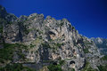
| 07/25/2009 08:10:15 AM | Amalfi coastlineby Rino63Comment:
Critique Club Critique
First Impressions
A nice specimen of this part of the world that shows man's engineering skills to get around it.
Photograph Information, Technicals & Composition Review
Whilst the blue is rich, the barely discernible gradient seems out of balance upper right. The scene doesn't seem to be placed within the frame in a way that leads the eyes in and around to explore. It would have been good to see a little tighter crop if the quality was there and be able to see more detail in the mountain face, that or a little more context, more background mountains showing the land formations may have given this some added interest. As is, the crop looks like parts are missing, such as below the road at the bottom of frame, the upper left peak of the mountain and the distant mountains to the right.
Comments, Score & Placement Review
53/182 with a score of 5.30 is not such a strong showing for this Challenge - I suspect that, whilst the geological formation is good, there was no main focal point, or feature placement compositionally, to hold a viewer's attention and draw them in to linger for a while. Your commenter's provide some good feedback and there are some helpful points made too.
Summary
A more refined crop and choosing a section of the image to feature more would likely have given this image a bit more of an edge. As rich as the sky is, it probably dominates the subject a little too much. | | Photographer found comment helpful. |
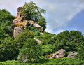
| 07/24/2009 07:14:07 PM | Robin hood's strideby alpharichComment:
Critique Club Critique
First Impressions
A good selection of rocks/boulders, but the trees are getting in the way.
Photograph Information, Technicals & Composition Review
You used Capture NX in anger, interesting - I'm sure you're not the first. You say you will go back later in better light, that might allow you to take a different vantage point to minimise the trees and shrubbery a little better. Perhaps a change of lens is in order, especially to focus better on the rocks. The most interesting area seems to be at the top, so my eyes are interested to see more detail there.
Comments, Score & Placement Review
52/82 is not that great, but I'm guessing you are there because nothing 'jumps out' in the image to hold a viewer's attention long enough to explore the image. Your commenters like the scene and most seem to like the greenery mixed in.
Summary
For me, much stronger for this Challenge with less greenery, maybe even a bold crop off the bottom to allow the top area to dominate more, if the quality was there in your image to allow that, which it does appear to be. | | Photographer found comment helpful. |
| 07/24/2009 07:03:28 PM | Brief history of timeby olbolComment:
Critique Club Critique
First Impressions
I like the way it looks somewhat like a landscape on first look. The lighting is interesting, but results in a harsh contrast that detracts from the subtle patterns, texture and colors of the rock/crystal.
Photograph Information, Technicals & Composition Review
The combined image you mention might have shown more detail, alas with Basic you had to 'redo' and abide by the Rules. Good for you for making that effort. Composition wise it is ok, as mentioned, this composition lends itself to another 'scene'. I can notice, only barely, what appears to be black fabric in the background, but minor. A more refined crop around the patterned areas of the crystal would have been better.
Comments, Score & Placement Review
31/82 is quite good. Your commenters all like your vision.
Summary
A good subject choice that a variation in lighting may have showcased even better. Would also have liked to have seen this a little sharper with more texture discernible.
| | Photographer found comment helpful. |
| 07/24/2009 06:55:28 PM | Street Photography In Color! by howie733Comment:
Critique Club Critique
First Impressions
Certainly quite a 'gay' image. There's a street sign, it's very colorful, your title reinforces the Challenge - I guess you made it over the line. However, there's not much interest in it for me to hold my attention.
Photograph Information, Technicals & Composition Review
I see you've selected the Humor gallery for this and I imagine many folk find this an amusing image, however it doesn't have that appeal for me. Composition wise, especially for this Challenge, it seems too 'squashed' into the frame. More street, more pose, more context would likely have allowed other elements to come into play more and create more interest and story. The image also looks like it may benefit from straightening.
Comments, Score & Placement Review
59/135 is pretty good for this Challenge and the score of 5.28 seems about average. Your commenters all seem to like it and enjoy the frivolity of the image.
Summary
Cropped this close the colors clash a little in my opinion and I can't help but imagine a richer scene out of the frame. It's a moment captured, but the character looks like he has more of a story than this crop is allowing to be told. | | Photographer found comment helpful. |
| 07/24/2009 06:46:26 PM | The good news, we put out the fire. The bad news, well your truck...by ejfrothComment:
Critique Club Critique
First Impressions
Good photojournalism and capture. I'm thinking Road Photography (maybe a different Challenge idea). The spirit of Street Photography is not so strong in this image for me, but it is somewhat borderline.
Photograph Information, Technicals & Composition Review
Composition is quite sound, although the image looks like it may benefit from a slight nudge rotate up on the left. Again, difficult because of the Challenge, but maybe cropping in a little tighter would have removed more of the rural feel.
Comments, Score & Placement Review
15/135 is very good for this Challenge. The one comment that seemed to have the Challenge at the fore of their mind you didn't find helpful, which makes me wonder whether you were aspiring to awe the voters with the capture rather than meeting the Challenge. Given your score, placement and most of the comments, it seems you did that well.
Summary
Again, good capture but not Street Photography enough for me. Maybe more context (despite my crop comment above) may have given this more for this Challenge, if you had it and wanted to evoke that feel in your image. |
| 07/24/2009 06:35:28 PM | Beijing in the eveningby shamblesComment:
Critique Club Critique
First Impressions
Not getting a 'Street Photography' feel from this image. Comes across as a landmark/nightshot photograph more.
Photograph Information, Technicals & Composition Review
After reading your comments that you were trying to get the feel of the Forbidden City area in the evening - I think you achieved that quite well, but without people in the scene, or streets visible, it is struggling as a contender in this Challenge. The image as is can't be modified to show these aspects either. Composition wise it is too centered for me and the angle of the building is pointing 'out' of frame so throws the visual balance out. The hedge dominates the frame too much as well, without being a 'feature'.
Comments, Score & Placement Review
79/135 and a score of 5.06 is quite good, considering the Challenge and the lack of a stronger street scene. I agree with the first comment.
Summary
Looks like more potential venturing up into the City than has been captured from this distant vantage point. Street photography in itself requires a certain 'boldness' - it is not for everyone. As is, perhaps tweaking the colors and lighting in pp may have given this more pop - but would still fall short of the Challenge. | | Photographer found comment helpful. |
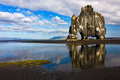
| 07/24/2009 06:12:29 PM | Ancient creatureby pallComment:
Critique Club Critique
First Impressions
First impression is "oh cool, the Blue Ribbon image". That pushed aside, second is I admired this image the other day, my 'first impression' then was: what an awesome geological formation. Definitely well titled and indeed looks like a creature.
Photograph Information, Technicals & Composition Review
Composition wise I like the placement of the creature and also the placement of the colors within the image, they provide good visual balance. The reflection is well retained and the cloud formation leads the eye to the creature. The image overall looks like it needs a whisker nudge up on the left but could be a perspective correction option instead.
Despite not being able to see much detail in the rock itself, the mass and formation of it speak for itself. Part of the interest is in the shape the rock has formed, so going in closer would lose that aspect and be an entirely different image (although I'd hazard a guess, still very unique and interesting).
Comments, Score & Placement Review
First place - can't be complaining. I did look at the other image of this formation by  Brin Brin and, while an excellent image, shows a different scene and creates a different mood and feel entirely.
Some commenters mentioned the people, luckily I think they're subtle enough that you get away with it. Perhaps waiting for them to disappear next time - if that opportunity arises.
The commenters loved it - it's a Winner.
Summary
Nice lighting and capture of the hoovering mammothorhinotriceratopsyak. I like the bird elements and wonder about a slightly tighter crop to allow them to come into play more, but that is 'another image'. Thanks for sharing this image showcasing more of your country's amazing landscapes. | | Photographer found comment helpful. |
| 07/24/2009 05:50:49 PM | Cyclistsby danculwellComment:
Critique Club Critique
First Impressions
There is some interest in the cyclists and other basic elements, which the simplicity helps come into play more - the fire hydrant, the ONE WAY sign, the red 'Stop' hand and the PARKING signs.
Photograph Information, Technicals & Composition Review
After reading your comments, I'm struggling to see a homeless man on the left. The composition is quite sound, although the perspective seems out by a fraction. This is an image that I think may have been stronger in b&w. I like the leading path with the person walking down it. Sounds like you enjoyed the challenge of Street Photography and will explore this photographic style more in the future, which is another added benefit of entering different themed Challenges at DPC.
Perhaps simplifying this image even more by cropping out the left person seated would have allowed the main characters to feature more. Nothing to be done (beside waiting for other passer-bys) about the fire hydrant view blocked by the passing cyclist, but my eye instantly wanted to see that isolated at first, especially because of the color element.
Comments, Score & Placement Review
121/135 with a score of 4.53 seems like a fair score, but perhaps a hard placement, especially given you seem to have made an effort to shoot for this Challenge. That's always a little disappointing, but don't let that deter you from pushing your boundaries in the future.
Each of your commenters seems to offer some good subtle points and pointers. Hearing what people like in an image (when they mention it) allows you insight into how your viewers perceive your image and what their eyes are drawn to.
Summary
Some interesting elements captured in an everyday scene. Nothing is holding my interest strong enough for me to linger too long within the image. My favorite part is probably the feeling of depth captured (despite the focal length), which I think the large PARKING sign helps come into play. | | Photographer found comment helpful. |
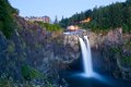
| 07/24/2009 05:28:41 PM | Twin Peaksby CraigDComment:
Critique Club Critique
First Impressions
First impression is that this is more about the water and overall scene than the geology. Second aspect I notice is that the rock/geology closer to the fore is too dark to discern.
Photograph Information, Technicals & Composition Review
A deeper depth of field may have produced more detail in the rock, especially at the fore. After reading your Photographer's Comments I see that you were aware that the main focus of the image was not the geology, although by default it is included. Even cropping the buildings out, whilst destroying the landscape scene, would still allow the geological formations to come into play more than they do with the composition and image as it is, in my opinion.
Comments, Score & Placement Review
25/82 with a score of 5.83 is a fair score and placement in a difficult Challenge. You awakened memories in many of your commenter's which was in your favor. One of your commenter's makes a good point.
Summary
The crop and lighting on the rock formation isn't showcasing it strong enough for this particular Challenge. The main subject dominates more than the Challenge theme, but you produced a strong enough image of that to woo the voters anyway. I like the flow of the water and the flowers in the corner, but would like to have seen this showcase the "erosion or a fault" more. | | Photographer found comment helpful. |
|
Showing 491 - 500 of ~4957 |
Home -
Challenges -
Community -
League -
Photos -
Cameras -
Lenses -
Learn -
Help -
Terms of Use -
Privacy -
Top ^
DPChallenge, and website content and design, Copyright © 2001-2026 Challenging Technologies, LLC.
All digital photo copyrights belong to the photographers and may not be used without permission.
Current Server Time: 07/16/2026 09:54:49 PM EDT.
|