|
|
|
Showing 481 - 490 of ~4957 |
| Image |
Comment |
| 07/25/2009 11:21:31 PM | Coming Together at the Cornerby kewzooComment:  Critique Club Critique
First Impressions
Critique Club Critique
First Impressions
I see a drive-by shooting and wonder if you would have taken this image if you were standing on the street. I see vulnerable people photographed. Yes, yes, they are 'characters', I see that - I guess I see a 'cheap shot' more. Many will not agree with me, and that is ok - candids can be a sensitive subject with photographers. I can appreciate them, but I feel the need to draw the line at certain times.
Photograph Information, Technicals & Composition Review
Just read your comments and it seems you were conscious of your subjects' vulnerability. The other elements you mention, such as the baseball I also saw and do find it a good element for the photograph, just like the dolls.
Who knows, perhaps the fact this has been taken from the car is unsettling my opinion of the photograph - it could be a different image altogether with a slightly different vantage point. As is, the car vantage point just dominates the image too much. Perhaps a bold crop, losing the car entirely, may have created a different image, but you may not have had the quality in the zoom to do so.
Comments, Score & Placement Review
113/135 - I'm curious if this placement is because my sentiments are echoed with many voters, or if it is because of the technicals and distractions.
Most of your commenters like it and found the humor in it.
Summary
In a different situation, perhaps this could have worked and told more of a story, as is, the story I get isn't one I'm interested in. Admittedly, I am probably not the biggest fan of this style of street photography. In fact, you may benefit from seeking different opinions from those who are avid street photographers. |  Photographer found comment helpful. Photographer found comment helpful. |
| 07/25/2009 10:56:25 PM | Erosion by drick172Comment:
Critique Club Critique
First Impressions
(Deja Vu) I admired this briefly the other day and my first impression then was: a beautiful image with a well done long exposure, featuring one of my favorite birds, but the geology aspect wasn't as dominant as I'd like to have seen for the Challenge, but only slightly. The image of course shows good formations, but there are other fine elements within the image that compete for center stage.
Photograph Information, Technicals & Composition Review
Composition is very good, perhaps a little more visual balance by a little more height in the rear rock and a slightly tighter crop at the bottom, not sure - but of course, with the bird in this position and the flow of the waves - some things cannot be 'shifted'.
The lighting on the rocks, especially at the rear, is nice and warm and shows the surface and details well. The control of the whites looks very good and it sounds like you notched it up just right in pp.
It's good to hear you printed a larger version of this and are content with it.
Comments, Score & Placement Review
As I've said before: first place, can't complain. 7.25 I see is your new PB, so well done with this excellent score. You won the hearts of most of your commenters.
Summary
A rare opportunity well captured - you produced a very serene and gentle image that shows the constance and harmony between geology and other elements of nature. | | Photographer found comment helpful. |
| 07/25/2009 10:30:53 PM | Lookby bjoernComment:
Critique Club Critique
First Impressions
Hmm, seems a tourist type shot at a bridge or similar - but even so, could still classify as Street Photography, however there are not enough people in focus, or at least where the eye first rests, to create the interest.
Photograph Information, Technicals & Composition Review
Ok, just read your comments - if your favorite part of the image was the two people at the front, I don't understand why you didn't allow them 'center stage' more. The OOF (out of focus) areas dominate the image too much and cause a distraction from these two. Aside from that, with everyone looking down, and the man pointing down, the mind wants to either 'see down' or at least have some space leading down within the frame.
A more refined crop would also have helped. Perhaps even a very bold one, bringing the girl's distant look into play.
Comments, Score & Placement Review
98/135 seems a little harsh, perhaps - but your last commenter provides some very good insight into your image.
Summary
Possibly good potential with the image as is, but would likely take a bold crop and some tweaking in pp to enhance & portray the 'moment'. | | Photographer found comment helpful. |
| 07/25/2009 10:12:17 PM | Always on the sunny side.by EgillPComment:
Critique Club Critique
First Impressions
The girl in the window adds interest and makes a good candid. The lady at the table appears somewhat uncomfortable and the jacket, etc makes this photograph seem more of a tourist type snap becase of that (girl in the window aside).
Photograph Information, Technicals & Composition Review
The eyes are unsure which subject to focus on, as mentioned above, the girl on the phone provides more interest - perhaps this image may have allowed more of the 'cross-mix' of stories/situations to be told better if there was a little more context.
A more refined crop at the top would be good too, but fairly minor.
Comments, Score & Placement Review
91/135 would seem that people were not stopping to study the image long enough during voting.
One commenter provides some insight into why the majority likely scored you around the 5 mark.
Summary
This may be a 'personal image' that may hold special meaning for you if you know the lady at the table in the sun (which may also be why you titled this as you have). Otherwise, for me as the viewer, I see two women in a sunny spot at a cafe, however only one seems truly candid and therefore doesn't dominate the image enough to carry it to another level for this particular Challenge. | | Photographer found comment helpful. |
| 07/25/2009 10:07:56 AM | Lonelyby MCCullenComment:
Critique Club Critique
First Impressions
Good potential in this scene.
Photograph Information, Technicals & Composition Review
The man getting in the car on the right detracts from the image overall. A difficult crop choice, but despite the good leading lines/element on the left, it doesn't lead anywhere interesting. The boy, your main subject, brought more into play by a much bolder crop (possibly even going square or vertical) would have made a stronger image, in my opinion. Some tweaking in post processing to bring the textures and colors out more would likely also have added some extra depth and feel.
Comments, Score & Placement Review
72/135 and a score of 5.16 is not bad - your commenters make some good and helpful points.
Summary
More refining in post processing, especially by composing your subject strategically within a selected cropped frame, would have brought this scene to life more. Well seen opportunity. |
| 07/25/2009 09:59:05 AM | Then there was you.by prslespaulComment:
Critique Club Critique
First Impressions
'Hmmm'... Well, it's color, may well be on a street, but it is not in the spirit of the Challenge.
Photograph Information, Technicals & Composition Review
Ok, just read your Photographer's Comments - first entry and you want me to be gentle. I can do that. I want this to be an 'oops - meant for the Flowers II Challenge, but I see you are a not a Member so wouldn't be able to enter that. The only other two reasons would be: 1. didn't read the Challenge description for Street Photography in Color or 2. misinterpreted the concept. Unfortunately for those new to photography concepts, the description for this Challenge didn't help them: "No black/white or duo-tone for this challenge." I guess you would have to research Street Photography on the net to get an idea of what it is all about. No doubt it was also discussed in the DPC Forums, but it would be easy to lost in there. I stongly suggest searching for Street Photography and looking at some examples to get a feel for this photographic genre.
As is, I'm guessing (hoping) this was taken of your front yard from your front 'street'. It doesn't fit the Challenge, but aside from that - a nice study of this flower and the focus is quite good. The image would benefit from a more refined crop, especially on the left hand side to eliminate the 'cut' distractions.
Comments, Score & Placement Review
Don't take your score and placement to heart, it looks like an innocent first timer's mistake. You've learned the hard way about photographic genres - but it will also teach you to study the Challenge description and requirement for next time. Some DPC users are flexible with the requirements, but I personally see them as ways to learn and try new things in photography.
Your comments are mostly 'gentle', and I think helpful. You may wish to absorb them, find and mark them helpful (tick the box) - or if you feel otherwise inclined, that's up to you.
Summary
You say 'raw out the camera' - forgive me if you already know this, but there is an image format called RAW, which usually requires some slight tweaking in post processing (pp). If this is in .jpg format and unedited, the in-camera settings seem to have produced a sound image. Practice makes perfect (or at least starts an obsession). Good luck in future Challenges. |
| 07/25/2009 09:31:00 AM | side walkin'by posthumousComment:
Critique Club Critique
First Impressions
Unusual effect and capture of life in color. The power/telephone line catches my eye.
Photograph Information, Technicals & Composition Review
The composition is quite sound and I don't mind the slight skew. The strange effect of the man, who almost appears to be shuffling along, is enhanced by the house in better focus in the rear. The power/telephone line at first detracts, but grows after a while, but not too much for me. The ivy/vine growing up it enhances that 'element growth' in the image.
A "drive-by shooting", well yes, it does look like that, but I think you've pp'd it to give a unique feel enough that it doesn't seem snapshottish. The feel from the pp is a little 'dark', but the contrasting 'bright blue sky' balances it out. Would like to have seen a little more context, or even a different vantage point giving more interest in the depth and rear.
Comments, Score & Placement Review
130/135 and a score of 4.02 probably doesn't surprise you. I know you submit images that appeal to you and that is the creative key.
You have to like the honesty in comments during anonymous voting.
Summary
It has some interest for me as the viewer, but once my mind absorbs it for what it is (suburban scene, old man shuffling down street), I'm ready to move on from it. That said, this is your artistic vision and outlet, but you obviously like the feedback on it - so now you have mine for this image. | | Photographer found comment helpful. |
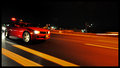
| 07/25/2009 09:12:37 AM | 2010 Camaro: The Legend Returnsby boyhuntsforblissComment:
Critique Club Critique
First Impressions
I wonder whether the concept of Street Photography was a little lost in this interpretation.
Photograph Information, Technicals & Composition Review
Difficult to comment when this seems a literal street photograph rather than encompassing aspects found in street photography.
As is, the image looks like it needs straightening and, especially for this Challenge, more street context - although I'm not sure it may have been there.
Comments, Score & Placement Review
67 out of 135 is quite good for a photograph that doesn't convey street photography, at least not in the traditional sense. Your commenters only comment on the car - which only reinforces my view that your main focus was to submit an action shot of this vehicle 'on a street'.
Summary
For me, it is reminiscent of young boys throttling cars down a suburban street - not something that holds my interest. As nice as the car is, I don't think you've captured it well in this image. Maybe there was potential to get this car into an image that would still fit this Challenge, but I don't think you've achieved that with this creation. |
| 07/25/2009 08:55:42 AM | Iceberg Melting on a Smooth Wave by JohannesFrankComment:
Critique Club Critique
First Impressions
Peaceful scene, beautiful colors. Interesting and unique take on the Challenge.
Photograph Information, Technicals & Composition Review
Good use of long exposure and good control of the whites, still showing the detail and color of the iceberg. I think the framing suits the image, but this is definitely an image that is underappreciated at this size, including the subtle flows.
Composition wise: a little tough, as I think it does work as is, especially with the water patterns and lines strategically placed. The black area on the left looks like it may have some issues, but at this size (not to contradict what I said above), it is barely discernible. Perhaps that left side cropped out, despite the iceberg 'pointing' out of frame, would still work well and retain balance in my opinion.
Comments, Score & Placement Review
19/82 is a strong finish - a score of 6.00 seems a little low for this image. Interesting comments, certainly a specialised science (icebergs and the study of them) - whether it fits the Challenge, I'm not commenting on, other than to mention the literal translation of iceberg to 'ice mountain' in Danish. Overall your commenters liked the scene and appreciated the interpretation.
Summary
A beautiful photographic creation that is underappreciated at this size. Not the strongest subject choice for the Challenge, but conveys the right spirit, in my opinion. | | Photographer found comment helpful. |
| 07/25/2009 08:33:10 AM | Heart of Stoneby SenayComment:
Critique Club Critique
First Impressions
Good potential for this Challenge, but the image seems to be more about the sky than the rocks.
Photograph Information, Technicals & Composition Review
Well done for the straight horizon, however in this image, it being placed almost smack in the middle of the frame isn't enhancing the image, especially the main subject for this Challenge. The rocks look very slightly OOF (out of focus), so it appears that when framing the image in camera you may have been focussed on the water and sky, rather than the fore - but apologies in advance if wrong there.
Composition wise, a much bolder crop eliminating most of the sky would be required to bring these rocks into play more. If you had it from the original shot, more of the bottom area, where the water is foaming around the rocks would have been better included, rather than cropped / 'cut' as it is.
Your title is a little lost on me unless it is that vaguely heart shaped rock a little right of center - if that is the case, then placing that within the frame so as to be the main feature would have strengthened the concept. A much tighter crop to show it would also have been required. Again, probably composing it within the frame so it is not smack center, but rather creating a visual balance, would probably have worked.
Comments, Score & Placement Review
49/82 and 5.35 is a good score for this Challenge and I suspect that the voters were taken with the rich sky, rather than the geological element. Just read your comments and confirms this. The last comment received provides some very good pointers.
Summary
Fill flash for the scene as is may have helped show up more detail in the rocks, but otherwise I think that a much bolder crop and attention paid to where your main subject (the 'heart of stone' rock, if I am not mistaken) is placed within the frame, would have created a more dramatic image in my opinion. | | Photographer found comment helpful. |
|
Showing 481 - 490 of ~4957 |
Home -
Challenges -
Community -
League -
Photos -
Cameras -
Lenses -
Learn -
Help -
Terms of Use -
Privacy -
Top ^
DPChallenge, and website content and design, Copyright © 2001-2026 Challenging Technologies, LLC.
All digital photo copyrights belong to the photographers and may not be used without permission.
Current Server Time: 06/26/2026 09:25:54 PM EDT.
|