|
|
|
Showing 471 - 480 of ~4957 |
| Image |
Comment |
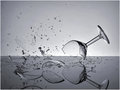
| 07/28/2009 05:31:21 AM | CRASHHHby rio78Comment: 8 - Well done. A little more off the top makes it an even stronger image, in my opinion. |  Photographer found comment helpful. Photographer found comment helpful. |
| 07/28/2009 05:30:34 AM | | | Photographer found comment helpful. |
| 07/28/2009 05:29:37 AM | Tranquilby darnokComment: 9 - Beautiful scene and image. Certainly tranquil. | | Photographer found comment helpful. |
| 07/27/2009 08:18:47 AM | | | Photographer found comment helpful. |
| 07/27/2009 08:14:45 AM | Macro Thingby silverhawkComment: Hey... that's me. :)
7 - Nice colors and detail, always like seeing the fur on these guys this close. He's like a bear... 'thing'. Nice interpretation - thanks. | | Photographer found comment helpful. |
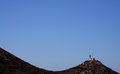
| 07/26/2009 01:19:58 AM | Knidos Curveby ridvanerkanComment:  Critique Club Critique
First Impressions
Critique Club Critique
First Impressions
I like the extreme composition, unfortunately I think the geology isn't showcased quite enough for the Challenge.
Photograph Information, Technicals & Composition Review
Read your comments, indeed it could fit the Challenge, but I think you'd have to either zoom in further to show more geological detail or else include more in your frame to show the land form a little better. The landscape is a little dark, so difficult to discern the features or textures. A slower shutter speed may have helped there, but you may have created issues with the sky, framed as is.
Comments, Score & Placement Review
65/81 and 5.05 is not a bad score for a fair way down the pack.
You have some good praise in your comments.
Summary
A little dark for me to see the detail for this particular Challenge. As already mentioned, whilst I like the bold composition, there needs to be more context or more detail to discern the geological element(s). |
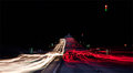
| 07/26/2009 01:12:50 AM | Tricolor Semaphorby M4TRIXComment:
Critique Club Critique
First Impressions
Wow. That's some street shot. The processing is like something I would do, so yes, I like it. Do wish it was 640 though.
Photograph Information, Technicals & Composition Review
For Basic Editing I'm a little baffled about the dark areas at the top, but assume there was little lighting there to begin with and you upped the contrast levels with the image as a whole.
Composition wise - like the placement, but wonder about a little more off the left to center this, that or going the other way and off-centering. Again, like to have seen you use the whole 640 pixels available to you. Like the almost 'milkiness' of the lights and the way you've captured the distant vehicles stopped at the next set of lights. Certainly a unique image. The road seems to go a little funky in the rear, but could be issues after resizing.
A shutter speed of 336 seconds? - hm, I wonder if it is a typo.
Comments, Score & Placement Review
94/135 and a score of 4.96 seems a little harsh for the uniqueness and artfulness of the shot - however given the challenge was Street Photography, I don't think the voters felt it conveyed the spirit of the Challenge - and I do agree.
The one comment you got in-Challenge shows an appreciation for your vision and title and your comment received PC (Post Challenge) also comments on the artistic feel to the image. Both seem to be insightful and helpful.
Summary
There's really no getting away from the fact that this doesn't quite fit the Challenge. Still, an artistic photograph that makes good use of color on the streets and photography. |
| 07/26/2009 01:00:27 AM | | | Photographer found comment helpful. |
| 07/26/2009 12:56:16 AM | Old Montereyby Alex_EuropaComment:
Critique Club Critique
First Impressions
I like the leading lines, the trail lights of the car and the fact this is a semi night shot. I also like the stop sign.
Photograph Information, Technicals & Composition Review
Just read your Photographer's Comments and commend you for your thoroughness in explaining your steps both to take the image and also in post processing.
So how does all that come across as a final image to me, the viewer? - the image seems to be struggling with an identity - I like the stop sign, yet it is not dominant enough to be a feature, the trees/tree lights are nice, but again, they're not dominant enough to make an impact. The composition of the subjects doesn't seem strategic, leaving them all competing for attention.
The street is empty of people (seemingly) and there is nothing grabbing my attention - save for the stop sign (but it needs lighting) and the trailing vehicle lights. A variation in crop and composition, possibly even going for a bold crop and completely recomposing the image. For example: losing the stop sign and also cropping close to the left 'flared' light or keeping the stop sign and cropping out the light on the left and almost centering the trees. Small details like a more refined crop bottom right (red thing creeping in) also help refine the image.
Comments, Score & Placement Review
64/135 and 5.22 is about middle of the road - the perspective is good, but my guess is that the vantage point - the scene on the street, was a bit straight on and doesn't lead the eyes anywhere in particular, therefore your viewers didn't linger long.
Only one comment, but it tells two helpful things: the viewer liked the overall feel with the image (lights, colors (I'm guessing)) and that they appreciated the low angle.
Summary
The stop sign makes me want to see something contradictory in the scene, but I don't - well perhaps the car passing off into the distance - but the crop is not tight enough to bring these aspects/elements into play enough. Experiment with the cropping and overall feel from the image and I think you'd produce something to hold the voters a while longer and also urge people to make a comment (hopefully helpful). | | Photographer found comment helpful. |
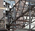
| 07/26/2009 12:40:14 AM | Broken Dreamsby cjgormanComment:
Critique Club Critique
First Impressions
Wonder whether this is a literal interpretation of the Challenge. I think I understand the vision but don't think it has been realized, especially for this Challenge, more context would be required. The iron at the fore of the image also dominates too much.
Photograph Information, Technicals & Composition Review
Just read your Photographer's Comments - seems like you had a visual of this in your mind before you took the image. Again, I think a little more context, or a different angle/vantage point would have given this an edge and allowed more story to come into play. As is, there seems to be some slight blur issues as well. Looking at your aperture, I would hazard a guess that gaining a deeper depth of field would have suited this image and allowed more textures to also come into play. As mentioned, there are some blur issues so perhaps a tripod (or makeshift one) next time. I say next time, because it seems you are not too far from this building and, with the childhood memories attached to the scene/building for you - it sounds like a good self challenge to explore and perfect.
Comments, Score & Placement Review
131/135 and a score of 4.01 seems harsh, but my guess is that the voters didn't understand the concept and also wanted more of the street photography aspect. Of course, they don't get the benefit of your explanation during voting, but the image should be able to stand on its own at any rate.
Just reading the comments, including yours: excellent stuff that you are keen to learn. This was submitted with a max width of 620, you are allowed 640 in Basic Editing and (quality issues aside for a moment), I'd suggest always using the available screen real estate to showcase your image. As for quality deterioration on resizing, experiment with the compression factor when saving the jpeg and you should be able to achieve a good result with no major visible deterioration. Roughly 10% usually works, give or take.
You've been given some curt, but excellent feedback. Remember that people don't have much time when voting, so comments should be taken in that regard. I strongly recommend voting as much as you can and taking the plunge to comment as much as you can too - it is an invaluable way to learn.
Summary
The most interesting aspect being the windows, is lost behind the busy iron at the fore. Potentially an interesting image with the scene and good luck pursuing it in the future. | | Photographer found comment helpful. |
|
Showing 471 - 480 of ~4957 |
Home -
Challenges -
Community -
League -
Photos -
Cameras -
Lenses -
Learn -
Help -
Terms of Use -
Privacy -
Top ^
DPChallenge, and website content and design, Copyright © 2001-2026 Challenging Technologies, LLC.
All digital photo copyrights belong to the photographers and may not be used without permission.
Current Server Time: 07/17/2026 08:12:18 AM EDT.
|