|
|
|
Showing 4631 - 4640 of ~4957 |
| Image |
Comment |
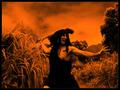
| 08/12/2005 09:18:45 AM | 3000 B.C.by anthonyczajaComment: 8 - Met the Challenge (I think a photo of this put into a 'time capsule' would give future generations a good depiction of this era/year - though it requires a tiny 'stretch' for me in the imagination for this Challenge). This is very well done. And you kept just the year in without any 'explanation' - good for you, it doesn't need it (though personally I'd like to see 30,000 BC or whatever is more 'authentic', perhaps what you have is right, who knows). Criticism; not much, I like the color treatment/effect, you've done very well with the 'props', the coloring/darkness washes out the costume so that it is not discernible enough to see the authenticity. The 'action' is perfect, and amusing. Perhaps without the frame - not sure, just to give a 'largeness'. The 'feel' you have created with the set up and the pp is very good in my opinion. You get the most points from me for creativity. |  Photographer found comment helpful. Photographer found comment helpful. |
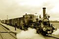
| 08/12/2005 09:11:59 AM | 1922 by AzrifelComment: 8 - Met the Challenge (I think a photo of this put into a 'time capsule' would give future generations a good depiction of this era/year, if that is the correct 'interpretation' of the Challenge). This is a great shot. Criticism; not much at all. I really like the steam you have captured, the characters, the texture/surface of the train - ok, maybe those power lines I just noticed should not be there in 1922 for 'true authenticity' - who knows. The lamp posts look good, the b/w or sepia? looks very good - perhaps just a slightly more front on angle to get more perspective on the train and platform, and get both those (but especially the 'left) shot of steam in the frame. | | Photographer found comment helpful. |
| 08/12/2005 09:06:41 AM | 1930by muur88Comment: 7 - Met the Challenge (I think a photo of this put into a 'time capsule' would give future generations a good depiction of this era/year, especially in an economic sense). It is a little 'stretch' in my opinion on the Challenge, but as I say you captured a certain essence of this particular era and well. Very nice photo too. Criticism; not much, perhaps more distinction on the lamp post if possible. I really like the angle and the b/w? works well here, keeping it a nice clean shot. Maybe even sharper of an angle to get in more of the post and fore building, and enable you to crop out that 'level' that has the line across it on the fore building. Possibly without the frame to give more 'height' - not sure. | | Photographer found comment helpful. |
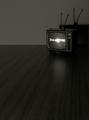
| 08/12/2005 08:59:33 AM | 1959by danderson107Comment: 7 - Met the Challenge (bit of a stretch in my opinion, but it is a 'mood' based one for me so a 'pass' in my books). Criticism; Whilst I like the 'bareness' and the focus on the 'twilight zone on tv', the grain of the 'floor' overpowers the setting in my opinion. For me, if you had a little rug or something it may have made this a better photograph, but seeing as that is a 'toy tv' (?) hard to find a rug that small. I like the shadow effect and I just think you have captured a little of the 'feel' of that time/era, even in the 'little set'. | | Photographer found comment helpful. |
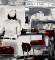
| 08/12/2005 08:55:48 AM | 1955by CutterComment: 7 - Met the Challenge (I think a photo of this put into a 'time capsule' would give future generations a good depiction of this era/year). I like the effects you have used here I think they are ideal for bringing out the textures and color here. Criticism; not too much, perhaps the red carnation? clashes a little, for 'pure authenticity' the waitress' hipsters detract a little in my opinion. Perhaps a slightly different angle or crop could have made this a better photograph, not sure, I think you have done well. | | Photographer found comment helpful. |
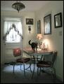
| 08/12/2005 08:51:22 AM | 1958by RKTComment: 7 - Met the Challenge (I think a photo of this put into a 'time capsule' would give future generations a good depiction of this era/year). Criticism; Whilst I think you have a good 'setting', there are a few factors which 'detract' from the theme. The air vent, the 'flip flops' and possibly the carpet. If you had removed those or 'hid' them, it would have made this a better (read more authentic) photograph in my opinion. I like the added character of the cat, just would like to see it sitting still. | | Photographer found comment helpful. |
| 08/12/2005 08:44:47 AM | 1881by HornOUBetComment: 7 - Good effort to meet the Challenge. Criticism; I would like to see more detail (closer angle) on the smaller items, coins, bullets and watch. I also wonder if this photograph might have looked better in b/w, though I know those said smaller items would get 'lost' then, but if they were at the 'fore' perhaps that might have helped. Maybe just a different angle and placement of items (ie maybe the newspaper laying diagonally), would have made this a better photograph in my opinion. | | Photographer found comment helpful. |
| 08/07/2005 06:40:42 AM | Piercing the Fogby BeagleboyComment: '8' - Nice shot. Criticism (with the caveat I know squat about long exposures) ; I keep viewing this photo with the lighthouse 'out' (using my hand in front of eye to crop) and, although I do like the unusual green, and its combination with the blue, for me, this would be a better photograph without the lighthouse. I like it as is but in my opinion, it would give it a more 'mysterious' feel with just the 'dark rocks' and the foggy sea. An overall nice 'feel' to this photograph - the only other criticism would be that I would like to have seen it larger (but yes I know difficult with the horizontal angle and width constraints for the Challenge). | | Photographer found comment helpful. |
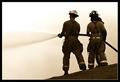
| 08/02/2005 11:39:10 PM | Lifeline by NeilComment: 7 - Met the Challenge, barely; In my opinion, the hose is a tool, the only other possible 'reach' I can get is the harness, or the hats, possibly the uniforms but getting into semantics there so in my books 'ok pass' (but it's too much of a reach). I have a feeling this will either win or rate very high. It is a 'nicely composed' photo and the b/w or sepia? works well. Criticism; I would like to see more contrast on the spray and even more definition in the fireys. May be a little 'blown out', not sure on that. Although I mentioned the b/w, given the minimal subjects I wonder how this would have looked in color.
edit; ok - up to 7 from 5 re toolS (definitely more with 'definite' toolS) | | Photographer found comment helpful. |
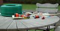
| 08/02/2005 09:40:12 PM | Waterworksby julesdvComment: 7 - Met the Challenge (just - in my opinion it is a bit of a stretch, especially given the home garden setting). I really like the feel and mood of this photo and the colors. The scalloping of the chair adds a nice touch too in my opinion, coupled also with the roundness of the table, also the 'coil' of the new hose.. I like the background, including the gate back left. Criticism; either a slightly tighter crop at the fore or otherwise that in focus as well. That white section of hose is a little distracting/detracting,and the tools (for the Challenge) need to be somehow more emmphasized. Perhaps taking that sprayer out of the pack too, not sure on that.
- edit - up to 7 from 6 | | Photographer found comment helpful. |
|
Showing 4631 - 4640 of ~4957 |
Home -
Challenges -
Community -
League -
Photos -
Cameras -
Lenses -
Learn -
Help -
Terms of Use -
Privacy -
Top ^
DPChallenge, and website content and design, Copyright © 2001-2026 Challenging Technologies, LLC.
All digital photo copyrights belong to the photographers and may not be used without permission.
Current Server Time: 07/17/2026 11:13:48 AM EDT.
|