|
|
|
Showing 4501 - 4510 of ~4957 |
| Image |
Comment |
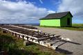
| 09/21/2005 06:44:42 PM | Little Green Shackby orussellComment: 6 - Nice perspective, nice colors. Criticism; fore left, minor details there, looks like 'garbage', so either cropped out, although in my opinion, if you had moved closer to the 'rack', and utilized 'it', with an even sharper perspective, while retaining the 'shack' at the 'rule intersection', would have made this a more dramatic shot. Perhaps you were trying to retain the shadow that I just noticed under that 'rack', but as I say, in my opinion, for this Challenge, and given your title, more impact on the 'shack' would have made this better. A lot of potential in this scene. Perhaps even a little darker/contrasted, not sure. |  Photographer found comment helpful. Photographer found comment helpful. |
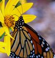
| 09/21/2005 06:38:25 PM | Hannibal Nectarby lshlesComment: 7 - Amusing title and good meeting of Challenge. Criticism; difficult, as you have applied the rule well in my opinion, although I am no expert, in regards to the Challenge. However, given the subject, I just wish the wings were not cropped. The colors are nice, the background is a little detracting though in my opinion, just a bit 'busy' for the subject(s). Maybe just a straightening/rotate, especially if you are going to 'chop the wings', retain or 'use' the symmetry to 'balance' the shot, not sure. | | Photographer found comment helpful. |
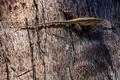
| 09/21/2005 06:30:52 PM | Lizzardby gg_139Comment: 6 - Good potential here. Criticism; lighting is the biggest issue and the liZard seems either out of focus or 'blurry'. Difficult with the tree bark background, but definition on the lizard, the lighting and making it 'contrast' somehow again the bark, would have made this a better shot in my opinion. Technically, while no expert in this rule, it seems you have used 'the top third', however the body of the lizard is on the 'intersection', in this case, I would like to have seen the head/eyes on that intersection, or else possibly with a different angle that 'top third' rule enhanced in some way. | | Photographer found comment helpful. |
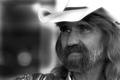
| 09/21/2005 06:06:48 PM | The hatby militarygirl10Comment: 7 - Good portrait shot, has character. Criticism; the title detracts in my opinion and actually leads me to focus on the hat, which to me, is a little blown out and causes 'problems' in that top right corner. Difficult with the balance on the white, but perhaps a tighter crop at the top would have made this a better shot, especially for the Challenge, not sure. Technically, while no expert on this rule, seems you have used it well, but I would like to have seen it even 'stricter'. The b/w works well here, nice shot. Different title, or else more attention to the hat, especially re 'the rule(s)', for this Challenge, would have made this a better shot in my opinion. | | Photographer found comment helpful. |
| 09/21/2005 09:10:41 AM | Openby wsteynComment: 8 - Very nice. Beautiful colors and though normally I personally prefer 'natural environment' flower/plant shots (this looks like studio, but forgive me if I am wrong), the black background is excellent here, especially mixing with the blue, which you have captured well. Criticism; 'if only' those few fore 'anthers' were in focus, would make this much better in my opinion. Perhaps more of the petals bottom right too, like the ones bottom left, but then that may detract from that central focus on the blue 'stigmas'(?). Like the bit of pollen on the petal upper right too. Good 'rule(s)' too. | | Photographer found comment helpful. |
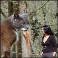
| 09/21/2005 07:40:58 AM | Anyone watching? Mmmm ... Lunch!by banditComment: 8 - For me this was the type of perspective "to create a dramatic effect" that I was looking for when I voted. I liked the perspective and the colors mostly. Criticism; In my opinion, the cat made this shot, including the colors in the fur, which complemented the background, but the woman in the shot detracted, mostly because of what she is wearing, hair, posture and 'view'. If she had been 'blurred/softened' more (if possible), more 'neutral clothing/styling' or less 'prominent' (though the 'illusion' may not have worked then) may have made it a better picture in my opinion. Also the 'dramatic effect' of the cat and its 'size' would have been enhanced. Perhaps just a sharper angle with the cat taking up more frame, not sure. I thought it met the Challenge well, had humor, was different and with a few tweaks, had great potential. | | Photographer found comment helpful. |
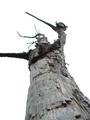
| 09/09/2005 06:46:58 AM | The Paperbark Warriorby roscoComment: 7 - Well seen. Looks like a dead Paperbark (tree) warrior. Criticism; slightly different angle, maybe more fore focus, could have made this a better shot in my opinion. Dependent what is there on the end of that left 'limb', that incorporated into frame would be better too. Just a little more 'space on top, or to the left, perhaps a slight nudge rotation to the right, may have also made this a little more dramatic. | | Photographer found comment helpful. |
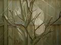
| 09/09/2005 06:41:47 AM | Nature Garden Artby trainComment: 6 - Indeed it is, but I think you have not 'grasped' the full potential within this 'set'. Criticism; I would like to have seen either a much tighter crop, different angle, possibly even close enough that only one or two webs/branches were in the frame. The back fence (?), especially the posts/rails, detract too much from this shot. There is just a lot more potential here in my opinion that is not captured. | | Photographer found comment helpful. |
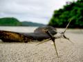
| 09/09/2005 06:35:25 AM | Branch Armorby ronaldibayComment: 8 - Very nice shot. Great color, texture on the sand, 'composition', natural too by the looks of it. Criticism; whilst I like that I can discern the sand, sharper focus on the 'branch', especially the 'points', would have made this a better shot in my opinion. Not sure, but seems the 'horizon'/balance needs a slight nudge up on the right hand side. Good, unusual capture of nature. | | Photographer found comment helpful. |
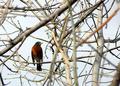
| 09/09/2005 06:31:40 AM | Choicesby fiveriversComment: 8 - This is a great shot and very good for the Challenge. Criticism; not much, maybe the bird slightly to the left more in the frame, different cropping, especially to excluse that bottom right blurred branch, would have made this a better shot in my opinion. I like how you have managed to keep so many branches in focus, as well as the bird. |
|
Showing 4501 - 4510 of ~4957 |
Home -
Challenges -
Community -
League -
Photos -
Cameras -
Lenses -
Learn -
Help -
Terms of Use -
Privacy -
Top ^
DPChallenge, and website content and design, Copyright © 2001-2026 Challenging Technologies, LLC.
All digital photo copyrights belong to the photographers and may not be used without permission.
Current Server Time: 05/10/2026 01:22:02 PM EDT.
|