|
|
|
Showing 4481 - 4490 of ~4957 |
| Image |
Comment |
| 09/22/2005 01:07:04 AM | Hiby owenComment: 8 - Really like this shot and the perspective/timing. Good colors and background, and while no 'expert', good use of the rule(s), especially for the eyes. Criticism; though I would like to see the entire wing span, difficult with this crop and 'opportunity'. If it were a horizontal frame rather than vertical, who knows. The detail in the bird is great, including the feathers, feet, but especially the eyes. Just like to see all that 'enhanced' more if possible, maybe contrast, not sure. Good shot. |  Photographer found comment helpful. Photographer found comment helpful. |
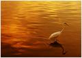
| 09/22/2005 12:57:25 AM | Leaving the day behind by arpitaComment: 8 - Very nice, elegant. Nice colors. Criticism; difficult, but perhaps more detail on the stork/crane(?), especially as you have with the 'rear', somehow to capture that 'all the way to the beak' would have possibly made this a better shot in my opinion, though not sure. That may have detracted too much from that 'ripple' that you have captured well and also, the reflection. Considering the Challenge, perhaps that suggested focus would have worked better re a 'stricter adherence', and while no expert, you have used that 'intersection' well as is, and indeed, used the 'third base line' as well, with the ripples, so covered 'two bases', in a sense. Perhaps a slightly different crop, not sure, would change the shot entirely if you did anything else, though the use of this 'point of interest(s), on the left, if possible, would also have worked well. The upper left slight 'ripple' visible, mildly detracts from the 'calmness' of this shot, but just to contradict that statement, it does add something here as well, but for me, would be a better shot without it, in my opinion. Nice shot. edit:typo - and Congratulations. Message edited by author 2005-09-28 00:27:47. | | Photographer found comment helpful. |
| 09/22/2005 12:48:08 AM | 3 Heads are better than...by APComment: 8 - Good, 'cute', nice colors and amusing. Criticism; more definition. More contrast, sharper focus.. just noticed the background, looks oversharpened(?), so maybe a tighter crop, removing the background if possible, while retaining the rule(s), which I think you have used well here. Perhaps a slight nudge rotation down on the right, not sure. Also not sure on the frame, but I do not think it 'detracts'. Good opportunity/timing. | | Photographer found comment helpful. |
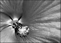
| 09/22/2005 12:44:24 AM | Silver Hibiscusby lwkimagesComment: 8 - Like this. Though not normally a fan of 'taking color from flowers', with the texture and detail of the hibiscus - I think this works very well. Criticism; I would like to have seen the end stamens(?) in focus, and that one middle left, not 'blown', but difficult. Title works well, frame also works too here I think. How you have 'converted' the texture on the petals, and indeed the 'glow like' of the stamens, is what I like most about this shot. Technically, while no 'expert', I think the rule(s) are used well here and definitely enhance the shot/style. | | Photographer found comment helpful. |
| 09/22/2005 12:40:08 AM | Gorgeous Cascadeby eqsiteComment: 8 - Very nice. Criticism; not sure, perhaps a tighter crop on the left hand side, the wall is a touch detracting/distracting. The water capture is excellent, from the top 'flow' to the bottom 'mist'. Technically, while no 'expert', I think you have used the rule(s) well. Maybe just a touch darker, creating more 'impact', not sure. | | Photographer found comment helpful. |
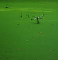
| 09/22/2005 12:37:42 AM | Swamp Creaturesby glodaComment: 8 - Good, and 'different'. Criticism; if it were a gator or 'something', would make it better in my opinion, but I like the humor and as I said the 'different' perspective/aspect. Really like the green, the 'fallen leaves', the shadows.. maybe a touch more vivid or sharp would have made this shot better in my opinion. Technically, while no 'expert', I think you have used the rule(s) very well here for the Challenge. Maybe a slight tighter crop at the fore there, not sure. | | Photographer found comment helpful. |
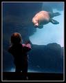
| 09/21/2005 11:57:31 PM | Wanna Play??by princessfriesenComment: 6 - Like this, mostly for the potential, as well as your seemingly good use of the rule(s) (though I am no 'expert' with them). Criticism; even though it means cropping out the childs 'feet', I would like to have seen this cropped to the 'glass edge', to create a more dramatic, possibly 'surreal' type effect, especially given your title, but I can 'see the perspective' that you have gone for/retained. Perhaps a touch more contrast, again even if doing so (or darkening) meant that the child became almost 'silhouette' like, may have given this shot something 'different'. Maybe in this shot, a slight softening may have also added a certain effect, whilst 'disguising' the glass and lack of fine focus on the seal, not sure. The frame detracts in my opinion. | | Photographer found comment helpful. |
| 09/21/2005 11:50:08 PM | Field of Dreamsby TurbotechComment: 6 - Great perspective, nice colors and 'texture' capture. Criticism; would like it cropped at the top to remove most, if not all, of the 'fencing', which may have created a 'purer' shot, in my opinion, but not sure. Technically, while no 'expert', especially for this Challenge, I would like to have seen a stricter adherence to the rule(s), which would have been achieved with said crop and the inclusion of a fraction more 'space' at the fore. I do not think it would have detracted from your sharp perspective here either, but not sure on that. Colors are good. | | Photographer found comment helpful. |
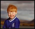
| 09/21/2005 10:48:33 PM | Happyby JohannesFrankComment: 5 - A lot of potential here in my opinion. Criticism; I would like to have seen a better/stricter use of the rule(s), not only for the Challenge, but as a portrait, but I am no 'expert' on the Rule of Thirds. I think you have captured character fairly well but I see more potential - tighter cropping perhaps, excluding the 'shirt', even a selective desaturation maybe. The color in the hair, and the movement is good, and while the contrast of that color against the shirt is bolder, the shirt is 'competing' with the child - for a portrait anyway, in my opinion. Eyes maybe opened a tiny bit more, but 'as is', as I said, you have character here, the smile seems 'natural' (not forced) too. Not sure on the frame. Background is nice, although more 'level' or, alternately more 'diagonal', may have made this a better shot in my opinion. |
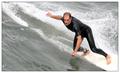
| 09/21/2005 10:38:16 PM | Rule No. 3: Keep your balance...by TerramarComment: 5 - Good angle. Criticism; would like to have seen a tighter crop or zoom, creating a more dramatic effect here, especially given your title. Technically, while no expert, I would like to have seen a tigher adhesion to the rule(s) for the Challenge, again though with a different crop/zoom, I see potential for this to be played into more resulting in a more dramatic effect. I like the texture capture on the wetsuit and the 'feel' of the water. Not sure on the frame. |
|
Showing 4481 - 4490 of ~4957 |
Home -
Challenges -
Community -
League -
Photos -
Cameras -
Lenses -
Learn -
Help -
Terms of Use -
Privacy -
Top ^
DPChallenge, and website content and design, Copyright © 2001-2026 Challenging Technologies, LLC.
All digital photo copyrights belong to the photographers and may not be used without permission.
Current Server Time: 07/17/2026 06:55:39 PM EDT.
|