| Image |
Comment |
| 10/21/2005 12:04:04 AM |
walk this wayby jonnieComment: 8 - Like this, especially the colors. Criticism; perhaps a different crop, incorporating more 'fore reflection' and less 'top of tree'. Perhaps the 'distant waters edge' softened somehow may have made this better in my opinion. The soft ripple effect works nicely here. |
 Photographer found comment helpful. Photographer found comment helpful. |
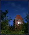
| 10/21/2005 12:01:21 AM |
Lost In Timeby instepsComment: 8 - Like this and good title. While not normally a 'fan' of 'flipping' reflections, etc (and apologies if you somehow have not), I think it works very well with this shot. Criticism; not sure for 'calmer waters', with this one, as I like the 'warped time' look, which your title is apt for. Somehow, a more 'dreamy' or 'surreal' look obtained would be good, but unsure how, perhaps the coloring and/or light (sky especially). Not sure on the frame. |
| Photographer found comment helpful. |
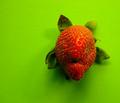
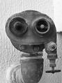
| 10/19/2005 07:59:06 PM |
Put Your Teeth In Dearby macrothingComment: Originally posted by aquarian11:
But..how did you notice the look on the strawberry? |
But.. "it was just my imagination, running away with me" coupled with a 'Spanish Inquisition' of a selection of fruits. The shot is far from perfect, but.. thank you for the '10'.
Thank you also to all those that voted it high, I am very pleased with my 'place'. |
| 10/17/2005 09:56:16 PM |
Mildred put a lamp shade on her head and thought she was the life of the party.by chaliceComment: 5 - 'Juvenile', but I like it. The title carries most of the weight though in my opinion, and whilst not normally a 'fan' of 'weighty titles', for this Challenge, I make an exception. Criticism; noisy/grainy(?), not sure on the colors, perhaps a diffferent crop/perspective. Mildred facing the others may have also made this better in my opinion. Just noticed the 'remnants' on the fore partygoer, attention to detail (cleaning) would be better. The lighting needs work and overall this shot has a 'snapshot' 'feel' to it, in my opinion, but I like the potential, just wish you gave it more 'attention'. |
| Photographer found comment helpful. |
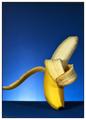
| 10/16/2005 10:20:52 PM |
Bashfulby sibelingComment: 7 - Well executed. Criticism; whilst the colors and lighting work well, I would like to have seen the 'blues'/background/base/etc more subtle if possible, really making the bashful banana 'pop' out. Not sure on the frame, maybe it helps with the 'subject' though. |
| Photographer found comment helpful. |
| 10/16/2005 10:19:04 PM |
Introspectionby BudmullaComment: 7 - Like the concept. Criticism; seems a little 'noisy' in parts and/or perhaps oversharpened. Not sure on the colors/background. |
| 10/16/2005 10:15:44 PM |
Scuba diverby AnandComment: 7 - Like it. Criticism; maybe slightly different coloring/toning/contrast. Different crop may have made this better in my opinion, not sure. |
| Photographer found comment helpful. |
| 10/16/2005 10:04:49 PM |
The Embraceby lenahComment: 7 - Like this, although I see 'the dance' more so, but just my opinion. Criticism; not much, perhaps more detail on the 'embracers', making them 'pop out' more, not sure. |
| Photographer found comment helpful. |
| 10/16/2005 10:00:24 PM |
He Grew Nervous Hearing Their Taunts -- "Apple Pie... Apple Pie..."by joroComment: 7 - Good and humorous, but the title is what makes it in my opinion, and while not normally a 'fan' of 'title heavyweight', given this Challenge, the 'text addition restrictions', your 'subject' and the 'emotion' you were conveying (and did so well too) - I make an exception. Criticism; perhaps a different crop and angle. |
| Photographer found comment helpful. |
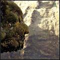
| 10/16/2005 09:52:28 PM |
Roman Emperorby GautiComment: 8 - Like this. Criticism; difficult I imagine given the 'placement' of the subject and the 'depth of field', however I would like to see the 'emperor' more vivid, with more detail in the texture, although I realize you may lose the 'profile effect' in doing so. Perhaps a different crop too, depending what is above 'his forehead'. |
| Photographer found comment helpful. |
Home -
Challenges -
Community -
League -
Photos -
Cameras -
Lenses -
Learn -
Help -
Terms of Use -
Privacy -
Top ^
DPChallenge, and website content and design, Copyright © 2001-2026 Challenging Technologies, LLC.
All digital photo copyrights belong to the photographers and may not be used without permission.
Current Server Time: 07/18/2026 07:53:33 AM EDT.