|
|
|
Showing 4371 - 4380 of ~4957 |
| Image |
Comment |
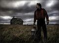
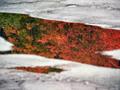
| 10/26/2005 10:16:58 PM | Desolation by Joey LawrenceComment: 8 - Good use of grain for the Challenge, adds to the 'drama' and 'story'. Criticism; not much, perhaps an even sharper angle (ground up), giving the man more 'dominance' and setting the 'house' back a little perspective wise, may have made this a better shot in my opinion. Maybe even a bit more sky, as it adds such a great 'effect'. Good shot open to a few 'story interpretations', 'desolation' being just one. |  Photographer found comment helpful. Photographer found comment helpful. |
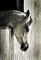
| 10/26/2005 10:07:31 PM | Horses love grainby BrennanOBComment: 8 - Good use of grain for the Challenge. Criticism; difficult given the coloring of the horse, but perhaps a different 'contrast', also perhaps a little more 'space' to the right, or at the bottom, may have made this better in my opinion. | | Photographer found comment helpful. |
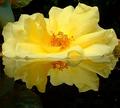
| 10/26/2005 12:38:10 AM | Glowingby macrothingComment: Originally posted by 1olddawg:
Sort of confused on this one. I don't understand how the orange centre can reflect below the flower with a large petal laying flat in the surface in front of it. I think the photo is great just don't know how this was achieved. "8". Is it possible to pm me and explain? |
- Scientific explanation: "The illusion of a reflection underneath the flower is achieved by selecting the right angle to take the photo from, relative to a horizontal plane.......as well as determining the correct, yet subtle angle to place the object at......thus creating the illusion of an underneath reflection". (thanks to my better half)
Originally posted by Tuckersmom:
I'm a flower lover, this is beautiful. Colors are perfect and focus nice and crisp. Only small complaint would be the leaf in the upper left. |
- Not a leaf, but part of a statue and I had the same 'complaint'.
Thank you to all who voted it high. Message edited by author 2005-11-01 21:41:14. |
| 10/25/2005 07:22:55 PM | The Dog Went Firstby hideoutComment: 7 - I do like this, and/but(?) the title carries a certain amount of 'weight' here in my opinion, primarily in regard to the fact I may not have picked up on the 'paw prints' without your title, but I do like the title and am not implying you are 'forcing it'. Criticism; I would like to see more 'context', it is difficult in my opinion to discern the 'top' and 'right' part of this shot, ie: 'real' or 'reflection', which I would like to have 'realized'. The shot is kind of 'abstract' though in an unusual (and good) way. Colors are nice. | | Photographer found comment helpful. |
| 10/23/2005 10:04:05 AM | | | Photographer found comment helpful. |
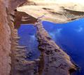
| 10/21/2005 07:30:02 AM | Water Colorsby ucanoeComment: 6 - Nice colors. Criticism; I like that you didn't flip it, but 'somehow' incorporating the 'real', even a little at the top, may have made this even better in my opinion, though you would lose the 'abstract' kind of 'feel' it seems you have gone for. The rock(?), even though barely discernible, is a nice subtle texture and pseudo frame for the 'reflection'. | | Photographer found comment helpful. |
| 10/21/2005 07:20:13 AM | The Jacaranda in Bloomby biggood53Comment: 5 - I like this mostly for the potential. Criticism; knowing the brilliant color of these trees, I wish you had been able to capture more of it in this reflection, perhaps the time of day/sunlight may have helped, not sure. Also, especially given the beauty of these trees, I would like to have seen this particular tree incorporated if possible, along with the reflection, and hence, the reflection not 'flipped', which it seems you have done, apologies if I am wrong. | | Photographer found comment helpful. |
| 10/21/2005 07:07:19 AM | Seagulls on thin iceby GautiComment: 7 - Like this. Criticism; wish the seagulls 'popped' out more, somehow. Colors are nice, but perhaps a slightly tighter crop may have made this better, not sure. | | Photographer found comment helpful. |
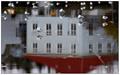
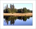
| 10/21/2005 07:06:07 AM | Mirror in Lakeby MardukComment: 7 - I do like this but, Criticism; the frame detracts from the colors and 'feel' of the shot in my opinion. Also, if possible, the shot this size (without frame), would be much better and have more impact. | | Photographer found comment helpful. |
| 10/21/2005 07:04:27 AM | Bel Air Reflectionzby alzartComment: 7 - Like this and 'different'. Good colors. Criticism; not much, perhaps a slight rotate and different crop, excluding the wheel and white panelling far right, may have made this better in my opinion. edit:typo Message edited by author 2005-10-26 09:19:06. | | Photographer found comment helpful. |
|
Showing 4371 - 4380 of ~4957 |
Home -
Challenges -
Community -
League -
Photos -
Cameras -
Lenses -
Learn -
Help -
Terms of Use -
Privacy -
Top ^
DPChallenge, and website content and design, Copyright © 2001-2026 Challenging Technologies, LLC.
All digital photo copyrights belong to the photographers and may not be used without permission.
Current Server Time: 07/18/2026 04:20:28 PM EDT.
|