|
|
|
Showing 421 - 430 of ~4957 |
| Image |
Comment |
| 08/07/2009 08:01:13 PM | |  Photographer found comment helpful. Photographer found comment helpful. |
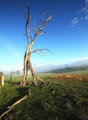
| 08/07/2009 04:35:48 PM | Overlookingby dewofwinterComment:  Critique Club Critique
First Impressions
Critique Club Critique
First Impressions
I like the vantage point and the angle, but the image needs straightening. The OOF fore dominates a little too much as well, in my opinion.
Photograph Information, Technicals & Composition Review
I'm not sure why you chose a shutter speed of 1/105s, as you don't mention it in your Photographer's Comments, however for this scene, and with the apparent light, I guess that it may not have been necessary. It doesn't look like a shutter speed of this long, so it may be a typo in your Photographic Information details.
A deeper focal length than f/3.5 would have allowed more of the fore focus to be sharper. I like the effect created by the OOF (out of focus) background, but I believe the image would be stronger with the fore shoes both in focus.
Composition wise, straightening of the image so that the distant 'horizon' is straight, would have helped as well. Placement of the subject: there is nowhere really to go - you have placed them in the middle of the frame, albeit down the bottom of the frame, which is 'ok', but doesn't create any real impact, other than a fairly strong first hand point of view, which for shoes, I'm not sure is necessarily a good thing. But that may be subjective.
The sky is 'blown out', so either cropping down to reduce that within the image, or adjsuting the exposure (re my comments above) would have allowed more detail of the distant sky (which plays a fairly important role in the image) to come into play.
Comments, Score & Placement Review
4.74 and a placement of 93/199, perhaps reflects that most voters were distracted by the main impact of the image - the tilted background. You have a few especially good comments to help you with this image.
Summary
A variation in composition and more control of the focus and exposure would have made this a stronger image.
I noticed you placed this image in the Portraiture and Persuasive galleries... interesting.
PS
I see this is your first submission to DPC - congratulations on taking the plunge. It is a great way to learn about photography and the different arts involved. |
| 08/07/2009 04:19:00 PM | Broken Lanternby kyagudinComment:
Critique Club Critique
First Impressions
Struggling to get the Challenge connection. I voted in this Challenge and I gave this image a 3.
Photograph Information, Technicals & Composition Review
The image is fairly sharp for a 1/15 sec exposure. After reading your Photographer's Comments, I understand the opportunity you saw and therefore 'get' the concept, but I don't think it has been achieved, or at least with this little context, to be able to display it in an image for someone to grasp, who didn't witness the street scene itself. Especially for this Challenge, voters likely wanted to discern that the image was taken 'from above' and I don't think the elements and feel for this image give that impression.
Comments, Score & Placement Review
105/141 and a score of 4.88 I guess reflect what I have said above. I presume this score is likely because of the lack of connection that voters had, rather than the quality of the image.
Your commenters mostly all say the same thing: that they see an abstract here, which again, for this Challenge of 'From Above II', an abstract is a much more difficult image to have in this 'race'.
They are all helpful comments, albeit somewhat subtle, especially as to why they voted an average of 5.75.
Summary
I like the concept, but as I mentioned above, if you had shown more context, with possibly a few more reflections to show more of the lantern and perhaps also more of the puddle/context of the street, it may have allowed the image to connect with the voters better. |
| 08/06/2009 05:29:50 AM | | | Photographer found comment helpful. |
| 08/06/2009 05:25:06 AM | Horse Playby IvoComment: 7 - Good portrait. Wish I could see more of the horse in the frame, despite the good effect of him/her sneaking in up the top. | | Photographer found comment helpful. |
| 08/03/2009 04:43:34 PM | skylineby SenayComment:
Critique Club Critique
First Impressions
The colors of the city are quite nice but the frame dominates the image too much. It is not quite 'far out' enough to show a 'skyline' to match the username for this Challenge.
Photograph Information, Technicals & Composition Review
For a long exposure of 3 seconds, I think you could have afforded a much lower ISO than 800. The quality of the image is not very clean and the night sky is showcasing this, rather than being nice and smooth, which may have been helped in post processing. I also wonder whether a deeper DOF, especially to garner some of the fore water as well.
Compositionally, with the tall buildings in the center of the image as well as on the left, throws the compositional balance out. With the scene as is, perhaps a tighter crop on the right would have helped. Apologies in advance if wrong, but it seems this may have been taken through a window as I can see what look like some subtle reflections here and there.
As already mentioned, the frame is too dominant, not only in color (which doesn't seem to pick up and complement any color within the image) but also in size, for an image of this size. The image also looks like it needs a slight nudge rotate up on the left to straighten.
Comments, Score & Placement Review
133/169 is low down the pack, but I think that the voters didn't get a strong connection with the username, that and the framing might have made them move on a little too fast. The score of 5.44 is quite good, especially for where you placed.
Just reading your two comments, one mirrors some of my comments above and the other says that they like the image. With a combined score of 7 from your commenters, they both liked it and voted it high.
Summary
Without your border and with some post processing to smooth out some ISO issues and tweak the lighting, this image may have been improved. However as I first mentioned, for your title/choice of username, the impact and 'fit' is not as strong as more skyline would have given, in my opinion. | | Photographer found comment helpful. |
| 08/03/2009 05:13:33 AM | Macro Thingby silverhawkComment: " ...Hope Member Macro Thing is sort of happy i picked his name."
I certainly am (and I 'get it' too) - Thanks
edit to say: meant to mention that I didn't even think to look for my name, just started voting - saw the title and 'twigged' - hence my comment reading the way it did - was a nice surpriseMessage edited by author 2009-08-03 05:15:47. | | Photographer found comment helpful. |
| 08/02/2009 02:40:42 PM | The Burn Pitby CorySmithComment: 7 - Nice lighting, nice quality - I want to see more 'roughness' on her face.. if that makes sense. She looks so clean. I like the forward glance/look - just wish also for a little more 'character' to shine through - facial expression or something, just to give her/the image a little more of an edge.. if that makes sense. Also, do miss her legs, but... I appreciate the crop dilemma. Like the distant sun and its placement too. | | Photographer found comment helpful. |
| 08/01/2009 05:53:31 PM | Re-Voltingby desertoddityComment: 8 - I like the balance (including the yellows) and I like your framing and I like that wicked looking cloud. | | Photographer found comment helpful. |
| 08/01/2009 05:47:35 PM | in peace...by edmengComment: 8 - Very nice. An uplifting image. I know there are issues, yes would be better with more detail especially in the face, but overall I just like this. Ok, maybe a fraction nudge up on the right, but only a fraction and could just be a perspective thing. Good capture of a good moment in life. Adding to Favorites. | | Photographer found comment helpful. |
|
Showing 421 - 430 of ~4957 |
Home -
Challenges -
Community -
League -
Photos -
Cameras -
Lenses -
Learn -
Help -
Terms of Use -
Privacy -
Top ^
DPChallenge, and website content and design, Copyright © 2001-2026 Challenging Technologies, LLC.
All digital photo copyrights belong to the photographers and may not be used without permission.
Current Server Time: 06/26/2026 04:56:02 PM EDT.
|